
Daily Diary 30/11
Today I went in the gallery to record my voice over for the interactive video. I think I did well with recording and tried to follow the tips that were given in the videos I researched for voice overs
Magazine Requirements
For my video, I'll mostly be sourcing stock footage from pexels. The icons in the video are from flaticon

Production Log

unlinking
As I had some stock videos that were attached with audio, I had to remove it. I did this by right clicking on the video and clicking on unlink. I deleted the audio because I didn't need it
Interactive Video
Daily Diary 01/12
Today I had to finish making my interactive video and do a production log for it. I have to research into News UK for my Professional Practice page, which is due tomorrow
I think I did well with my video and edited it better than I could've back when I first started this course, as I have improved more since then
Production Log

polygon lasso tool
I used the polygonal lasso tool to take the person out of the picture. I did this by right clicking on the lasso tool and clicking polygonal lasso tool
Daily Diary 02/12
Today I had to make a draft for my entire magazine while adding new techniques to my production log. When I go home I have to be a copy editor for two other people and have two other people do it for my draft. This is due on the 7th, the same day as my interview
I'm proud of my double page spread pages but I don't like my front cover that much. While I do think it's interesting, I don't think it fits with the rest of the magazine and the background really bothers me. I also slightly squashed the model and while it isn't really noticeable, it's hard not to notice once you do. I plan to change it later if I have the time
Magazine Draft
Copy Editors
Copy Editors Evaluation
The target audience of the magazine was intended to be young women and teenagers, the editors could tell as well. For the front cover of the magazine, the masthead stood out but one of the criticisms I got was that the colour choice didn't feel right. They said that they knew why I chose the colour but felt as if it was dull, which I understand but am not sure if I agree with. The secondary leads were clear and told what would be in the magazine, I didn't use pugs as I wanted to focus more on buzzwords instead, but I may use pugs as I was criticised for not having a clear main headline for my articles. I was also told that Photoshop was evident in my magazine and that I could smooth out some of the sharper lines on the models to make them fit better. Another thing they mentioned is that words such as "Exclusive" or "Popular" could be used to draw in more attention. One said that there was too much negative space in the cover and that the background felt forgotten about. I also didn't feel as satisfied with the background used in the front cover as well
They both liked the double page spread but felt that there was too much negative space on the first page and that it's not coherent with the front cover. I agree with both and may change the front cover to more suit the pages. I was thinking of adding text to the front page promoting the Laura Pitharas brand, which was also a suggestion made by one of the editors. The lighting of some of the images in the magazine was also mentioned which I'll do. They both liked the wardrobe/poll idea and mentioned making the wardrobe section look like an actual wardrobe but I'm not sure how I'd do it without clashing with the minimalist aesthetic on the double pages
Magazine Final

Interactive Elements
None on the front cover
Interactive video about the evolution of
the fashion industry, below it is a link to
one of the brands I mentioned in the
video
Price tags link to the clothes it's next to
for the audience to purchase it. The shoes in
the "Lets Get Ethical" also do the same
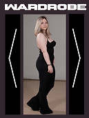
Wardrobe has a slideshow of different models,
navigated by the arrows beside the picture.
The buttons beside it change colours when
hovered over or clicked on, the "Send!" button
only changes colour when pressed


Daily Diary 08/12
Today I finished my interactive magazine, including all the interactive elements. My homework is to get audience feedback on my magazine from someone in my target demographic, this is for my presentation tomorrow
I'm happy with the overall design of my magazine. While I'm still not completely satisfied with the front cover, I do prefer it more than my draft one as one of the main problems I had with that one was how the background didn't fit with the double page spread. With the new cover it matches the simplistic style of the pages at least, even if I now worry about it being a bit too boring. My favourite part about my magazine is the double page spread, especially the Audience Vote page. The picture of both of the models and the slideshow section of that page both turned out really well. I think the colours somehow match with eachother and the two toned pages were a deliberate choice I made and I really like how it turned out
Audience Feedback
I decided to get feedback from one of my friends as she fits the target demographic (teenagers/young adults and women). The link is the same one as the PDF above

