
Articles (rough draft)
history of pets:
Animals and people have always been connected, even back when people used BC to calculate years! They’ve been with us from hunting to sitting on us while we’re asleep, it was only so long until we became friends and even family... And who wouldn’t want a memento of their most loyal family member?
The oldest paintings of animals go waaay back (19000 years back!) and were actually found in multiple different caves. But the first actual art of a pet comes from Babylonia, 3500 BC (5,500 years for all you counting) and were paintings of people with their goats and horses. Speaking of old times, did you know there’s an about 9500 year old grave of a cat and a person being buried together? That’s how I’d want to go out personally
Cats live like they’re above everyone else and we mostly have the Egyptians to blame for that attitude. Back then only the Pharoah could own a cat and the rest could only appreciate their beauty by making art of them. They were also worshipped as deities such as Bastet which, once again, does not help the ego problem. Egyptians also loved dogs too, being connected to the deity Anubis
The Greeks also appreciated dogs in a similar fashion, making thousands of sculptures, mosaics and pottery featuring them. They saw dogs as intelligent, Socrates calling them “true philosophers”. Rome even went a step further as this was the era people finally started taking care of their pets! Their dogs also helped them in wars, which now that I say it sounds a bit reductive doesn’t it? They still loved them though, the famous Cave Canem (Beware of Dog) mosaic coming from this era!
In both the Middle Ages and the Renaissance era, noblewomen and upperclassmen had many portraits of dogs on their laps. Cats were also beloved and drawn in Asian countries such as Korea, China, India and Japan all the way back in the 1700s. Because Victorians finally had cameras, having photos of pets became much more common
Nowadays you’d have to struggle to not find a pet around! The internets always had a home for pet photos, images and yes even art. Some draw parodies of other famous art like the Mona Lisa, others draw animals in their natural state of being adorable. There are many different ways to appreciate pets, so no wonder arts become one of them
freelancing:
The pandemic hit the freelancing scene hard, but illustrators are still going. Companies looking to cut costs have ditched freelancers but industries such as advertising, journalism and of course design still contract work with them. Freelancing sounds scary to many people, having to keep track of your own finances and deadlines, but its not as bad as you’d think. In fact, most creative jobs take this route of work!
Before even starting you have to prepare. Having a few clients who already like you is a good start as it means you won’t have to scramble for clients at the beginning. When starting out its actually better to stay in your current job, this provides financial stability and allows you to back out if you change your mind. Be 100% sure this is the right path before even thinking about leaving your job too, building your own portfolio can take much longer than you’d expect. For some lucky people it can take only a few months but for others it can take even years to have a proper portfolio!
To stay afloat as a freelancer, you have to find your niche and market yourself to others. The best way to market yourself is on social media, its an easy way to set up your portfolio and an even easier way to get people to find your work. Of course there are other places to put your portfolio, having your own website for it is a good idea too
It’s good to establish yourself as a small business, mainly to keep personal and work life separate. As boring as it sounds its also good to come up with a business plan, even the most basic ones can help you. Making a list of responsibilities, all the services you do, how much you charge and the prices it’ll cost you are all basic things you should already know. Yes this includes managing your own finances, as boring or scary as it seems someone has to do it
Most freelancers work at home, especially because of you-know-what, and it isn’t as comfortable as it sounds. Its hard to stay focused while you’re at home (I know this all too well) so it’s best to create a separate workspace. This can even be a separate building you can bring your clients over to if you work with locals. Having a daily plan and separating your day into sections is good as well, especially at the beginning so you don’t feel lost. The goal is to set a routine you can follow
As gigs are starting to make a comeback again, another important thing to know as a freelancer is your rights. Over the years laws have been put in place to protect freelancers but there are still pitfalls one can fall into if they’re not careful. Never work underpaid!
Looking for jobs? Have you tried LinkedIn, Behance, Working Not Working and Freelancer? These sites can help you get on the map, even Fiverr can be used to establish an audience when starting out. If you’re a seasoned illustrator you can even use Guru, a more professional platform. Job boards, grouping with other freelancer artists and selling your art online are also great ways to start out
animation vs illustration:
What’s the difference between animation and illustration you ask? Well ones animated and the others not. I could stop there but some companies out there still get confused and the differences run much deeper than that!
There’s a running problem with people assuming animation is for kids only, but that definitely isn’t the case. Animation can be used for many different things, a popular example is for advertisements or for videos giving a lot of information. Staying focused on one video is a hard task nowadays, animation is able to keep people engaged while also helping them understand what’s being said better. Animated advertisements are so common they’re seen as oversaturated, to pull statistics out of thin air here its said that animated ads get 73% more attention than static ones do
Illustration is different in that the art never moves, it’s always static. However unlike in animation, illustrations can be more thought-provoking as you can interpret the art differently. Not like this isn’t possible at all for animation, but its much more difficult to pull off. Despite the slow decay of print (I promise this isn’t a self-jab), art prints are still very popular. Illustrations aren’t just for posters and books too, they can also be used for advertisements such as business cards, signs and even on companies trucks
In work, animation is much more of a team effort. Many people such as background artists, concept artists and storyboard artists are just the few jobs that do the heavy-lifting when it comes to animation. Illustrations are commonly much more individual. As an illustrator its much more important to be able to stand out above the rest for your own individual style and art, while in animation its more about variety and consistency. Having a portfolio full of different types of artwork (background design, character design, short animations) that are consistent in quality can help much more in animation than having a portfolio full of portraits. Knowing about anatomy and being able to pull it off consistently is extremely important as companies look for foundational skills more than individualism. After years of working professionally you’ll be able to blossom into individualism and possibly be hired just for your art style
A way to develop your own art style is to… Practice drawing. The most common and basic form of advice I know, but it does really work. Take inspiration from other artists but try not to compare your art to the same artist every time. Try out new things, see if you like them and eventually you’ll have an art style to call your own
generative art:
In this new world of technological advancements, it was only time until art caught up too. With the latest technology comprising of code, computers and an eventual robot takeover, there’s been a wave of art that can only be done on a computer screen. ASCII art is a popular example, but today we’re diving deeper into generative art
Well, first I have to quickly run down what code art even is. Its exactly how it sounds, art using code. There are many different types, CSS is often the most common one. Generative art is actually a category of art, taking inspiration from modern and pop art. The artform mainly uses geometric shapes and patterns. However, unlike code art, generative art works on its own rules
The first rule of generated art? Randomness. Every time the art is reloaded or refreshed, the art is completely different and unique to whatever it was before. There are more orderly systems though, such as going off of a timer or set date. Making generative art that’s truly orderly is impossible though, randomness has to be a part of it. This is because generative art has to be different every time its been refreshed. There’s also generative art mashing both order and randomness together, creating something that could never be replicated
Generative art can be seen as a dance between an artist and a computer, they work together to pitch in for different things. The artist controls the randomness and order of the artwork, then the computer handles acting it out and can change the system to their liking. There’s even interactive generative art, where the audience can change what the art looks like. The process of making generative art is fundamentally different from any other artform and stands out for being truly experimental
To make generative art you can either let the computer do what it wants or to set a goal in mind that you want the art to look like, then try to work with the computer so it can make the art you’re looking for. Prior knowledge of scripts like Javascript can make the process easier as all you need to make generative art is p5.js. What’s P5? It’s a website dedicated to allowing artists to make their own generative art, whether that be illustrations, sound, video or even webcams. The “art” in generative art can really be anything you put your mind to
costume design:
Costume design is an unsung hero for many types of mediums, a piece of clothing can become synonymous with a character. Clothing can tell you all about what a character is like completely nonverbally. But it’s not like costume designers come up with outfits all in their head, for some it takes visualisation. Inspiration.. Illustration
I doubt I’ll need to explain what a costume designer is, its right in the name. Unlike fashion designers though, costume designers work on theatre, film and TV. Its much harder than it sounds: sourcing outfits yourself, making sure they’re comfortable enough to be acted in and it’s not just the main characters you’re dressing! You’re dressing everyone on set, including the background characters that’ll only be seen once or twice and never again. And that’s not including the fact that you have to decide on what they’re all wearing too
To help with that, costume designers often draw their outfits so they know exactly what they want. This happens during the planning stage so they’re able to visualise their outfits to the director. Traditionally or digitally, being able to draw your ideas is an extremely useful skill as a costume designer. Being able to draw from memory is also a great skill to have as you might find yourself making outfits on the fly
hobby:
Here at vision, we appreciate all kinds of art and walks of life. The illustrations, animations, even newer editions such as code art. Throughout the issue we’ve talked about art as a career, but it isn’t just a career though. To a lot of other people it’s a hobby to be enjoyed and celebrated and we’d be amiss to abandon those folks too in this issue
Art can be many different things when you do it as a job: fun, frustrating at times and to make deadlines meet it isn’t uncommon that you have to sacrifice on detail for a few parts. However as a hobby, art can truly flourish. Not that people who only do art as a hobby don’t come under the same stress factors as professionals do, but it’s a much less demanding environment
Art as a hobby can calm you down and even improve a few of your traits in the meantime too. Depending on how young you are when you start, it can even help a few important skills like hand to eye coordination, mobility and concentration. Art obviously helps with your creativity too, affecting your problem-solving skills for other parts in your life
Being able to freely express yourself is a huge reason why people do art as a hobby too, being able to visualise your intentions and emotions can be a powerful tool (seen in our article about costume designing). It can even help you socially if you choose to go to local art events and join art clubs. And last but not least, did you know art counts as a valid hobby to put on your CV or university application? It not only acts as a good conversation point in an interview, but it also shows how creative and passionate you are
Focus Group (rough draft)
I wasn’t able to find a magazine writer or reader but I still wanted to get an opinion on the rough draft for the article I wrote, I decided to choose the pet article as it was the first one I finished and felt a little off to me but I wasn’t sure how to put it into words. I sent the article to the focus group and got critique back
A few hours later 3 also said they agreed with 1, so I take it that most of the people in the focus group agreed with him and didn’t have much else to say
I was critiqued on the first and last paragraphs seeming too childish, while looking back on my rough drafts I’ll make sure to keep that in mind. The magazine’s primary target audience are teenagers in the 15-18 range, but I do think that having general professionalism is still important as I don’t want my target audience to feel talked down to either

Daily Diary 25/04
Today I wrote the rough draft for my articles, other than the last one as I can’t yet
I’m not super confident in my writing for articles, mostly because when it came to journalism I’ve never been interested in writing articles myself. I like reading them, especially when they’re about art, but I’m not really confident in myself nor do I find writing articles enjoyable. I’m surprised I was able to do it in such short notice though
While writing my articles I realised the research I did for costume design didn't really matter with what I was writing, this is because at the time I was planning to write about contemporary design vs periodic design. I realised now though that doesn't have much to do with art so I changed it to how costume designers use illustration instead, but the research I did for that didn't help much either. I think its mostly fine as having a smaller article in between the long ones might be beneficial to people anyway
I still haven’t heard a response from anyone I’ve sent questions to yet which is concerning. I planned to do this earlier as I was worried about this and I should’ve done it then instead of pushing it back. I also wasn’t able to find a magazine reader to interview either, which is unfortunate. I feel like I didn’t try hard enough to find a reader as I was hoping a writer would respond back as its been weeks, but that might’ve held me back instead
Articles (draft)
Daily Diary 26/04
Today I finished the articles, did an interview in person, research for the last article and then wrote it. I might have to check the article tomorrow with a fresh pair of eyes to see if I like it
I’ve finished the interview with Nora Zhao today as she’s responded with answers. I’m a little worried that I won’t have them all in time but to circumvent this I’ll try to focus on designing the article pages tomorrow instead of the interview ones. Of course I’m only doing the mock up so I shouldn’t need to worry too much about it
I also did the interview with Alex (the art student from upstairs) today, but she wasn’t as detailed in her answers than I hoped. That’s also my fault though for not asking enough follow up questions to what she was saying and we were on a time limit as she had to get to class in at least 20 minutes. I decided to record the two interviews in one go as to not waste her time
She was also meant to be the one to do the cover art for the magazine, she showed me some of her art before the interview though and I decided that it didn’t fit for the kind of art style I wanted. I wanted an art style that was more cartoony and her art seemed to lean more towards realistic proportions
After the interview I realised I could either do an article on doing art as a hobby or studying art in college. I decided to choose art as a hobby as I thought the magazine could do with a bit more variety with doing art for fun and it as a job
Interview Questions for Magazine Designer
1. When designing magazine pages is simplicity better?
2. Are magazines usually A4?
3. Should I format my magazine as 1 article page and 1 interview page per double page spread or do something else?
4. How should I format my article pages?
5. What should the image to text ratio be?
6. Is there anything I should avoid doing?
Interview Questions for Journalist Blogger
1. How can I write effective headlines for my magazine?
2. Do you have any tips for writing for a younger audience?
3. How should I structure my interviews?
4. How do I write effective articles? How can I properly introduce and conclude them
Daily Diary 27/04
Today I did transcripts of the recorded interviews and compiled all of the responses into one word document. I also sent out an email to Alex asking for her art since she doesn't have social media and interview questions to "so you want to be a journalist" on Instagram and the magazine designer I've already contacted. Tomorrow I'm starting on my mock up
I got a response back from Emily Zullo and Fantelle, leaving only Abbsterism left to answer my questions. I sent her a reminder and she responded quickly afterwards saying that she'll send the responses this afternoon. I had backup (people in focus group & questionnaire answers) in case she didn't but I'm glad she gave a quick response back after I reminded her
Pre-Production List
-
Font justification
-
Mock up: navigation and design mock up
-
Design brief
-
Photoshoot (editors note): risk assessment, lighting plan and storyboard image
-
Equipment list
-
Booking form
-
Budget
-
Article draft -> Copy editor -> Final draft
-
Art illustration video: shot list and talent release
-
InDesign/Photoshop tutorials experiments
InDesign Experiments

Following the first guide I used, I wanted to try using InDesign first. This is so I understand InDesign before I use it and also to test the fonts that work with InDesign, I was told that some fonts are finicky to print with. I think this might be because the fonts aren't attached or embedded into the magazine itself, but I'm not sure how to do that yet myself. It'll have to be something to research later. These are the two tutorials I looked at while doing research
The first video had these settings for creating the magazine, because the video has an outdated version of InDesign I wasn't able to follow it completely but I tried to match the settings as best as I could. I remember Creamers Printing also said the bleed had to be 3mm, the video also uses the same bleed
After choosing those settings my pages looked like this. I knew the video chose three columns as most magazines have three small paragraphs going down a page (as seen in the first videos thumbnail) but I found it a bit distracting. I tried using Overprint Preview like the second video suggested for getting rid of the boundary lines from the text box, but it didn't work for the guides. Using W to preview the pages did work though, so I can use that
The second video mentioned the pages appearing wrong if you checked Facing Pages in the settings, which I did. I did what the video said and was able to get my 12 pages all as double spreads. Doing this also made me realise I needed more than 12 pages as that could only fit the articles and not the editorial notes or adverts. I added two extra pages at the beginning for my editorial notes and an advert. I would have to fit the table of contents in with the editorial notes somehow or make another double page spread for that. The problem with making a double spread for it is that I'd have to put something else with it and I didn't agree with having another ad be next to it. I thought maybe I would be able to put both the editorial notes and table of contents on the same double page and then have a double page advert on the next page, I remember one of the magazines I analysed in the original magazine unit had this. I decided I would do that so this left me with 18 pages now
I tried making all the page numbers using the guide the second video has and I was able to do it. These are placeholders for now obviously, I won't use that font when actually making my magazine. ALT + shift to duplicate didn't work though.
I also noticed that using A Master affected my cover and back pages though, but I was able to come up with a fix for it. I can still put things over the A Master and its automatically layered above it, since the first page is going to be covered by the cover art this is fine. I can also do this for the back page as well. After doing this I realised the video went over this already and I can actually just click on pages, drag Apply Master: None onto the first and last "page" and then its gone
While I was here I decided to try out all the things in the video to make sure they work. I tried CTRL + shift to pull images while keeping their proportions, using Fill Frame Proportionally, making a gradient and then doing the Apply Master: None I described in the previous paragraph. In the video the pop ups don't come up unfortunately but you can see the end results
I now know how to do majority of the things in both tutorials (I decided to leave printing as I'm not the one whos going to be printed and it was requested that I sent a PDF instead). Doing this also made me realise that I had to add more pages to fit all the things I wanted in the magazine in and while its 6 more pages, I'm still confident I'll be able to do all of them by the deadline
Design Like a Pro. (2017) Let's Create a 3 Page Magazine Spread in InDesign. [Online Video.] Available at: https://www.youtube.com/watch?v=bjD4zhAvF7s. Accessed at: 28.04.22
Satori Graphics. (2017) MAGAZINE LAYOUT IN ADOBE INDESIGN TUTORIAL - PHOTOSHOP & INDESIGN - Adobe InDesign Tutorial. [Online Video.] Available at: https://www.youtube.com/watch?v=xXKAhmT9GxU. Accessed at: 14.04.22


Shot list
Talent Release Form
Raw Footage
wix doesn't allow videos over 10 minutes
Article Feedback (copy editor)

I was given feedback on how long the articles are and was told that I should mention some of the artists in articles such as the pet history one. I was also told to reinstate the magazines name more often in the articles as its something a lot of other magazines do as well
Around 670 words can fit on one page without cluttering up too much space, almost all of my articles are around 400-500 words with the shortest ones being around 220-290 words. I'm not sure about my interviews though, especially the recorded ones, but I think I should be able to shorten them down enough
Article (final)
Daily Diary 28/04
Today I tried out techniques in the tutorials I used previously for my research. I also did the shot list, sent a talent release form, filmed the footage that'll be used in my magazine and finished my articles. I'll have to edit the video later later. I'm going to work on the design brief, equipment list and the budget until next Thursday
I feel fairly confident in going into designing my magazine, I thought I'd be able to start my mock up design today but I didn't think about all the other pre-production things I'd have to do before that. I've been booked for the TV Studio for my editorial notes picture, but I'm not sure if I want to do it there as all of the editorial note pictures I've seen are outside. I also think having it in the TV Studio would make the background much blander
Interview with Magazine Designer


The layout guide she gave me is right next to the email. I sent this last Thursday and got a response today (30/04) which was later than expected but I have barely started on my mock ups yet so its not too late
I asked about simplicity as all of the other magazine layouts I've seen so far has been simple. I was planning to make mine simple as well, but I wanted confirmation. Okoro's response confirms this and also explains why simple designs are so common, its easier to read and understand. She also gives helpful questions I can ask myself while designing
The second question was asked more out of curiosity, I already chose to do A4 since most magazines I've seen usually go with that format. The answer is pretty general
I was already very set on the layout of each double page spread being one article and one interview, but I wanted to know if it would be better to do something else. I most likely should've sent an example of what I meant as the question is a bit difficult to understand otherwise, but she said that having each page stick to one topic is good as it keeps you organised at least
The next question is also similar for being harder to understand, but I still got good advice from it. I have to create a mock up of the magazine pages so I technically have sketches, but I haven't looked at Behance for layout inspiration yet. I can do that later
Art magazines aren't consistent when it comes to image to text ratio, I've seen some magazines be mostly text like Contemporary Lynx and Apollo are but I've also seen multiple magazine pages that are mainly (or in Hi-Fructose's case, only) pictures of art like from Hi-Fructose and Eyeyah. Most of my questionnaire answers also mentioned they'd rather look at images than text too. I asked about what the image to text ratio should be as I wasn't sure, at the time my articles hadn't been copy edited yet. I was told to have a balance between the two and try to browse through a few magazines myself to see
For the last question I was linked to an article titled The 10 golden rules of magazine cover design. The article first goes into what the elements in a magazine cover are. I already know these from the original unit, so I mostly glossed over this part
What I completely forgot about though were barcodes. It's recommended that while designing the cover to keep a small space for it in mind so it doesn't cover up or ruin anything in the cover. I wasn't sure how I'd even create one, but some art magazines I've seen don't have one (Communication Arts and eye, these might be because you mainly buy those online) so I decided not to dwell on it too much yet
The first tip is to put the masthead in an obvious place, most put it at the middle of the top. The layout should then be organised around the masthead as it should be the main feature of the cover. This makes it so that if one of your covers does slightly cover the masthead, like Vogue sometimes does, then your readers will still be able to tell what brand the magazine is. Before doing that the masthead and magazine brand should already be widely recognisable though. Something that many fashion magazines do is change the colour of the masthead to match the cover, but this might not be a good idea for more documentary heavy magazines as consistency is important for those
The second tip is to use the same cover template for all magazine issues. Since I'm only working on one magazine cover I decided to skim this section instead. Consistency is important for magazine covers as it also plays a factor in how recognisable the brand is to people. Most brands only change the image, cover lines and sometimes masthead colours but to not make them all look the same they also add the issue number or date and price on the cover. Vogue is given as an example of this done right
The third tip is to work with grids and layouts, using this makes the cover look more professional and helps with printing. This can be done with guidelines
The next tip is to decide on a focus point and build everything around it. What this means is to have a subject in the cover image and have everything else built around it. For fashion magazines this is usually a model, but you can also use an object or even a headline as a focus point. It's still important to make sure whatever the focal point is that it'll reflect your magazine and interest your target audience
Another tip is to play with font styles since it can drastically change the feeling of a magazine cover and can be the main decider for if people notice your magazine or not. Most magazine cover layouts are fundamentally the same so its important to be able to stand out against everyone else with fonts. An example given is a Vogue cover. The different fonts, colours and boldness compliment the cover well and makes it distinct. When using different fonts like this, its good to highlight the key words of the cover lines
Similarly, the next tip is to emphasise specific words. Words like "now", "free", "gifts" and "exclusive" are a few examples of buzz words to highlight. Emotional words are also good for this
After that the next tip is to use colour and contrast for the cover. Selecting colours has already been proven to be extremely important for fonts, the same is for the rest of the cover too. For this Marie Claire cover the masthead, Amy's hair and background colours all compliment eachother and make them all stand out. Getting colours for fonts can be easy as you can just colour pick from the original photo. Red is the most used for covers while green is the least, but they're all still viable colours. It's good to pick colours that fit with the feeling of the cover as well
The eighth tip is to have a portrait as the cover. Since I'm doing an art magazine this tip doesn't do much for me, the only thing notable is that when having a person's portrait on the cover it's imperative for the model to be staring at the audience. This is to automatically make a deeper connection with the audience
The next tip is to avoid busy backgrounds since it can distract the audience from everything else in the cover. Most magazines have the background be a solid colour instead, even patterns and mixed colours can be too distracting. A way to do a busy background still though is seen in one of Bazaar's covers, the background is blurred and is less distracting because of it
The last tip is to be bold and use illustrations for covers as well. While photos usually do better, illustrations can also be used with photos as well. Washingtonian, a food magazine, uses this to its advantage
Dolores, D. (2021) The 10 golden rules of magazine cover design. Available at: https://blog.flipsnack.com/how-to-design-professional-magazine-covers/. Accessed at: 30.04.22
The interview helped me a bit. She gave me a layout guide that I can follow and a website for inspiration. For the most part the interview confirmed my ideas for the magazine (simplistic design and the image to text ratio). The article was more about covers than anything else, something I'm going to be focusing on later into production
The article lists the staples of magazine covers and implies that these are required for covers (things like the masthead and lead articles), but many of the art magazine covers I've seen don't actually use cover lines. They're very simple in comparison, most only having the masthead, main image and issue number. Some only have the masthead and the main image, eye is an example. There are also sometimes taglines included about the magazine, Apollo has "The International Art Magazine"
I think the article mainly went over things I already knew and I didn't learn much from it because of that. It was also too general and focused more on fashion magazines than anything else. I don't fault Okoro for this at all and I do think it's good general advice but it wasn't exactly what I was looking for, especially since art magazines don't really follow some of these tips


Daily Diary 30/04
Today I got and analysed the responses from the magazine designer and the article she linked as well
I'll look at magazine page designs on Behance later on as she also suggested. I'll be going out to town tomorrow so I should be able to look at some magazines then. I still haven't heard back from the journalist on Instagram I contacted, nor from any of the writers either. I'm honestly not sure I will at this point
Speaking of interviews, despite reminding Abbsterism earlier I still hadn't recieved a response since then so I decided to email her again. We agreed that the responses should be done by next Tuesday at the very latest otherwise I'd have to replace her
Design Brief
Old ver.
Updated
Daily Diary 01/05
Today I focused on my design brief and was able to look at some magazines myself
While doing my design brief I realised I didn't know how I'd use a QR code to link the video. I'm also not sure if I'll be able to unless I edit the video first, but that directly interferes with the last two weeks being for the printers. The video was a very sudden decision for the magazine as well, I'm not sure if it's completely worth keeping if it ruins the last two weeks. I also had no clue what the "voice" section of the design brief meant at first, but I think I got what it meant
I went to town and I was able to look at many different types of magazines, fashion were the main ones but there were one or two art related magazines as well. I only saw the covers and didn't read any of them though, something I now regret as I'd have been able to tell what paper the pages were and possibly got some inspiration for my own magazine
Equipment List
Artist Interviews (full)
Old ver.
Video
Photo
Daily Diary 02/05
Today I had to do my budget and equipment list
I realise that doing my equipment list while not having a clue what the cameras are called was a terrible idea, so I'm fully prepared for having to go back and redo that later. I was planning to call Creamers Printers again to sort out the budget, but I completely forgot today was bank holiday and would mean they wouldn't be there to answer. I saved it for Monday as I didn't know if they worked on the weekends, but I see now I should've at least emailed them on Friday about it. I'll have to call them tomorrow. I'm disappointed in myself for not being able to do the budget today due to an oversight, I'll have to try again tomorrow
The good news is that Abbsterism has replied to me with her responses which means I'm completely done for the interviews and don't need to use the focus group or questionnaire answers to replace anyone
There's also something I've neglected to talk about since the beginning of this unit. I didn't talk about it because I thought it would be resolved by now and it temporarily was, but the problems here once again. I've mentioned being very demotivated during the research part of this because I had to work from home, this is only half the story. The keyboard on the laptop I currently use doesn't work and barely responds, so I usually have to use my phone to type. Working on a phone really doesn't help and means my work flow is much slower than it would be if I just had a working pc. I used my younger brothers pc to do my work for awhile which worked, however the layout of my website on that laptop looks completely wrong and my brother then broke that pc last week so I was back to my phone and a half-broken laptop. This on top of me already naturally struggling with working from home had completely demotivated me on this and during the easter break I only felt stressed and frustrated. My brothers pc is currently getting fixed but I have no idea when it'll be done. I bring this up as I feel I have to mention it at least once and to show that despite this annoyance, I've still persevered and tried my hardest with this magazine project. I have had many times where I felt completely demotivated and defeated during this unit, during the last week before the pitch I nearly felt like giving up entirely, but I'm still trying. While my self-evaluation isn't due until much later, I still think all this work so far counts for something at least
Forms for Photo Location (garden)
Risk Assess.
Hazard Form
Budget
I called Creamers Printers again and they said the two magazines would cost about £25, which is definitely doable. However they also said that the magazine has to be in fours, so I'd have to make the magazine either 16 or 20 pages. I can't remove the adverts, so I decided I'll go for 20 pages. This means I'll have to update my design brief to include 20 pages instead of 18
Storyboard for Photo

Daily Diary 03/05
Today I did my risk assessment for the editorial notes photo, redid my equipment list and updated my design brief to account for the new changes. I also worked on my font justification and storyboard image
I originally started out with 12 pages but over the course of pre-production I've added 8 more. I dont think this will be much of a problem because I still have quite a bit of time and 4 of those pages will be adverts (I'll have a double page advert at the beginning and end). I think I'm working ahead of the deadline still so I'm not too worried about time in general currently
I looked at the weather for this week and I think borrowing a camera this week would be a good idea as its expected to be sunny throughout the weekend. I chose to do a photo outside instead of in the TV studio because I didn't want the photo to feel too corporate or boring and all of the editorial notes photos I've seen are of people or artworks outside, so having good weather for the photo would help a lot with that too
Font Justification

I'm still not completely set on the fonts I've chosen for my headings and subheadings but I decided I'll stick with the ones I originally stuck with for now and change it later if I still dislike it later on
Daily Diary 04/05
Today I had to make some improvements to my design brief, budget and storyboard. I also had to make a hazard form for the photoshoot
While finishing my design brief I realised I didn't know the adverts I was going to put in my magazine yet. I also didn't know how I'd get a video as a QR code, I was reluctant to because I'm supposed to be done with research now but I really should do research on these before I start production. Another thing I'm not sure about is embedding my custom fonts into the PDF so the printers will be able to access it, I was planning to leave this one until the end of production but it'd be better to know it as early as possible so I don't waste the printers time
I found a few things I liked for personal use as well. I like this font and this cover art, I'm not buying the book though because its Japanese only..
Research List
- source adverts
- how to get video as QR code
- embed custom fonts as PDF
Research
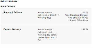
I decided to first start with advertisements as I already had an idea on what I could include. WHSmith has art and craft supplies and I have their sketching pencils, so I'll be able to advertise that and even take a picture of it at home. The pencils are on their website so I'm able to see how much it costs
There's also "Buy 1 Get 1 Half Price WHSmith Artist Materials", which is something else I can advertise. There are delivery options and even free returns on this product as well
Afterwards I wasn't fully sure on what the other advert should be. I looked at Creative Boom again and remembered how they did articles on different artist's books and work, while this is mainly seen in online websites only I thought it might be a good idea to do for my magazine as well. I also looked at a GraffitiArt magazine as I remember they had many adverts, these are mostly about art products and related news such as: art festivals & galleries, art products (spray cans, art toys) and their own previous issues
Some of the websites I've found through research sells books, such as Village and slanted. I also found Rough Trade Books during my free time as well. I went with slanted as those give extra pictures of the book while Village and Rough Trade Books don't. I looked through their books and magazines and decided on their latest issue of Slanted Magazine, issue 39. This is because this issue has the same message as my magazine, in issue 39 they interview different graphic designers in Stockholm and have essays dedicated to art in Sweden
I know I said I wanted to do the other research as early as I could, however I feel like I need to use my time in college wisely as this'll be the only time I'm able to do work on my mock up. I decided I'll have to do the other research points as they come by
I realised I didn't have to do research on how to embed custom fonts onto a PDF because.. That happens automatically. I'm not sure why I didn't realise that earlier. I moved onto doing research for the QR code and found a few websites that were dedicated to it, I haven't tried them out yet as I hadn't started on making the videos yet, but if one of them doesn't work then hopefully one of the other ones do. There is Multimedia QR Code and Scanova. I also found an article on Guiding Tech and another on Data Driven Labs that had more information on how to create a QR code if none of those work
I also decided to do a little research on drypoint printmaking for the video. The first website I looked at was artistsandillustrators, giving a guide on how to do drypoint
Drypoint is a technique where you etch on something (traditionally done on copper plates with a diamond needle), then ink on and clean afterwards. With a printing press the ink can be squeezed on into the paper, the sheer amount of force required to do this can't be done by hand. Two artists that have done this are Whistler and Picasso
There's also a guide on the website on how to do this without a printing press. This includes using a card that is laminated on one side (cereal boxes for example or a drypoint card), a nail and a rolling pin or even a hand-made palm-press to act as the printing press. The first step is to first get the card, drypoint cards are usually in printing shops. It's recommended to use something small for this like in A4 or A5 size. The second step is to transfer the art onto the plate, this can be done by either using tracing paper or even drawing directly on the plate. Breaking the surface is the main goal here, one reminder is that the art will come out in reverse by the end. The next step is more of a recommendation than anything, experimenting with different materials can bring up interesting results. After that you have to scrape the ink into the plate or card being used, then you can get rid of the excess with old newspapers or rags. If you're using one, you have to varnish the mountboard with button polish first though. Then you can finally get onto pressing the plate or card into paper, it's important to work on a nonslip surface while doing this. You first have to soak another paper in water, getting rid of the excess, and then use a clipboard to hold everything in place in this order: non-slip material, plate, damp paper, newspaper and finally a soft, thick fabric (felt is an example). After that you can use a rolling pin or whatever you're using to press it together and then slowly peel back the paper to see your results
While that guide was helpful, it more taught me how I'd do it if I didn't have a printing press and that's something the college has already. I think I mostly understand how it's done regularly though as I can just replace the DIY tools with the actual ones. I looked at a website called Tate to see if I was correct and it was very brief but made me feel confident enough with how I understand drypoint so far
I remembered that the first website I looked at mentioned Picasso being a famous artist who used this technique so I quickly looked into that. On an article in Daily Hampshire Gazette, it gives some examples of his art using this technique. Picasso used an array of different styles while usng drypoint as well, from surrealism to cubism. In a lot of this art he drew his past loves, he often used them as muses for his art. During his time he experimented and worked with many other printers to create his art
Now I feel like I know enough to make my video, I can also ask the person who's in the video what she's doing and note what she's saying down as well just to make sure I've got it right
Artists & Illustrators. (2020) A beginner's guide to drypoint. Available at: https://www.artistsandillustrators.co.uk/how-to/drawing/a-beginners-guide-to-drypoint/. Accessed at: 05.05.22
Canvas. (2022) Art and Culture from Middle East and Arab World. Available at: https://read.canvasonline.com. Accessed at: 05.05.22
Cowan, K. (2022) Rob Ford of FWA talks us through his new book heralding the VIP passes of acid house and rave generations. Available at: https://www.creativeboom.com/features/members-only/. Accessed at: 05.05.22
Edwards, C. (2018) How To Make A QR Code Automatically Open A Video. Available at: https://datadrivenlabs.io/blog/qr-code-open-video-mobile/. Accessed at: 05.05.22
Gautam, G. (2018) Video QR Code Generator: Easier Way to Share Your Videos. Available at: https://scanova.io/blog/blog/2018/07/13/video-qr-code-generator/. Accessed at: 05.05.22
GraffitiArt. (Year unknown) graffiti art issue 50. Available at: https://www.shop-graffitiart.com/en/graffiti-art-50-xml-354-910.html. Accessed at: 05.05.22
Mehvish. (2019) How to Create QR Code for a Video. Available at: https://www.guidingtech.com/create-video-qr-code/. Accessed at: 05.05.22
Multimedia QR Code. (Year unknown) Generate dynamic QR Code. Available at: https://www.multimediaqrcode.com/generator/. Accessed at: 05.05.22
Pefarrer, S. (2017) Picasso the printmaker. Available at: https://www.gazettenet.com/Clark-Museum-unveils-new-summer-exhibits-including-rare-prints-by-Picasso-10517646. Accessed at: 05.05.22
Rough Trade Books. (2022) Rough Trade Books. Available at: https://roughtradebooks.com. Accessed at: 05.05.22
Scanova. (Year unknown) QR Code Generator | Create and Design Dynamic QR Codes. Available at: https://scanova.io/design-qr-code-generator.html. Accessed at: 05.05.22
slanted. (2022) Slanted Magazine #39—Stockholm. Available at: https://www.slanted.de/product/slanted-magazine-39-stockholm/. Accessed at: 05.05.22
Tate. (Year unknown) Drypoint. Available at: https://www.tate.org.uk/art/art-terms/d/drypoint. Accessed at: 05.05.22
Village. (2022) All. Available at: https://villagebooks.co/collections/all. Accessed at: 05.05.22
WHSmith. (2022) WHSmith Sketching Pencils (Pack of 12). Available at: https://www.whsmith.co.uk/products/whsmith-sketching-pencils-pack-of-12/0000024597319.html. Accessed at: 05.05.22


Booking Forms
Mock Up
Daily Diary 05/05
Today I polished my Font Justification and continued on my mock up. I'll have to take the editoral notes picture during the weekend and design my mascot + front cover. I quickly did everything on my research list as well and added research into dry point making since that was what my video was going to be about
I thought I'd have much more time to create this magazine but I only have about 5 days to do it if I come to college every weekday after today. I also have to edit my video as well and I'm not sure when I'm going to get that done. I was told that I could export what I currently had as a mock up since I went into a lot of detail, which was a complete accident. I don't need to come in tomorrow because of it but I'm still concerned about how long it'll take for me to finish designing my magazine
I'm partway through designing and I'm not sure I like the fonts I've chosen still, nor do I really want to use them for every single page. For the generative art page I was planning on doing something more unique than the other pages and I still want to do that but I'm not sure if the fonts currently available will fit, its likely though. I'm also not completely sure on my layout, in the interview with the magazine designer she told me to do a drawing of all my pages and I should've done that before this
I also haven't written my editorial notes yet, this was on purpose. I want to write it at the end of designing the magazine as all editorial notes are written by the end of magazine production
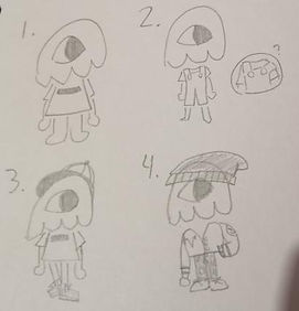
Focus Group (mascot & logo design)
I decided to ask my focus group about my mascot and logo design as I couldn't show them my mock up yet. I drew four designs for my mascot and was already biased towards three and one, but decided to ask anyway. For my logo designs I wasn't too biased towards any of them, I liked the solid colour ones (left) slightly more though
The responses I got were actually quite different from what I expected, they were also very mixed for the mascot design. Everyone agreed that the middle ones were the best one, so I'll try to go with a mix of both moving forward. Onto the mascot designs I liked three the most for the same reasons five did, but overall it seems that the concensus was the fourth design. One also gave me some solid advice I didn't think about, which was that it felt too fashionable. I based the designs off of streetwear as its a style that appeals to my target audience and would fit the tone of the magazine, but it does make the magazine feel more fashion oriented.To compensate, I added two new designs and asked the focus group to tell me what they thought
Going into this I was also a bit biased with B, but One said they liked A better. I might try to find a middle ground between these two designs as I'm a bit worried the outfit will feel too childish if I go completely with design A
With this meeting I now know how I want my mascot and logo to look like, two things I wasn't completely sure on before. It also reminded me that people can have varying opinions, I only showed them the mascot designs on a whim (as I was already confident in what I chose) but I'm glad I did as I now have a mascot that better fits an art magazine rather than a fashion one


Daily Diary 08/05
Today I drew what I wanted my mascot to look like, asked my focus group about my logo and sent the mock up to the magazine designer
Throughout the weekend I tried using the camera and tripod indoors and outdoors, recording and taking photos of others, and I feel confident enough with it to use it outside. It also helps that I've previously brought this camera home before. I was going to take my photo in the back garden as planned, but my family members have convinced me to do it somewhere else instead like at a park. This means I'll have to make a risk assessment and hazard form for wherever it'll be, and I'll be doing his tomorrow
I didn't realise this until it was too late (weekend) but I realised I couldn't open the .indd file I had of my mock up which meant I couldn't show it to the focus group yet. This was a major oversight by me and I'm disappointed in myself for not taking pictures of the pages when I had the chance, as it means this weekend was pretty much wasted. I even noticed this earlier but didn't send the mock up file to the magazine designer as I was worried she wouldn't be able to open it, but I should've tried as now she'll most likely take too long to respond
Throughout this project there has been an awful feedback loop to where I feel very stressed thinking about this project and therefore distract myself from it when I'm at home, leaving the important parts to the last day. Designing the magazine has been the most fun part of this project so far, but everything else about it is very stressful to me. I especially find talking to the focus group difficult as, despite most of them being people I already knew prior, I hate asking people for help and I always feel like I'm bothering them. I am proud of myself for already securing a magazine designer early so I don't need to worry about audience feedback, but there have been so many mistakes I've made throughout the project that its a bit hard to feel proud of anything I've done so far. I will persevere through this and see this project to the end though
Focus Group (mock up)
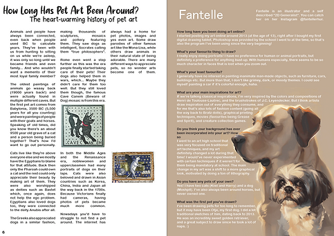
Since I now had pictures of it, I could show a few mock up pages to my focus group and to Emily Zullo. Currently only the focus group has responded so I'll be focusing on their reactions. I showed them these pages
Both said they really liked it. I said that the empty space on the first page was on purpose, so that ruled one criticism out. Both one and two said that I should space out the text wrap between the dog art in Fantelle's page, which I can do. When presenting the pages I said that I would most likely change the art in Abbsterism's page which is why two mentioned that they already liked it. I'll try out both and possibly show them the layout I'm planning to do with the new art to see which one they'd like better


Daily Diary 09/05
Today I took my photo and came into the college for an hour to do work. I wasn't able to do much unfortunately but I was able to work on the table of contents page. I also sent some of the mock up pages to the focus group and Emily Zullo. I haven't gotten a response from emailing Alexander either so I will have to meet them in person again, which should be simple as last time we met it was on a Tuesday at 1pm which is the same time I'm going to the college
I'm not sure if I'm happy with the picture I took, I might try to retake it before 1pm tomorrow as that's when I'll have to give the camera and tripod back. The main problem is that the photos taken of me weren't portraits like I wanted, they're all wide shots
I've been feeling a bit creatively burnt out over the layouts of the pages, I made sketches of what I want the pages to look like to help me a bit with that. I specifically focused on the pages I was unsure about as there were a few pages I knew about already. This was something that was recommended to me and with the layout guide sheet the magazine designer gave me I was able to do decent designs. I also drew two ideas for what the front cover should be, although the first one didn't come out how I wanted. I downloaded some more fonts that might inspire me more today as well

Bibliography
Artists & Illustrators. (2020) A beginner's guide to drypoint. Available at: https://www.artistsandillustrators.co.uk/how-to/drawing/a-beginners-guide-to-drypoint/. Accessed at: 05.05.22
Canvas. (2022) Art and Culture from Middle East and Arab World. Available at: https://read.canvasonline.com. Accessed at: 05.05.22
Cowan, K. (2022) Rob Ford of FWA talks us through his new book heralding the VIP passes of acid house and rave generations. Available at: https://www.creativeboom.com/features/members-only/. Accessed at: 05.05.22
Design Like a Pro. (2017) Let's Create a 3 Page Magazine Spread in InDesign. [Online Video.] Available at: https://www.youtube.com/watch?v=bjD4zhAvF7s. Accessed at: 28.04.22
Dolores, D. (2021) The 10 golden rules of magazine cover design. Available at: https://blog.flipsnack.com/how-to-design-professional-magazine-covers/. Accessed at: 30.04.22
Edwards, C. (2018) How To Make A QR Code Automatically Open A Video. Available at: https://datadrivenlabs.io/blog/qr-code-open-video-mobile/. Accessed at: 05.05.22
Gautam, G. (2018) Video QR Code Generator: Easier Way to Share Your Videos. Available at: https://scanova.io/blog/blog/2018/07/13/video-qr-code-generator/. Accessed at: 05.05.22
GraffitiArt. (Year unknown) graffiti art issue 50. Available at: https://www.shop-graffitiart.com/en/graffiti-art-50-xml-354-910.html. Accessed at: 05.05.22
Mehvish. (2019) How to Create QR Code for a Video. Available at: https://www.guidingtech.com/create-video-qr-code/. Accessed at: 05.05.22
Multimedia QR Code. (Year unknown) Generate dynamic QR Code. Available at: https://www.multimediaqrcode.com/generator/. Accessed at: 05.05.22
Pefarrer, S. (2017) Picasso the printmaker. Available at: https://www.gazettenet.com/Clark-Museum-unveils-new-summer-exhibits-including-rare-prints-by-Picasso-10517646. Accessed at: 05.05.22
Rough Trade Books. (2022) Rough Trade Books. Available at: https://roughtradebooks.com. Accessed at: 05.05.22
Satori Graphics. (2017) MAGAZINE LAYOUT IN ADOBE INDESIGN TUTORIAL - PHOTOSHOP & INDESIGN - Adobe InDesign Tutorial. [Online Video.] Available at: https://www.youtube.com/watch?v=xXKAhmT9GxU. Accessed at: 14.04.22
Scanova. (Year unknown) QR Code Generator | Create and Design Dynamic QR Codes. Available at: https://scanova.io/design-qr-code-generator.html. Accessed at: 05.05.22
slanted. (2022) Slanted Magazine #39—Stockholm. Available at: https://www.slanted.de/product/slanted-magazine-39-stockholm/. Accessed at: 05.05.22
Tate. (Year unknown) Drypoint. Available at: https://www.tate.org.uk/art/art-terms/d/drypoint. Accessed at: 05.05.22
Village. (2022) All. Available at: https://villagebooks.co/collections/all. Accessed at: 05.05.22
WHSmith. (2022) WHSmith Sketching Pencils (Pack of 12). Available at: https://www.whsmith.co.uk/products/whsmith-sketching-pencils-pack-of-12/0000024597319.html. Accessed at: 05.05.22