
Initial Ideas
I knew what I wanted to do for FMP ever since the start of the previous unit. I originally wanted to do an interactive magazine about art and how a person's background can influence the art they create, but now I want to include all creative mediums instead of just art (like music, photography, animation, ect.). The brand name I had was called "I, For Art" but since my magazine isn't just focused on art anymore I'm not sure if I can still go with it. I still might be able to though and make it so that the magazine I'm doing is a special issue of it, celebrating different types of art and trying to broaden what the word "art" even means
Mind Map

I made a mind map to better illustrate my ideas since I work best when my ideas are written down and I can properly read it all. In my mind map I went over three important points: my role in the previous units and what I had to do for it, what I learned from the unit and the emotions I currently felt over them. The units have a score out of 5 in what I was most interested in doing to what I knew I didn't want to do for my FMP, the more stars a unit had the more interested I was in doing it. Since I was already set on doing an interactive magazine, I didn't want to focus too much on the other units other than what I could add from them (like possibly adding an interview video like the one I had to do for professional practice). Doing all of this made me realise how fast the year has already went
On the bottom right I decided to write down everything I could think of that I would need to sort out for my magazine, such as a target audience for my magazine, why I would have to contact different people, what tone I would write my articles in and ect. These are not everything that I have to consider while moving forward and only everything I could think of at the time
Initial Research
This is just a small bit of the research I have to do for the magazine, but the main three points I want to do research on are how many pages a magazine like this typically has, if a market for this type of magazine even exists and how to self-brand. I want to do research on how many pages interactive magazines has since I currently don't know, I also don't know what the layout of them are (how many adverts are in there and how many are placed in between pages, how many articles these types of magazines have). I'm not sure how many magazines there are out there that cover all creative mediums either or if that would be something people would want to see, I may have to ask a few people if they would be interested in that later on. Since I'm doing a self made brand I'd also have to do research into how magazines brand themselves and think of a title, logo and colour scheme
- how many pages does an interactive magazine typically have? conduct market research into the content of the bestselling interactive magazines in relation to page numbers, the number of articles, adverts etc.
- is there a place in the market for a ‘creative magazine’- look at existing interactive magazines in relation topic to help decide on focus for own magazine
- how to self-brand- how to create a new brand- logo, name, colour schemes etc.
Research
The first thing I wanted to do research on was if there were any other creative magazines like this, since if there aren't any then I would have to change what the magazine is about or focus on just one creative medium. While looking I found a website called Creative Boom that focuses on multiple different mediums such as illustration, photography, graphic design and publishing. The website itself is meant to be like a magazine and they have a newsletter for anyone who signs up for it. They also do podcasts and interviews
Scrolling at the bottom of the website's page it states that "Creative Boom celebrates, inspires and supports the creative community". The articles on their website help artists by promoting their work, talking about the creative industry, spreading awareness of their campaigns and write tips to anyone who wants to be in the industry. They have many interviews on their site with famous illustrators and they do these interviews every week. Their podcasts are also similar with the founding editor of the website talking with artists and designers about their life as a creator and giving tips and insight along the way. While looking at their podcasts I noticed there's one about building an online brand which may be useful later for when I have to do research into creating my own self brand
I decided to move on and look at Creative Review, a website similar to the previous one. The website focuses mainly on art and illustration, but also talks about photography, film, advertising and fashion. There's a dedicated page for the websites magazines and newspapers, you have to have a subscription to the website to read them all though. On the websites about, it says that the website has brought "the creative community together since 1980"
I didn't find much else on the website so I looked at a few different sources. I found Wallpaper*, a website about multiple different subjects (art, design, entertainment, beauty, fashion, technology and architecture to name a few). They also host their own magazine on the website called Global Interiors, it focuses on interior design
Communication Arts is a website that hosts its own magazines about five different topics: design, illustrations, photography, advertising and typography. These magazines only focus on one of those topics instead of having a general magazine that includes all of them. There is also their interactive annual magazine, showcasing students award-winning portfolios. These magazines can be purchased and then read online or be printed as a PDF
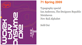
Eye Magazine is a printed magazine that, like Communication Arts, creates magazines that focus on one specific topic. Eye usually only focuses on graphic design, but they also have special issues about different subjects like typography, illustrations and photography
Looking at all of these online magazine websites shows that magazines can focus on other things than just art and design, but that the magazines themselves often only focus on one topic. Creative Boom doing interviews and podcasts interests me as I was considering having an interview as a short video in my magazine. If I do include it then I'll either read the interviews or listen to one of their podcasts so I know what questions to ask later. While Wallpaper* has a magazine that's focused on something different from what I'm doing, on it's website it has a diverse range of subjects that their articles talk about. One thing I noticed though is that these magazines don't talk about music, which was the reason why I was going to focus on multiple different creative industries in the first place. Doing this research has made me reconsider talking about the creative industry and instead focus on one or two different topics in my magazine since that's what the magazines I've looked at do. This was what I wanted to do in my initial ideas (art and graphic design) before I changed it while making my mind map anyway
I felt like I looked at enough magazines to make my choice, so I focused on researching how many pages I should have. While I know the general idea of what my magazine will be about, I'm not sure how many pages it'll take and I worry that I need at least another subject to talk about in it
The first website I looked at was Village, this is a website you can buy books and magazines from. The website has products that cover different topics such as photography, design, food, fashion and art to name a few. I looked at their selection of magazines focused on design to see how many pages they have
This issue of Canvas is about something similar to what my magazine will be, looking at how artists can use their own different stories to create their art and express their opinions on issues that affect others. This issue has 172 pages and 20 different topics. I went on the magazines own website to look at some of the previews, in the magazines table of contents it shows what all of those pages are used for
There are multiple reviews, interviews and tributes in the magazine. In conversation seems to be similar to an interview but more casual and conversational. Before the table of contents there's also a one page bibliography
I looked at another magazine called TYPEONE next since I thought about adding typography into my magazine. This has 148 pages and is purely about typography and fonts. Going to their website, I had access to some of the previews in the magazine. The magazine is mostly a showcase of fonts, but it displays them in bold and different ways
I then looked at another art magazine on a different website, this one being Graffiti Art. I looked at Issue 56
While I'm not sure how many pages this magazine has exactly, it at least has over 128 looking at its table of contents page and 18 different articles. The contents are: news, books, opinions, comics & graffiti, agenda and talents with multiple different artists. This magazine is also written in multiple different languages, which may explain why there's a bit more pages in this one than the rest. There's an advert on the first page and the page next to the table of contents. There's also an advert after the first subject is finished, afterwards the subject changes. This is what happens throughout the entire issue
As seen above, these magazines usually have 100 pages or more. The first two pages are from Graffiti Art and the other two are from Canvas. There are some pages that are double spread, but most fill up an entire page with words more than art and photography itself. This isn't always the case though as seen in the 2nd Canvas page, sometimes there's an equal ratio between the two. A single page is used to display pieces of art or even one large piece (seen in the 2nd Graffiti Art page). Small text is used for the paragraphs as they need to be that small to get all of it in the page, the font is also simple so it's readable. The header's font can be changed from page to page (1st Canvas page) and is often in full caps to catch the readers attention. Pages are numbered in any corner
Having over 100 pages is obviously isn't possible for my magazine, but it tells me that these types of magazines normally have many pages. These pages are often filled with lengthy articles, but there's also some pages that have art and nothing else. I was planning to add interviews in my magazine regardless, but looking at the table of contents in these magazines made me realise I have to have more subjects as well. My magazine will have to be similar so later on I'll have to do research into what to talk about. Canvas has 8 interviews while Graffiti Art has 6, so I should have about 6-8 interviews in mine
.
While doing research into different magazines, I came across one called GRAPHIC. GRAPHIC is a magazine that's made in Korea, but for most of their issues there is an English translation. Most GRAPHIC magazines focus on one singular theme and feature different artists with that theme. For example Issue #35 is about book designs. The magazine has interviews with 11 designers and studios that work in designing books, showcasing some of their work within the magazine. This issue in particular is part of "The Book Trilogy" GRAPHIC did
I wanted to do a short section on this magazine as I really liked it and it gave me an idea I could do for my magazine, I could have it be specifically about one theme and get artists and designers to make art or design for that theme. The way GRAPHIC does it doesn't stray away from that theme and only has around 12-13 pages for each issue because of that. I'm not sure if I'll be as one-note as GRAPHIC is, but I'll keep their simplicity in mind
The last point in my research list is doing research on self-branding. I decided now was when I'd listen to the Creative Boom podcast from earlier on. The podcast was an interview with a popular content creator, but they didn't talk about self-branding as much as the podcast title suggested. Because of that I didn't learn much from it
While listening to the podcast, I looked at a Forbes article about personal branding. The first tip it gave is to have focus, keeping a single message for a target audience. It sites a quote from Adam Smiley Poswolsky, “Carve a niche, and then carve a niche within your niche. The best personal brands are very specific.” The next tip is to be genuine and to tell a story. Making a narrative for your brand will interest others, an example is Allen Gannett who often talks with others and his audience. The website recommends making a video or doing written content to make personal connections with others. A tip similar to having a focus in your brand is to be consistent. Fyiona Yong, a millennial leader coach, says that there has to be consistency within your communication and appearance as small inconsistencies can ruin a brand. A storyteller on Snapchat, CyreneQ, recommends having something consistent in your brand like a catchphrase or a mascot. The next tip is to be ready for failure and to not be ready for perfection. Another tip is to "live your brand", to create your brand to be part of your personal life already. The last two tips is to let other people "tell your story" and leave a legacy behind once you do have a personal brand
The next website I looked at was an article specifically about personal brands with magazines, interviewing Robyn Gipters who worked in magazine publishing. When talking about making a magazine, the first thing to think about is the target audience. While the appearance of the magazine definitely matters, the articles and appearance are dependent on who's the main demographic. It also mentions that being a local business that has a magazine is good, since you can get "local celebrities" to boost your work. It also recommends not having too many pages in the magazine as it can cause the reader to start flicking through pages and not pay attention to the content of the articles. The article says that 28-32 pages isn't as much content as it sounds though, the first page is usually an advert, there's the table of contents afterward, a contributors page and a message from the editor. There is also the articles from the contributors, adverts for their events or anyone else in the industry, a list of upcoming events happening in the industry or community and then an advert at the back. The final thing it recommends is using a website called issuu.com to publish the magazine when it's done
I then looked at a book called Platform, written by Cynthia Johnson. Personal branding is talked about more generally in this book. It goes on about how strategies are important when making a brand and how they can redefine you. Having a personal message is important as well. The book sites four important factors when making a brand: personal proof, social proof, recognition and association. It also says that personal branding is about making humans more authentic and sharing your own voice. Not putting much emphasis on logos or stereotypes to instead have control your own image and reputation
It defines personal branding as "self-awareness and preservation". A tip is to not force your brand to constantly copy the latest trends and to instead be authentic. The book then talks about knowing what your audience would think and feel about your product, who'd they learn about it from and what they would already be passionate about. Instead of thinking about yourself the book says to think for yourself instead, as its more about the people you're trying to influence. This is why brands try to use third party authorities to confirm their status, more people will believe you are something good if a trusted brand says you are
I then wanted to look at logos as that's a part of personal branding, I found a book called Magazine Editing by John Morrish and Paul Bradshaw. When talking about the cover, it more focuses on where it is on the page and why it is. The book does this as the logo "is really not part of the cover discussion" and that it usually stays the same for each issue; this is so the magazine is recognisable on shelves. There are times where the logo moves but those exceptions are seen as the brand having extreme confidence to do so. There are times where the logo is used for other merchandise such as stationary or advertising, so there are times where the design has to compensate to fit all of those as well. Slogans are seen as a good idea as long as they aren't extremely tacky. Barcodes have specific limitations because of their size and colour
Covers have to be bold and interesting from a faraway distance because that's how it'll look on the shelves. The book recommends to stick to one medium when making cover art for a brand (illustration, photography, ect.) and to use the same typography for the same reasons, to be memorable to readers. Its also important to not lean into this too hard though, otherwise audiences won't know if it's a new issue without reading the date. Cover lines are also important because they're what can possibly get the audience to read the magazine, they have to tell what is going to be in the magazine
After this point I decided to read something else as the book was going into managing production, a different topic entirely. I wanted to look at the actual logo itself next, so I looked at Logo Design Love. This book is subtitled as a guide to create an iconic brand. The book goes over famous brand logos and dissects why they're so popular
One of the examples given is Kellogg’s, the logo is handwritten to differentiate from other cereal brands and to add a more genuine and trustworthy feel to the brand. Another example given is the Royal Parks, this logo uses leaves to symbolise the trees in the park and "tells the story of the parks" by doing so. A different example is FedEx, the logo is very simple but also timeless because of that. The simplicity also makes the logo easier to remember. Logos have to be understandable despite the language as well, this is why brands many use symbols
The first article talked about having something recognisable and consistent, one of the examples being a mascot. While I haven't really seen mascots in art magazines, I think having a mascot for mine would be fun and make my magazine stand out more from the rest. Another thing it talks about is to carve a niche and then carve another niche. I'm only doing this magazine once and never again, but I agree with what its trying to say and will try to keep it in mind while making my magazine
The second article saying that too many pages would bore the audience was interesting as all the art magazines I looked at previously (other than GRAPHIC) all had over 100 pages. I wasn't planning on having that many pages regardless but from what I could tell the more pages an art magazine had the better. Because of this research I may decide to have less pages, possibly around 30 or so as that was the medium number of 28-32 (the page count suggested by the article). Graffiti World had a similar layout to the one the article described as well, which suggests that format may also be the same for art magazines still
A similarity in the book Platform and the first article is that they both encourage to make your brand be an extension of yourself rather than whatever other people want, to be genuine. The book emphasises that you must be knowledgeable about your target audience and therefore know how to cater to them. Everything I've researched has stated this multiple times as well, so when making any decisions about the magazine I will keep my target audience in mind (once I've decided who that is first of course..)
While reading Magazine Editing I realised this wouldn't help me as much purely because I don't plan on selling these, it wouldn't feel right since the book mostly focuses on artists and their personal works. Because I'm not selling these many of the tips don't really work for what I'm doing, for example my magazine won't be on store shelves so I don't need to prioritise cover lines so much. Additionally I haven't seen cover lines on art magazine covers so it might not even apply to the magazine I'm making. While this does give me more leeway to make a cover different from the usual, I will still use these tips to follow the formula of what professional magazines do so my magazine follows industry standard
I was a little disappointed after reading Logo Design Love since the book doesn't specifically talk about magazine logos, which was what I was aiming to learn about. It gave tips on designing a logo though which was still one of the main things I wanted from it
Airey, D. (2009) Logo Design Love. [Ebook] Pearson Education. Accessed at: 28.03.22
Calameo. (Year unknown) Graffiti Art 56 - Extrait. Available at: https://en.calameo.com/read/00546737179bde40f5ec8?authid=g4rkEUgWh0V2. Accessed at: 24.03.22
Canvas. (2022) Canvas – Art and Culture from Middle East and Arab World. Available at: https://read.canvasonline.com. Accessed at: 24.03.22
Chan, G. (2018) 10 Golden Rules Of Personal Branding. Available at: https://www.forbes.com/sites/goldiechan/2018/11/08/10-golden-rules-personal-branding/?sh=6cacdefb58a7. Accessed at: 24.03.22
Clemett, L. (Year unknown) Marketing Your Personal Brand With Your Own Magazine. Available at: https://theaudaciousagency.com/marketing-your-personal-brand-with-your-own-magazine/. Accessed at: 24.03.22
Communication Arts. (2022) Magazine | Communication Arts. Available at: https://www.commarts.com/magazines. Accessed at: 24.03.22
Creative Boom. (2022) Art & Design Magazine for the Creative Industries | Creative Boom. Available at: https://www.creativeboom.com. Accessed at: 23.03.22
Creative Boom. (2021) Amanda Rach Lee on doodling, building an online brand and coping with millions of followers. Available at: https://www.creativeboom.com/podcast/amanda-rach-lee/. Accessed at: 24.03.22
Creative Review. (2022) Sector: Magazine / Newspaper. Available at: https://www.creativereview.co.uk/sectors/magazine-newspaper. Accessed at: 24.03.22
Douglas, S. (2022) Introducing the April 2022 Global Interiors Issue of Wallpaper*. Available at: https://www.wallpaper.com/design/april-2022-issue-read-more. Accessed at: 24.03.22
Eye. (2022) Back Issues. Available at: https://eyemagazine.escosubs.co.uk/back-issues.htm. Accessed at: 24.03.22
GraffitiArt. (2021) Graffiti Art 56. Available at: https://www.shop-graffitiart.com/en/graffiti-art-issue-56-xml-354-918.html. Accessed at: 24.03.22
GRAPHIC. (Year unknown) HOME : GRAPHIC. Available at: graphicmag.kr. Accessed at: 24.03.22
Johnson, C. (2019) Platform. [Ebook] Clarkson Potter/Ten Speed. Accessed at: 24.03.22
Morrish, J. and Bradshaw, P. (2012) Magazine Editing. [Ebook] Taylor & Francis. Accessed at: 24.03.22
Rand, P. (2017) Design, Form, and Chaos. [Ebook] Yale University Press. Accessed at: 28.03.22
TYPEONE. (2022) TYPEONE Magazine — Issue 01. Available at: https://type-01.com/product/typeone-magazine-issue-01. Accessed at: 24.03.22
Village. (2022) Design Magazines | Village. Leed, UK. Available at: https://villagebooks.co/collections/magazines/Design. Accessed at: 24.03.22
Wallpaper*. (2022) Wallpaper*: design, interiors, architecture, fashion, art. Available at: https://www.wallpaper.com. Accessed at: 24.03.22


Daily Diary 23/03
Today I had to listen to the FMP brief, create a mind map on my previous units, discuss my initial ideas for my FMP and about the mind map and create a research list that'll help me when I have to do my pitch later on
As said already I knew what I would be doing for my FMP for awhile and what my interactive magazine would be about. I was aware that since this would be such a big project and would take awhile that I had to pick something I was passionate about otherwise I wouldn't feel motivated to work on it, this is why I chose to focus on the creative industry for my magazine. I've mentioned it in previous diary entries but I love art and graphic design, while I'm not sure I would ever be an artist or graphic designer myself I do enjoy seeing other peoples creations. I also like music so I wanted to include it as well, this is how my original plan of only talking about art and graphic design in my interactive magazine turned into me talking about all creative industries. Although when I went home to think about it later I thought that maybe it'd be better if I just focused on art and graphic design again and possibly removing the interactive elements so it could be printable. I want to do research on magazines like Creative Boom anyway just incase I stick with the idea
Daily Diary 24/03
Today I continued working on my initial research. Later on when I figure out my target audience I plan to create a concept for the mascot of my magazine, since I decided earlier that it would be fun to have one. I also still need to contact artists and designers to interview
Doing research on these different magazines has made me reconsider my magazine being about the whole creative industry, I might go back to only focusing on art, design and possibly add typography. Typography is one of the niches I'm most interested in when it comes to designs, so I thought it'd be a good fit for me to add to my own magazine. I'm also starting to think I should make it printable instead of an interactive magazine, something about being able to read the magazine in my own hands makes me happy. I did research on magazines that are both printable and readable online, since this is something many professional magazines do I should be able to do both as well. While looking at how many pages these magazines normally have I realised I would have to write a lot more than I did in my previous magazine, which is fine by me. While reading Magazine Editing, I thought about how the cover art for my magazine could have the logo incorporated into the art. I think it'd be a nice way of putting the logo on the front cover without disrupting the cover art, but I worry that if that happens then it'll be hard to distinguish what's part of the art and what's the logo so It'd have to be obvious
I still have a few things I need to figure out such as the target audience for my magazine, all the research I did heavily emphasised that the target audience of the magazine is very important. While doing research I also found two websites that really interested me, GRAPHIC and IDNworld. This is more for personal interest than for helping me with my magazine though
Daily Diary 27/03
Today I contacted an artist about being in my magazine, I wasn't able to do much else as today was my brothers birthday and we went out tonight
In my previous entry I talked about doing concepts for a mascot, but I'm already set on what I wanted to do. I wanted the logo to have an eye symbol and going back to the "I, For Art" theme. I'll probably use a different title for my magazine since that current title feels too pretentious and formal, which isn't what I want to go with for my magazine. Looking at my research tells me how many interviews I should have in the magazine. 6-7 shouldn't be too difficult to find (especially since I do have a few friends who are in the art industry) so I'm not too worried about getting them, I'm more worried about them not responding. It's definitely possible if I contact them too late which is why I'm trying to contact artists now before then, since that's what happened with my audience feedback for the last unit
Daily Diary 28/03
Today I finished my initial research. I was also able to talk to two of my friends about being in the magazine and they agreed! So that's at least 2 people down and 6 more to go. I hope to get professionals as well, but having some people who also do art for fun sounded nice to include too. There is a difference between making art for a living and having it as a hobby after all
While doing research I realised I didn't really have a USP yet. This is a little concerning seeing how a lot of my research talked about having a clear focus for self-branding being important, but I think not knowing right now isn't too bad since it's still very early into my FMP (although this might bite me later when I have to do my pitch..). I've decided on what the target audience should be though, I'm mainly aiming for young people and teenagers (and explorers) since I feel the most confident knowing what they would want. I won't lie and say I'm not also doing this because with this magazine I'm trying to appeal to myself and do things I want though. I feel that if I didn't do this I would have a much harder time being interested in what I'm doing
About what I said about adding typography to the magazine earlier, I don't think I'll be able to do so because it doesn't really fit the magazines theme (how does your background inspire you as an artist) but it still might be possible? I'll have to come back to it. Today is also the start of Autism Acceptance Week, so I'll try to be more active in finding artists and graphic designers. I'll try to get around 8 total since my research showed thats the usual amount and I hope to get an even ratio of them, but I'll most likely get more artists than designers purely because I know more artists
Now that I think about it maybe the USP is uplifting artists voices. Talking about lesser known/represented artists and spreading awareness about different causes and how to help others. I chose to talk about artists backgrounds for a reason, from personal experience I know it can inspire what you create. For example I draw a lot of black characters because I'm black. Maybe I can be one of the artists interviewed..... (I'm joking of course, a section of me talking about my experiences is plausible though)
Daily Diary 29/03
Today I had to fill in my project proposal sheet and detail my schedule for the upcoming weeks
I spent a very long time doing my schedule but I think it was worth it as I was able to correct a lot of mistakes I did in the first attempt (I knew I had to do a pitch but I didn’t know when so I didn’t put it in the schedule before). By doing this I definitely improved in my time management skills and I’m confident in how it is now, I’m a little worried I piled up too much work for me to do though since a lot of this is going to be working from home and my laptops keyboard is honestly really bad
While doing my schedule I had the idea to possibly interview someone who is in the art magazine industry but I’m not sure how that would work with the questions I’m interviewing the other artists and designers, so maybe they can just help me from behind the scenes. I decided to stick with doing a printable magazine instead of an interactive one which meant I couldn’t incorporate the podcast-like video I wanted to in my magazine. While this is a bit disappointing because I wanted to reference the work I did for my radio production unit, I think the presenter style will show up in a different way as I’m the one who’s going to be interviewing the others
Project Proposal
Daily Diary 30/03
Today I had to finish my project proposal sheet, the deadline for it is still tomorrow though
I had to do more detail on my audience feedback (I now have a focus group to source and a questionnaire to distribute), which meant I had to add more in my schedule. I also have a lot more topics to do research on because of the feedback I got from my one to one session. When I first made my schedule I decided on having thirty pages but after finishing my schedule and seeing that I'd only have two weeks (aka four days) to finish my magazine I realised that was way too much. I originally got thirty as I was planning to interview eight artists with their own double page spread for each one, doing six articles also with their own double page spreads and simply because I counted wrong. I stuck with twelve as I knew it'd be doable (still difficult in that timeframe but possible) and because with my one to one session I was given the idea to structure the articles to be related to the people I'd interview, so they'd be able to be side by side without one feeling misplaced
I also decided because the artists and designers I was going to interview turned from eight to only six that it'd be best if I tried to find only professionals on this, or at least people who do art/design regularly as a job. I'd only want one person who only does art for fun if anything which is why I'm deciding not to interview the two people I was planning on earlier before. Speaking of, I found four other people I can ask instead. Tyler and Ronin Creative (run by someone who has spina bifida) are both graphic designers as their job, Scoliwings is a deaf cartoonist and unsocialzombies is someone who does art as a hobby but is incredibly open to talk about his disabilities and neurodivergencies. Ronin Creative and Scoliwings both have their own contact us pages on their websites so I used that, for Tyler I emailed him. There's no way to contact unsocialzombies without friending them on their accounts, so I had to do that first. I plan on getting a Creative Boom writer to interview in the pre-production stage later on
Research List
week 2/3:
- topics to discuss in articles (related to each artist) [6/6]
- look at how magazines are designed in general and the tone used (cover art, editors note & informal/formal)
- distribute questionnaire about what my target audience would want to see from an art magazine brand (75 responses)
- find art magazine writer to interview for writing help
- find more artists/designers to interview for magazine [6/6]
week 3:
- research interview techniques
- research how to make effective headlines/sub headings
- colour meanings for logo
- focus more on brand identity (title of magazine, aesthetic and design of magazine)
- do the interview with the magazine writer
week 4:
- photography techniques for magazine
- law & ethics (defamation and copywrite)
- photoshop & indesign research
- analyse questionnaire responses if not already done
all research must be done by 19th april
Research
I put researching about the article topics first as I knew it'd take the longest, but I planned to make them something relating to each artist and I can't do that if I don't have all the artists yet. I decided to look at how magazines are designed instead as I also planned to do research on that this week. I looked at an article about the top 10(+1) best contemporary art magazines to find a magazine to start with
The first magazine I was able to preview was Contemporary Lynx, I decided to look at Issue 1 (9) 2018. Contemporary Lynx is a publisher who does both online and print magazines. I'm only able to preview a few images but I was able to look at how the magazine was designed
The magazine uses art by visual artist Marta Antoniak in it's front cover and it takes up the majority of the cover. The title of the cover is to the left (most likely to showcase more of the art) and is inside a box so that it stands out from the cover art. There's also a small banner off to the left to make the box's colour feel less sudden and obtrusive. The font used is bold and readable but also has a visual flair (the L and N in LYNX) so that it isn't boring. Below the title is the issue number (The Art Magazine Issue 1(9)2018) in a smaller font. The cover is very simple but the cover art makes it much more visually interesting and feel slightly cluttered
The pages themselves are very simple as well. The magazine uses double pages to its advantage, using one page to showcase the artists or photographers work and the other page for the article. When images are used, beside them vertically is credit to where the photo came from (such as a book) and who took it. There is a lot of text in art magazines, but by doing the layout this way the reader doesn't feel as overwhelmed and people are easily able to skip the text and only look at the pictures if they want to
The other page can be laid out differently as seen in the four double page spread examples, two of them are the same while the other two look completely different. "Not So Innocent Game" (page 70) has more text as it's an essay but is still presented in a way that isn't too overwhelming (the authors name is between the paragraphs written and the paragraphs themselves fill a small space which makes it look like there's slightly less to read). The page also uses the same font as the Mariusz Tarkawian page but is bigger and has an almost equally big sub heading. The page number is also above all the text in the middle instead of at the corner like all the other pages. "Mariusz Tarkawian" (page 50) is also similar to that page but is still visually different. The title is much closer to the top than before and below it is a disclaimer that this art was made exclusively for this magazine alone. The page uses its paragraphs in a similar way that the previously talked about page does, taking up smaller space on the page and looking smaller to read because of it. It has a lot more space than the other pages do, possibly because the art used on the other side is so complicated already
The "Gilbert & George" and "Martin Parr" pages have the same layout. The title below the paragraph of text is in a different font from the other two pages analysed and seems to also be slightly bigger. Despite the layouts being so different, the font used ties both the "Not So Innocent Game" and "Mariusz Tarkawian" pages together and the layout being the exact same for the other two pages show that this is a layout that (while different from the other two) likely appears a lot in the magazine. The simplicity of all the layouts also ties the design together
The actual text in the magazine is formal and direct. The "Gilbert & George" page uses words such as "regard", "occasion" and "response". The "Martin Parr" page is also similar with it's formality, beginning with an almost story-like paragraph about the mundane parts of life and people-watching. The pages then go into detail about the people and their life, Martin Parr's photography and what he's best known for and Gilbert & George's dedication to art. Both pages are introducing the person before we're able to read what they had to say (Gilbert & George answered questions the writer asked them and they also had an interview with Martin Parr)
The next magazine I decided to look at was Hi-Fructose, I found the magazine the same way I found Contemporary Lynx. Hi-Fructose is a magazine run by two artists who showcase other smaller artists
The front cover's art is by Hattie Stewart and the art is called "Violently Happy". The cover is very bright and eye-catching and quickly makes the reader draw its attention to it. The title is big and bold at the top like most magazines have their titles, the magazines tagline and issue number ("The New Contemporary Art Magazine Vol. 56") is also above the title to not cover the art. The title and tagline also use white to stand out against the page as there isn't that much white in the cover art
Majority of the pages themselves are just art. Because of this the pages that do have text stand out a lot in this magazine and even then the art takes up most of the double pages still (the second double spread is an example of this). The layouts also aren't consistent either, using different layouts for each different topic. The second double spread title seems to be specific to the art its accompanying as it uses leaves similarly to it. The website's preview unfortunately makes the text hard to read so I'm not completely sure if they're interviews or just about the artist, but they're at least about other people
The first double page spread is used to show the article and one of Stockard's pieces, which is something Contemporary Lynx also does and seems common within art magazines as Graffiti Art (an art magazine I previously looked at for my initial research) also does this. The second double page has less text than the first one does and is more stylised. There are two different colours for the container to differentiate between the title and the rest of the article
I didn't really have much else to discuss about Hi-Fructose so I decided to move on. The last magazine I will look at from the Top 10 list is Apollo Magazine. The magazine is the longest running art magazine in the world (founded in 1925) and focuses on what's currently happening in the art industry and also antiques. I decided to look at the latest issue, April 2022
The cover seems to be an edited collage rather than actual art, which would be the first time an art magazine I've seen doesn't use an illustration for the cover (there is one for the Communication Arts photography issue but that obviously doesn't count). It also has a different layout than the others, having cover lines at the bottom while the others don't have one at all. The image doesn't take up the whole screen either which is another thing all the other covers had other than Graffiti Art having the masterhead above the cover art. The font used for the APOLLO title is skinnier than what's usually used for titles, but stands out more for being stylised (the A, the O being a perfect circle and the L being slightly pointed). Below the title is the magazines tagline ("The International Art Magazine") and above it is the issues release date and how much it costs ("April 2022 £7.95"). One of the cover lines are bigger than the others, this one being the main cover line. This one is also in the middle to draw the audience's attention to it quicker. Orange isn't usually a colour that's used for text, but it stands out against the monochrome picture and white background
The magazine itself uses double spread pages the same way the other magazines I've looked at do, but like Hi-Fructose it uses double page spreads to showcase only art. It uses it in a subversive way however, making the entire double spread an art piece and then describing it in small text at the bottom (as seen in the first double page spread). This showcases the art but also allows the reader to know who did the piece and get more insight into how it was made. The page number also aren't in these pages. The other pages are similar to how the "Mariusz Tarkawian" page in Contemporary Lynx was, but in Apollo it's more out of necessity rather than visual flair. The paragraph lengths and text are smaller because there is so much of it and they have to fit it all on the page. The category is on the top left ( "Books", "Architecture" and "Entertainment") but the font and size seem to be able to change and sometimes it's uppercase and other times it's capitalised normally. The font and size of the headings and subheadings seem to also be that way and the first letter of the architecture article is highlighted unlike the others, but there are other pages that are formatted the same ("Social whirls" and "Lord of the wings") so there is a bit of consistency. Other than the headings these pages are formatted pretty similarly
I can't read the articles as they're too small, but I am able to read the tone used in the "Hunger Games" double spread. The tone of the description is also formal like Contemporary Lynx, describing the art piece as a "sophisticated palette one would expect from a Victorian painting". Speaking of, the double page spread is there for the same reason the "Gilbert & George" and "Martin Parr" pages were used for (and also for the pages in Canvas) which heavily implies that it's common practice to have a page introducing the person being interviewed before actually reading the interview itself
However at this point I noticed that I still wasn't able to look at an editors note, which was something I wanted to specifically do. This part isn't specific to just art magazines since many magazines have an editors notes, so I decided to look at a list of free graphic design magazines and found Graphic Design USA. This is technically from the publisher and not an editors note, but it is in the same place as the editors notes would be. The entire magazine is available to read for free
The editors note first features a quote from a comedian that "sums up this edition of GDUSA". The next paragraphs go into how the magazine uplifts rising graphic designers and how this is the first magazine of the year. It details how the pandemic has affected designers and their work as a result and how people still are trying to persevere during it. Afterwards it promotes the magazine again as something to uplift others, citing a quote about how the rest of 2022 will go
The layout of the page is very simple, almost being laid out like a forum post. The "Letter From The Publisher" text is at the top left corner like most categories are but it also has the "We Get Back Up" subheading. The text is uppercase and is bigger than the text used for the actual letter. Other than the picture the page itself is entirely monochrome. There is text below the picture stating the publishers name and occupation. Below that text is a way to contact the person
I then decided to look at a different magazine, Works That Work is a magazine also about graphic design. The magazine has a website preview. I decided to look at the first magazine since the last one talks about the previous magazines, which is something I can't really do
The bold heading is actually the same text as the first sentence on the first paragraph. They talk about why they're opening up a printing magazine despite it being seen as a dying business and the core messages the brand has. The aim of the magazine is to explore creativity and understand the meaning of the works featured. It's mentioned that the magazine is available to read both online and printed
The design of the page is similar to the one used in GDUSA in that its very simple, but there are slight differences. The issue number at the top left is more likely to not be in the printed version, but it is still on the page. The title of the page is "Editorial" in bold and big font for obvious reasons. Below (but still spaced out) is the writer of the editorial, it also says the word count of the notes next to his name. Below the editorial is a short introduction of Bil'ak, the founding editor of the magazine and the one who wrote the editorial. It's mentioned how he runs a foundry, co-founded a different magazine and teaches at an art academy. The picture on the left isn't a photo of the editor but instead a piece made by a Spanish street artist. Below the art is credit to the artist who made it, where it was made and who photographed it
Using art as a front cover seems to be a staple of art magazines, so I may have to find someone who'll be willing to do art for my front cover. The art used in Contemporary Lynx and Hi-Fructose are both visually eye-catching, Lynx is a very complicated design while Hi-Fructose is very bright and cheerful. Art magazines seem to usually be written with a formal tone, but I most likely won't go with that as I don't think it would appeal to my target audience (young adults and teenagers). Most magazines also have their article pages in a similar way, having one page showcase something related to the article (usually art) and then the writing itself. I can't do this as I don't have as many pages, but I might be able to replicate something similar to them (explained below)
I really like how the pages are designed in Contemporary Lynx's magazine, but I know I won't be able to properly recreate it as I don't have as much space in my magazine for that (I only have 12 pages and for the double page spreads I'm doing an interview and an article on each page). They have pages introducing the artists and photographers before they actually delve into the interviews they had with them, which I also don't have enough pages for. Instead I might try to do a smaller version of what they do so it can fit into one page, having the art above the interview with them. I won't be able to go as in depth about the artists/designers I'm interviewing as Lynx does, but it should hopefully be similar enough
I like the cover art of Hi-Fructose but I'm not sure if I like the actual pages so much. The Vanessa Stockard page's layout personally doesn't interest me much but I think I like the concept it goes with as it's similar to the one I proposed in the previous paragraph. Something about the font and the colour choice in the page doesn't interest me, but it is a layout that I can easily put in my magazine unlike the double page spreads the others use and I can tweak it to my liking later on
I also like how Apollo uses its double page spread to showcase only art but still have text about who the artist of it is and what the art means, but just like with Contemporary Lynx I don't have as much space to do this. Instead of doing this style of layout on two pages, I can find an art that goes portrait and do it on one page instead. I may do this for a few of the interview pages. I'm aware that compared to how other art magazines are designed that Apollo sticks out for being different and following what's seen in different magazines (cover lines are often seen in fashion and media magazines for example), but I still thought it was worth analysing because of that and since its the oldest art magazine that's still going today
For the editors notes, I assumed many of them would be too basic for me to cover properly without constantly repeating myself. I was surprised with how the editorial notes seemed to only focus on the magazine and weren't personalised at all as that's what I was expecting. In hindsight I'm not sure why I expected anything else. The page itself is designed very basically and similarly throughout art and design magazines, a picture and then whatever the editor has to say about the magazine. I plan my editors note to also be the same, a photograph of me most likely and then notes about the magazine and how it was to produce it. I want to also add a bit of personality to my editorial though as I think my target audience would appreciate it and it'd give them a chance to be a bit more attached to the magazine brand itself
The next subject I decided to do research on was interview techniques since I had to interview a writer soon and the other artists and designers in the magazine. The first website I went on was an article called Strategies of Effective Interviewing on Harvard Business Review, this one was about job interviews but it still had advice that worked in more general settings
The first point it focused on was planning and preparation. The article cites lack of planning as a major problem in interviews, but also says that planning too much can also be a problem. A way of circumventing this is by letting the interviewer know the subject they're being interviewed before the interview is actually happening. It's also good to tell them the specific points the interviewer will go over as well, this is so the person being interviewed has a clear understanding of what the interview will be like. There can be typical questions asked at the beginning as well, but each respondent should have questions that are specific to them. Something else recommended was to have is a time limit or a schedule, this is so the interview doesn't go on for too long and makes it more likely to get proper information
The next point is building rapport, making the interviewee comfortable. This is especially important if the interview is taking place in an environment the other hasn't been to before. To do this there can be some familiar luxuries and items in the area. The interviewer writing down what the other is saying can also be reassuring to them. Its important that the interviewee isn't giving too much information for the same reason, also because its dangerous for them to become too emotionally involved in the interview
Afterwards is a section on guiding the conversation, something the interviewer will have to do. By doing this the interviewee might be able to give more specific and helpful answers. Asking a rhetorical question can force the other to think more heavily about their answer. Nonverbal ways of support (nodding or short humming like 'uhmm') are also good. Clarifying what the interviewee said can help as it gives them a way to understand what they said, they can easily give a general statement afterwards too
The next section is about developing information. The questions and the order they're asked in are extremely important. The interviewer uses questions to guide the interview and get information at the same time. Leading questions (questions that have clear answers already) aren't recommended and double-negatives aren't either as they can cause anxiety. Interviewers should self-analyse their own techniques to circumvent this. Good interviews should use general questions at the right moments so the respondent can articulate their answer. After this the interviewer can ask more specific questions. Yes or no questions should be asked at the end instead of at the beginning. Sarcasm or subtle jokes shouldn't be used as the interviewee most likely won't know the difference between when they're being serious or not
Fear of silence can be a bad thing for the interview, especially if the interviewer has it. It's bad to rush through all the questions as it won't give the interviewee time to think about their answer. The interviewer can instead think about what the respondent is trying to tell them or come up with a hypothesis in the middle of the interview. After the interview is done, it should be analysed in the objective and subjective view
I decided to stop reading at this point as I felt I read enough to understand and I wouldn't need to go back to analyse what the interviewee said anyway. I'm also confident in myself enough to be able to understand the feedback I'll get from the writer I'll interview
I looked at articles focused on online interviews instead but most of them focused on zoom meetings, which isn't how I'm planning to do my interviews. One of these websites was bitesize
The first tip was to check everything is working, especially technology. The next tip was to get the details down and look presentable. If you know there might be interruptions in the middle of the interview, its good to say that at the beginning so both parties will be aware of that. The next tip is to have your notes ready and that technical difficulties can happen. At the end there was an interview section with a person who recently did an online interview. The interview went over the good and bad about doing an interview like this, she also gave advice similiar to the one in the article. Another thing she said was to slow down in interviews and that its okay to give yourself time to think
The Harvard article recommended having a specific time schedule but I'm not sure if it'll be possible as I'm doing this online, some of the artists also seem to be in different timezones than I am so it'd be hard to co-ordinate that as well. I don't think the building rapport section will help me as much for the same reason mentioned before (online interview), but I do think the part about becoming too emotionally involved is worth noting down. The fear of silence should be much easier to deal with for the same reason as well. Because I'm asking a personal question in the interview (how does your background inspire your art?), I'm not sure if this can be avoided though I'll try my best. Guiding the conversation should be easier because this will be online, even if I can't give much nonverbal support while the interviewee is typing their answer. When writing my questions I'll make sure to think carefully about when I should ask them while also understanding that I might have questions that I'll think of in the middle of the interview (the respondent talking about something and me pressing on it for more details, for example)
I knew bitesize wouldn't be as helpful as I'm not calling to conduct my interview (this is why I wrote less about it), but I wanted to go through it anyway as I think I can still use some of the tips provided. For one of my interviews I'll be using Discord, this is a website I personally use to talk to my friends so my presentation might be unprofessional currently. When doing my interview there I'll be sure to change my appearance so I look presentable to the respondent. Both the interview at the end and the Harvard article mentioned that its okay to take a moment to think about your answer/question and that taking awhile to respond isn't necessarily a bad thing
I decided that I had enough advice for interviews (mostly because the other websites I checked had repeated the same tips as the previous sources I looked at) and wanted to do research on the laws and ethics for the interviews (copyright and defamation). I moved it up on my research list as I wanted to do the interviews before the 25th, while I was talking with Emily they asked when the interview would happen and I wanted it to be as early as possible so I wouldn’t have to be forced to wait to write my articles. I also think it’d be beneficial to do after researching interview tips. I made sure to look at UK websites specifically as I know that laws might differ in other countries
I first looked at a UK website called Copyrightuser and its Interview Tape article. The interview can be protected by different types of copyright depending on how its conducted (audio, written, ect.). The interview itself will usually be protected under copyright as long as the interview is recorded or written down, since doing that makes the interview considered as literary work. Audio recordings are protected as a “sound recording” specifically. The interview will most likely always be original as it’s two people talking to each other and aren’t usually covering content that’s already made
Interviews are commonly seen as work owned by two people, the interviewer and the interviewee. This is why interviews are classified as joint authorship between the two people, even if only one person records the interview it’d still be counted. The actual recording of the interview itself is protected under different copyright laws though and count as different work. Whoever recorded the interview is the owner of the copyright of it
The interviewee is protected under performers’ rights, specifically for the interview itself rather than the recording of it. However it does get complicated as in court it’s not clear if the interviewer and the interviewee count as performers. “Performance” is defined as being linked to content that already exists by the CDPA. The interview is seen as literary work though, so it is still protected. These laws are slightly different from country to country as well, in the USA the law focuses more on the person recording the interview and only they’ll have copyright over it
After that I looked at the official Government website for general information. Copyright is automatically there as we don’t have to register for it in the UK. It’s automatically there for: original literary works whether they’re written or not, broadcasts or film, television, sound and music recordings. Copyright is usually formatted as © [NAME] [YEAR OF CREATION], but it doesn’t matter if it’s on the work. Copyright prevents other people from many things such as copying your own work, distributing it to others (it doesn’t matter if they’re being paid or not), renting any copies, showing the work in public, adapting it or even storing it on the internet
I then looked at an article on copyright.uk. The beginning of it was reinstating what the previous sources said, giving a general overview of what copyright and telling what’s protected by it. It also states that there’s a difference between commissioned work (made with/for a specific purpose and can only be used by the commissioner) and work that has nothing to do with the current project, such as personal projects. For joint authorship, all of the copyright holders have to grant permission to you before you’re able to legally use their work
Intellectual Property is split into two subcategories, industrial property and copyright. industrial are trademarks and industrial designs while copyright can be literary/artistic works, films, music and architectural designs. Fair dealing are things that can be done without a risk of copyright infringement, a few of them are: private research, broadcast recordings, libraries that allow lending and have copies, criticism, news reports, educational purposes and back-up copies for personal use to name a few
For literary and artistic works copyright lasts up to 70 years after the year of a known owner’s death, if the owner isn’t known then it expires from the end of the year the work was made public. For joint authorship the last author to die will be counted as the “known owner” in this case and the copyright will last for 70 years after the year of their death. When the copyright expires the work is then public domain, it also counts as works that never had copyright in the first place
The last source I wanted to look at about interviews being copyrighted is New Media Rights
The exact time where interviews become copyrighted is flexible and can depend on a few different factors. Copyright of speech does exist but it can become complicated. If the interview is recorded though then it automatically counts as being copyrighted
The person being interviewed can copyright parts of the interview, if the interviewee has a list of answers they wrote then they can count as having ownership over that. However, this is very complicated and isn’t often used in court as it causes problems for the First Amendment
Problems with ownership often happens when the interviewee isn’t happy with how their words or the interview are presented, this can lead to the interviewee claiming copyright infringement but courts don’t accept this. This is because the courts see the interviewee more as a procedure in the interview and therefore don’t use copyright law for them
Interviewers are recommended to record or write the interview down, its helpful if the written work is clearly about the interview and tells the conversation. When it only describes what happens it isn’t as helpful
I then decided to look at the laws surrounding defamation since I’m going to be interviewing others and may have to write a short paragraph about them. The first website I went on was a bitesize on journalism and I found a page where they talked about the defamation law
Journalists must be extra careful to not make any defamatory statements as they can lead to libel cases. What’s counted as defamatory are anything that can lead a person getting hated on by others and make them outcasted or avoided by others. For businesses this means anything that would make them less profit. When news outlets get into these cases it can severely impact them, they may have to pay massive legal fees and damages even if they win the case. This is why cases like these don’t usually go to court
If a journalist is put in this situation they can claim justification, truth, honesty and privilege as their defense. Claiming truth is when the journalist says they were being truthful, it’s seen as the strongest defense but puts stress on the journalist as they’ll have to prove that. Honest comment is when the journalist claims that they were being honest while talking about a subject that’s in the public interest, this is mostly used with reviewers and critics. Privilege is used when the journalist claims that they’re allowed to say the statement even if it’s defamatory, the validation of this defense depends on what context it’s used. A few examples are that journalists have the privilege to report what anyone says in court no matter who, in public meetings journalists have qualified privilege so they can still report anything said but with specific conditions and the last example is that journalists are allowed to report what’s said in a council planning committee meeting for another person but they’ll be legally obliged to give the person an opportunity to deny or at least comment on the accusations against them
I then wanted to look at a source that focused more on what counts as defamation, so I went on ICNN and looked at their article about Media Law Guidance
Defamation is a law in place to protect businesses and people. There are two types of defamation: libel which is if it’s “permanent” aka written down somewhere like on a newspaper or broadcast and slander which focuses on spoken words. Libel is usually the more common one since the age of the internet and defamation is seen as a civil matter instead of a criminal one. The consequences of defamation is paying cash (seen as damages) back to whoever was attacked, how much cash specifically is decided on by the court
The claimant needs to show three main traits for the court to consider a case: the content being complained about, the defamation and target (claimant) in it being clear and proof that the content’s been publicised. There are also two things against the defendant automatically, the claimant never has to prove if what the content said is actually true or not and they don’t need to prove they have a good reputation in a community either
Afterwards the defendant then has to argue their side. There are three main defenses: justification of the truth, absolute or qualified privilege, honest comment or online publishers defense. Justification is used the most but if it goes poorly it can lead to you having to pay more than what you would if you picked a different argument
Another civil wrong that’s close to defamation is malicious falsehood, this is used if someone publishes something false about someone and they get hate because of it. The main thing the claimant has to do is prove how the published content is false and the penalties for the defendant can be extremely damaging. Money loss can be severe depending on how bad the claimant was mistreated. The best way to avoid such a thing is to not let it happen in the first place, this is why editor jobs exist
I wasn’t planning to monetize this project in any way purely because I knew I wouldn’t be able to with copyright, it wouldn’t be fair of me to monetize off of other artists and designers work when I didn’t commission them for it. All of these laws have to be followed by professionals, so not only will this act as a guide for me on what not to do but it’ll also make me follow what professionals in the industry currently do. I’ll keep all of this in mind while conducting my interviews and with my project going forward
New Media Rights mostly repeated what the other sources already said, so I’m confident that I got all I needed from copyright for interviews. I’m not surprised that all of the sources here say the same things like when I was reading about defamatory, It’d be strange if it didn’t considering I was only looking at laws in the UK (laws that would affect me). I’ve already done research on the current artists and designers I’m featuring so I doubt I’ll have problems with malicious falsehood and if I’m ever unsure with something I’ll ask them first
I decided to look at colour meanings after as I had to focus on brand identity and do an analysis of the questionnaire soon. I found a website called Tailor Brands that specified the meaning of each colours used for logos in short paragraphs. Having appealing colours is important for brands as the colours can dictate who the target audience is or wordlessly tell the audience about the product. After going through all the colours on the website, I decided on these colours that could potentially work for my magazine brand
Red is seen as a colour of “passion, anger and excitement”. It’s popular for being seen as vibrant and playful and isn’t used by more reserved companies for that reason
Yellow is seen as cheerful and friendly. Companies that use this want to have a youthful and welcoming energy, it’s also a colour that feels more affordable
Orange is seen as more friendly and energetic while also being more “pushy”, this is why it’s often used for activism. It’s also good for travel companies for the colour’s feeling of vitality
Pink is considered the most feminine colour and has both a sense of energy and calm to it. It’s also sometimes used for love and sexuality
Those were the short paragraphs, but there were also pages going more in depth about each colour. I decided to look at all of them as well
Red is the most eye-catching colour and is exciting and energising. It can also increase people’s heart rates, which makes them hungrier. The colour is also very attention seeking and hard to miss. Pink is sometimes used with red to create a soft tone, it’s recommended that beauty and colour companies use this. Another colour recommended is electric blue as it stands out and synergises with red’s message of living boldly, this should be used with travel agencies and media businesses. Bright green is used for a similar reason of being trendy and out there, being good for fitness and media/entertainment industries
The typography recommended with red are: serif, sans-serif, slab serif, script and decorative. Serif is seen as trustworthy, sans-serif has a modernised look, slab serif is more bolder, script can be personal while also being elegant and decorative is entertaining and daring
Circular logos sometimes have red to highlight specific parts. Squares and rectangle shapes when mixed with red creates a balanced design that ignites positive feelings. If a brand has a mascot they’re almost always in the brand’s icon. Companies in the media industry (YouTube, Adobe, CNN, ect.) often use this colour to symbolise their importance and strong influence on others
The next colour I looked at was orange. Orange is a colour linked with excitement and creativity. It can also be seen as reckless thrill. Similarly to red, orange can cause hunger. Brown is a good colour with orange as they’re similar, when used with a muted orange it can create an earthy feel. Beige is calming and contrasted well when used with orange. Pale yellow, orange and a more vibrant orange also contrast well and can be used for fitness brands and any companies that work with companies
For typography, serif is seen as a choice for brands that are built on reliability and trustworthiness. Sans-serif is casual while still also being modern, it’s recommended to be used for brands that want to connect everyone and restaurants and technology businesses. Slab serif is impactful and can last an impression, this is why it’s usually used by car and tech companies. Script is used exactly like red is, elegance while also having a personal touch, and can shine when used for warmth and creativity
Circular logos can symbolise modernism and be energising. Simple shapes can also stand out when used with orange, an example being the arrow in Amazon’s logo. Entertainment brands work very well with orange as it simulates creativity, Nickelodeon’s colour and font choice emphasises it’s kid-friendly and joyful brand
After doing research on orange, I decided that was the colour I wanted to use as it promotes creativity and boldness just like my brand does. Since I know what colour I’m going to use It’d be pointless to look at the page for pink, so I decided to skip it
In the book Choosing Color for Logos and Packaging, it goes over many different logos to define what makes them work and how colours are used in them. The book looks at logos with only one colour to ones with over five, but I decided to look at the ones that only have one or two colours with them as I was planning to do that with my logo
Earthed was the first logo I looked at. It defines the orange used in the logo as “growing [and] tasty” and says the logo mirrors the natural reaction to seeing orange
When describing both of these logos, the book attributes the orange to cheerfulness and high saturated orange as energising
This colour is seen as more yellow-orange, which has a different connotation. This type of orange is seen as goal driven and powerful instead of the regular cheerfulness orange is known for. It also says that orange with a high-chroma (intensity in colour) would be good with enterprise companies that are high quality
However high-chroma orange can also be seen as healing and warm in this logo. This may be because of the colour it’s paired with and proves how important colour palettes and synergy can be
Doing this research helped me realise what colours I’ll use for my logo, I’ll use orange and most likely use black as well. I was also considering yellow being one of the colours, but I already knew about the meaning of that colour as I had to do research into it for the previous unit. I think looking at logos on Tailor Brands and reading Choosing Color for Logos and Packaging will also help me later on when I have to make my own logo, while the book doesn’t have a focus for any industry I think it’ll still help as logos are universal
After that I felt that I should start doing research on the articles for the artists, I held off on doing it as I wanted to get all the artists and designers before doing this but it’s best if I do this now. I decided to start with the first artist that responded back to me, Fantelle. We decided that I should do an article based on how people get art of their pets since it’s one of the things Fantelle gets commissioned to draw. The first website I found was Fanimal and an article going over the history of pet portraits
The oldest paintings of animals date back to be around 19,000 years old. These paintings were found in caves in places such as Lascaux and Southern France. These paintings were of undomestic animals, but it still shows that people have always had a fascination for them. The earliest artwork of a pet that’s been found was in Babylonia, 3500 BC (around 5,500 years ago). These paintings were of goats and horses, people were also in the painting
Later in the Egyptian era, cats were kept as pets by royalty. Only a Pharoah could own a cat but many people created art of them and they’re often featured in art of that time. Around the 800 BC, Greeks also appreciated their dogs in a similar way. Thousands of sculptures, mosaics, pottery and other art of dogs exist from this era. The Roman Empire also had a fondness for dogs, it’s also believed that this was around the time when people started to actually take care of their dogs. In the Middle Age dogs were seen as hunter aids and not much else, but some noblewomen did have paintings of them with their dogs as companions. In the Renaissance era, many portraits of upperclassmen and royalty featured their dog nearby them or on their lap. Around this time is when people felt that dogs were their companions, this is especially seen in this era’s art. Cats were common in 1700’s Asian art from different countries such as Japan, Chinese, Korea and India. In the Victorian era it was more common to take pictures of your pets instead, but these were still rare as pictures were taken in high end studios. Pets were a very common theme during this time which shows that people now considered them family
That was the end of the article, so I moved onto the next one. I found a different article on a website called petslady. The article starts with Egypt. Cats were essential protectors of the storehouses of grain since the Nile River was nearby, this meant rat and mice could easily get in. Eventually they were no longer used for this, but cats were still worshipped as deities in that time. Deities such as the Eye of Ra were associated with Bastet, a diety synonymous with motherhood and fertility who also had the head of a cat. The domestication of cats can go back to the stone age though, there's a grave of a man and a cat buried beside eachother (assumed to be about 9500 years old)
Egyptians also had a fondness for dogs as seen by the tomb paintings and limestone reliefs at the time. When one died the family members would shave their own eyebrows to show their grief, dogs were buried ceremoniously next to their owners if they both died together. Dogs were seen as connected to Anubis, the diety who guided deceased souls to the Hall of Truth
Greeks also shared a love of dogs as they joined people in battles. In general the Greeks saw dogs as intelligent companions and protectors, Plato called them a "lover of learning" and Socrates imaging them as the "true philosophers"
There's a famous mosaic called Cave Canem (Beware of Dog) from ancient Rome times, this is because back then they were noteworthy for their protection. They were often use as a guardian for houses. Virgil, a well known Latin poet, once wrote "Never, with dogs on guard, need you fear for your stalls a midnight thief". Other cultures such as Sumeria and India also depicted animals in their art
Now in modern times, animals are seen in art in many different ways. Some are used to "parody" previously renowned artworks, such as the Mona Lisa Cat painting or the many portraits of anthropomorphic animals as royalty. Others draw animals as their regular selves enjoying life or doing something whimsical and cute
I then moved onto researching InDesign and Photoshop techniques. I’ll admit that looking at my list that at first, I wasn’t completely sure what to do research on. There are a lot of complexities to both software and it’s hard to figure out what I should look up first. This is why I decided to watch a YouTube video on both of them being used to make a magazine, starting with InDesign and that’s the program I’m going to be using the most
I first started on a YouTube video by Satori Graphics. The intro specifies that this is a tutorial for both print and online magazines, but there are also timecodes in the video that say when the video is focusing on online or print magazines, so I’m going to be skipping the parts that only focus on online. This puts me skipping ahead to 4:50
Since this is a 2017 video, the layout of InDesign has changed since then so there’s a chance some of this will be outdated. Before even creating the pages, there’s settings that have to be changed. The intent must be set to print, I’ll have to change the number of pages to be twelve, change the page size to A4 and the columns if desired and use a 3mm bleed around all the pages
Once you’ve got the pages, to see the units and increments to you have to go to preferences in the InDesign menu up top and click on Units & Increments. To add pages you can go on Layout, hover on Pages and then click on Add Page
Satori does their page graphics in Photoshop instead of InDesign, other than the actual text in the magazine. They put the text in InDesign specifically so the text stays a high quality and does not become pixelated. The preferred settings is up above (the size should be A3, CMYK Colour, generate it at 33PPI), after clicking OK they will also rotate it 90 degrees landscape after and create a guide that splits it up into two sections to create two A4 pages. To rotate it I’ll have to go to Image, Image Rotation and then click on 90 degrees clockwise. To create the guide I’ll click on the movement tool to the left and make a line down the middle. Afterwards I should put a guide around the page for the 3mm space in the actual magazine itself. The canvas size is also changed to be bigger by 6mm in both width and length
After they finish designing the pages, Satori crops the image so it’s only one page, merges the layers and then exports them as JPGs. Then going back to InDesign, Satori uses the box with the cross in it to put the images in. I already know how to do this part as I’ve done it for my previous magazine. You can also hold down ALT until there’s an icon to duplicate the box (one cursor behind another one), then you can delete the image in the box on the other side and put the next page in. Afterwards you can then layout the text, it’s recommended to use Create Outlines in the Type menu above
To export the magazine I should go to Export in the File menu, select Adobe PDF (Print) and then press OK. Afterwards using the latest version of Acrobat I should use these settings, specifically Layout: Two-Up Continuous (Colour Page). They then show their settings for Compression and Marks and Bleeds. It’s recommended to talk to someone who knows about the printer being used before confirming these settings. There will be a preview of the magazine before it actually gets printed
I then decided to look at a different tutorial as I wasn’t completely confident in the one I just watched. I wanted a more recent tutorial but most of them were either for magazine covers specifically or digital magazines. I decided to look at Design Like a Pro’s video about make a 3 page (technically 4 for the advert) spread as the comments were very positive
They choose to do a 8.2677 inch width and 11.6929 inch length (aka standard A4, 210x297 mm), there’s no set size though and it can depend on what pages are desired. The bleed chosen to be around the page is 0.125 inches and Facing Pages should be checked. When choosing to select Facing Pages the layout of the magazine will change so that double pages are showing the wrong pages connected to each other, the way to stop this is to add double page spreads, delete the last single page and then ignore the first page
They also make A-Master page by clicking on the left page next to it. A-Master is used for footers, it’s content that’ll appear on every page of the magazine (it doesn’t have to be every single one though and can be changed). There can be multiple Master pages for pages with dark or light backgrounds, need for a footer or no need, even for headers. To create an updating page number I can right click on a page, go on Insert Special Character, Markers and then click on Current Page Number. ALT + Shift is to duplicate. It’s important to not put content too far to a corner as there’s a chance it could get cut off
When designing the layout of the magazine they recommend to put the image in first to get ideas. The layout is the hardest part of designing the magazine and it’s normal to have to try out different things before settling on one layout. Having a big image go over both pages is a common trend in magazines. CTRL + Shift can pull an image to be bigger or smaller without distorting it and changing its approximate width and length. You can preview the pages with W
All text should be before the page margin lines so that there isn’t a risk of it being cut off. They go on Overprint Preview on View so that they don’t see the boundary lines from all the text boxes. Another thing they personally do is choose that setting above for paragraphs and uncheck Hyphenate. It’s recommended to stick with editing one type of page at a time (articles should all be done one after the other and then afterwards there can be an ad) so that the layout sticks in your mind. For the Ad page they take the page number off, to do that they right click on the page in the Pages window, click on Apply Master to Pages and make it so that it’s Apply Master: [None]
When using horizontal images, you can still fill vertical spaces in by dragging the box to be vertical, right clicking on the box, going on Fitting and then clicking on Fill Frame Proportionally. Sometimes this has to be done twice to fit the box properly. It’s possible to make a gradient on an image in InDesign alone: first create a rectangle shape over the image, remove the stroke, fill the shape in black, right click on the box to go on Effects, click on Transparency and then go on Gradient Feather. They then go back to Transparency and change the opacity and turn the Mode to Multiply, this gives off a better effect for real life photos. It’s recommended to use Preview on this
While watching the first video halfway in, I looked at the comments for the video and found that this wasn’t the best tutorial to follow. There were a few problems with the tutorial in its efficiency, for example they export the Photoshop files as JPGs instead of using a PSD which would be editable. When making my magazine I’ll use PSDs instead and I’ll most likely layout the entire thing in InDesign instead of using purely Photoshop to design my pages, this is because other comments on the video suggested I should do this instead. This video has mostly confused me more than helped
The second video was much better and felt a lot more clear. I’m not sure I’ll use all the techniques in it, but I feel it was still important to learn and I plan to experiment with them more later


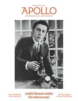


Daily Diary 31/03
Today I started on my research list. I was only able to complete the first subject on it
Despite saying I would do research into the articles first as it would take the longest, I realise that because I'm tailoring each article to be related to each artist/designer that I can't actually do it yet without securing all the artists. Getting artists to interview is my top priority because of this
While writing up the questionnaire, the title "Artview" came to me. It's a very simple title (being a mix of art and interview) but made sense as half of the pages in the magazine are interviews. However it's already been taken by a creative agency and it sounds too similar to ArtReview which is an entirely different art magazine website. I was able to add something to make it more original though, "Point Artview". It's a sort of cute pun but I'm not sure if I like how long it is. For now I've put it as a title people can say they like in the questionnaire, but I'll also have to ask my focus group later. When I get that focus group first..
After making my questionnaire I decided to first distribute it on art forums. The first forum I found and posted on was Artist Forum. I then went on WetCanvas but you needed an account to post and it seemed like registration was closed. I also went on Painters Online, Art Forums and Urban Art Association. I then contacted all the artists and designers listed in the 30/03 diary entry, I briefed them on what the magazine is about and told them that this was just an interest check and I'd ask the questions later. I still need to find more people though, so I plan on searching for more tomorrow
My forum posts are linked here: Artist Forum, Painters Online, Art Forums (since been deleted but you can also tell I did it by going on here) and Urban Art Association
I was recommended to possibly interview someone who would be coming to do an industry talk called Lynsey Moore, but I'm not sure if I'd be able to considering that I would need to finish doing my research by the time she would go to the college. I could do research on costume design as one of the topics since I know that's what she does though, so that might be a possibility
While researching I came across a few magazines I'm personally interested in, IDEA magazine and delve magazine. There is also A List Apart and slanted. I didn't talk about these magazines as IDEA is in another language, delve magazine seems to focus more on photography than art, A List Apart is about web design and slanted seems to be about typography and colours rather than actual art itself
Daily Diary 02/04
Today I tried to contact a few more artists and a writer for help with writing the articles
I also got response from one of the people I contacted, Fantelle. Looking back at my diary entries it seems I only briefly mentioned her in one of them (27/03). To put it very briefly, I won a raffle in a game and one of the prizes was art. While talking about what I wanted her to draw, I also asked if she was willing to be interviewed for the magazine and she agreed. There isn't a specific reason I asked her to be interviewed other than I liked her art a lot, I asked her before I truly knew what I'd be doing for the magazine (I didn't originally plan to have the articles be loosely based on the artists for example)
For who I first contacted Freddy Carrasco as I knew he was a professional artist already since I'm a fan of his work. He's done character design work for a Cartoon Network show, worked with other famous companies such as Spotify, Windows and Nike and does a variety of art such as sculptures, music and comics. This meant there was a wide range of topics I could write about in my article. He also lives in Japan which I could ask him about. I contacted him via the contact us page on his website
The next person I contacted was Abbsterism, similarly to Carrasco I already followed her on various social media. She's currently a freelance illustrator/graphic designer and she's about to be an art student. I can ask her about freelancing and write about how being a freelancer works for an article
I then contacted Emily Zullo, an artist who does animation and comics. She's currently working to get her BFA in animation at the School of Visual Arts. I decided to contact her as I haven't talked to an animator yet and I thought it'd be interesting to interview one as there is a difference between animation and illustration
The last artist I contacted was Cyan Daly. She's a freelance illustrator who has graduated from the School of Visual Arts with a BFA in illustration. She uses bright bold colours in her artwork and predominately draws black people and our hair, so I knew she'd be able to answer how her background inspires her art. She has a contact us page on her website that I used
Finally I contacted Katy Cowan, the host of the Creative Boom podcast and the creator of Creative Boom. The podcast she runs interviews different creatives each episode and she's the one who writes the articles interviewing people on the website as well. On her website she says that she's available to give advice to writers through many different ways such as workshops, one-to-one help and coaching. I knew that she'd be the perfect person, but I am slightly worried that she might be too famous for me to get a response back
Daily Diary 06/04
Today I looked at a source for interview techniques
I realise I'm not the best when working from home, I get easily distracted and my laptops keyboard is slightly broken so I have to type on my phone instead while doing work. Even still though I've tried to persevere despite everything. The article I looked at today went through many points that'll help me later, but I think when I come back tomorrow I'll have to search for tips on online interviews specifically instead
Since Cowan hasn't gotten back to me yet I decided to message Elfie Thomas, an editorial assistant on It's Nice That, an online magazine website that focuses on graphic design. I then realised how many artists I've contacted compared to how many creative designers (only two so far) so I emailed fakepaper, a graphic design studio
Daily Diary 07/04
Today I looked at another source for interview techniques and distributed my questionnaire in more places (social media)
I'm not proud of how little work I did today but I find it extremely difficult to work from home and I personally felt off today. Im worried that I'm falling behind schedule as I haven't interviewed a writer yet and I still have to do research on the topics for the articles, but I can't fully do that yet until I have all 6 of them. Im also considering dropping one of them (Fantelle) as she's very slow to reply to me, but this might be because I'm using the wrong platform to talk to her. There is still time in the week though so this is definitely still accomplishable
Daily Diary 08/04
Today I contacted a few more artists and designers
The first I emailed was Sabrina Cotugno, the artist and writer of the webcomic The Glass Scientists, and then yanadose, the creator of Dreamyverse. I contacted both of them as I didn't have any webcomic artists and I knew I'd be able to ask questions about both of their works
I also emailed Nora Zhao and Harry Richards as I still felt like I lacked graphic designers. Nora is Chinese and has worked on a few projects about it, two being Chinese Grid and a book called Machine Translation. Harry mainly focuses on typography and in his LinkedIn page states that he's "... supporting projects that aim to provide a positive impact on our world, visually and socially"
Daily Diary 10/04
Today I did research on laws & ethics so I’d be able to follow the guidelines later on when it came to conducting the interviews and putting them in my magazine
Nora responded to me quickly and agreed to be part of the project. I’m not completely sure what I’ll write for their article yet, but I can base it loosely off one of their projects or typography
Looking at my research list, I’ve decided to switch colour meanings and law & ethics. I also realise I never made time to find people for my focus group, but I know I’m mostly going to have my friends be in that group. While I know this is a bit frowned upon, they all cover the target audience (16, 17 and two 18 year olds, two do art as a hobby and the other two are studying art and design in college). Emily Zullo also expressed interest in seeing the production phase of the magazine as well and while I’m not sure I can add them in the focus group, I will allow them to see the works in progress and get feedback from them as well. I planned to get a magazine writer to interview but neither of the two I asked responded back to me yet, so I’ll have to push that back to next week unfortunately. I also still want to get a magazine designer to look at the project as well
Daily Diary 11/04
Today I continued researching laws & ethics
I have four artists and designers, but I still need to find two other people. I also need to find the writer to interview, especially since I should’ve already interviewed them. I feel like this might have something to do with how I’ve been contacting people so far, I’ve emailed everyone so far except Fantelle. I now realise that I want to do the interview in real time instead of just emailing them (I want it to feel like a conversation in the magazine) so for the next two I might have to think of different ways to contact others
Daily Diary 12/04
Today I finished researching about the law, I should be able to interview people now
fakepaper responded to me but unfortunately declined, they did agree to do my questionnaire I sent them though. I wanted to email and dm Nicole Cousins on Instagram to see what she’d reply to the quickest if she does at all, but she doesn’t accept private messages on the site. This may also be a problem if I decide to only dm people on Instagram. I chose Nicole as from looking at her bonus work, her race is the direct focus and it’s clear what I’d be able to make the article about
I still wanted a magazine writer but I decided to go for smaller magazine companies as they’d be quicker to respond, the first website I went to was Cassone. There is a contact page but the actual magazine itself has ended since December 2015 so I wasn’t sure I would get a response from them. I then sent one to Southwest Art Magazine as they do interviews with other artists and seemed to be one of the lesser known ones, but there was only an option to email the company and not any of the individual journalists. Since I wanted to email people instead of companies the last person I emailed was Vanessa Peterson, an editor on frieze


Daily Diary 13/04
Today I looked at colours and one of the topics I need to write about later
Looking at my research list, I’m not sure I agree with the placements I originally put. For example I was meant to do research on interview techniques and then about making effective headings afterward, but I decided to switch headings with looking into laws & ethics instead as I wanted to for the interviews. I’m not sure if I need to do research on photography techniques either anymore as none of the artists and designers are local, I might still do it anyway as I might choose to take a photo of myself for the authors note but I don’t intend to go into much detail for it
On the questionnaire, a graphic designer studio called Studio Helmo said they were willing to be interviewed for the magazine. I still need people (specifically graphic designers) to interview so I may contact them, the studio is only two people so I don’t feel like I’m interviewing an entire company which is something I was trying to stray away from. I have to email them as their private messages are closed, but their site isn’t in English and I have to use a translator to read it. I’m a bit worried that the email address is wrong because of that and I’m not sure if they’ll speak English fluently, but I’ll try it anyway
I also said that I would try to contact a magazine designer so I’ll have audience feedback for the end of this unit, but I haven’t done that yet. I knew this was a low priority though and I still have time to do that throughout the project, so it isn’t anything too major yet. I’m still worried I won’t get a response from any of the writers I contacted though


Daily Diary 03/04
Today I got a response from two of the people I contacted, Emily Zullo and Abbsterism. They both said yes and we were able to talk about where and when the interview would take place
I'm slightly worried that from the quick repsonses I got from the two that I wouldn't get any responses from anyone else I contacted, but I was also weary of that already. There's an option to put your social media link in the questionnaire for artists and graphic designers who wouldn't mind be interviewed, so if all else fails I will still be able to source other artists. I also have three of my friends who said they'd be willing to be featured (two of them were originally going to be in the magazine before I decided I wanted to get professionals instead, shown in my project proposal draft) so I have them if those people don't respond either
Another thing I'm worried about is getting responses though, despite me posting on multiple different sites I still only have about 10 responses. While questionnaires have always been extremely helpful for me, getting responses has always been extremely difficult and the minimum is 75


I felt that I looked at enough to understand how to make a magazine in InDesign and realised I wasn’t going to be using Photoshop that much for it. I’m familiar with Photoshop already and I’ll most likely use it for minor details I already know about so I decided to skip it. I wanted to look at the next article topic, this would be about freelancing art
The first website I looked at was an article called “How to Work As A Freelance Artist”. Recently freelancing has been difficult since the pandemic, many companies have stopped contracting freelancers to preserve their finances. The job is still seen as quite stable despite this, especially when compared to other traditional industries. Advertising, journalism and design are the three biggest industries that are in favour of art freelancers
Being a freelance artists means you can choose what to work on and your own hours. They can move from different roles quickly while not facing many of the problems a regular job would have. You must also find your niche whether that be writing or portraits, being able to self-reflect and realise what your best asset is in art is essential to making it
Freelancers usually market themselves on social media. It’s important to then build a client base, this can determine whether they make it or not in the market. People who are happy with the work you provide will most likely talk about you and shout you out, then attracting more customers to you. Being a freelance artist is very competitive as there are many different artists all competing for the same contract. As a freelancer it’s good to establish yourself more as a business or an entity, this is so you can market yourself as a business and also keep legal paperwork and finances away from your personal life
The article then provides 11 websites for freelancers. Portfolio sites and social media are generally used the most for obvious reasons, but there are also other alternatives. Upwork focuses on high-quality gigs for artists who want to work in marketing, consulting and web development. Freelancer is a popular site although it’s more general but it also caters for design, content writing and social media marketing. Both sites keep track of invoices, working hours, communication and payment, Freelancer also has both local and remote jobs. Fiverr is another popular site that’s more for creatives and is known for being low-costing, therefore being a good site for beginners. Guru is more for professionals who have work experience in design, marketing, programming, writing and translations. LinkedIn ProFinder works for freelancers who are editors, graphic designers, marketers or photographers. You must be approved to be hired for gigs, but once approved contractors get alerts for willing clients. Working Not Working is an easy way to get hired for big companies such as Google, Nike and Apple. It offers high-quality gigs and is very freelance-friendly with their interface, instead of freelancers bidding for jobs other companies will come to you instead. SimplyHired is the last website featured and focuses more on local jobs, there’s a tool to also see other artists around your area. They also highlight more websites such as: Freelance Writing Gigs, Designhill, Behance and 99designs
Statistics from the Americans for the Arts shows that non-profit arts and cultural organisations lost around $14.8 billion since the pandemic started. Almost 880,000 jobs for art have been neglected and 35% of artists have been laid off to reduce costs. Fine and performing arts have been hit by the pandemic the hardest, between these two industries about 1.4 million jobs have been lost. This is about half of all fine and performing artists and it counts as $40 billion in sales. However there are other independent creative jobs that are still thriving such as the fashion, marketing and communication industries. Most companies have switched to remote work, whether that be partially or fully, which is already common to many freelance artists. Some jobs like gaming have even benefitted from the sudden shift to remote work
There are 10 tips to becoming a freelancer artist: have a creative business, coming up with a business plan, having a website/online portfolio, creating a dedicated office/workspace at home, somehow get a few returning clients, sign up for job directories, market yourself on social media, sell art online, connect with other freelancers and secure a steady job
When making a creative business you should register as a small corporation or LLC (Limited Liability Company). Coming up with a business plan should at least include these four points: list of responsibilities, list of all the services you do, your charge for each service and how much it’ll all cost. Creating an online portfolio can be done with website builders such as Squarespace or even Behance. Having a workspace can help with concentration, in it you can meet with clients all while completing projects in it and storing your own supplies. Before even started freelancing you should have a few clients that already favour you, then afterwards you can grow your client base while still being supported financially. Registering for job boards is an easy way to keep up with current gigs and trends, being on these platforms also mean you can find companies willing to hire you more easily. Marketing on social media is also extremely important as it’s the most popular way for people to find you while also acting as a portfolio of your work. Selling art can help your profits while you’re starting out, Fiverr and Etsy are good sites for this. Joining with other freelancers in groups and communities is a great way to find relevant jobs while also helping others in the community. Securing a steady job, especially at the beginning, is important so you have a steady income to fall back into if freelancing doesn’t work out
Despite the pandemic, gigs are starting to pick up again. Freelancing is seen to forever be a viable option in industries such as entertainment, design and media because of the flexibility in these sectors. Freelancers are still exploitable though and aren’t completely covered by taxes, labour rights and benefits yet. Laws are steadily being made to prove freelancing as a legitimate career path and protect them, such as the Freelance isn’t Free Act and the Gig Worker Bill. It’s extremely beneficial to learn your rights as a freelancer and to know how to protect yourself from getting underpaid or scammed
I felt that the article was extremely conclusive and covered anything I wanted to talk about, but I decided to look at another source to see if I could learn anything else. I found a blog article for Displate called “How To Work and Succeed as Freelance Artist in 2022”
A freelance artist is someone who works for different clients usually in short gigs, but sometimes they can be contracted for longer. They sell their art by their own schedule and time. Some create physical artwork to sell online or locally while others do it digitally and sell it off as prints. There is inherit value to selling as prints, for example you only have to create the art once and then you can put it on anything. It’s possible to sell your work on multiple different websites as well such as freelancing websites, art marketplaces and even your own site if you can host it. They give a few examples of sites freelancer artists can use, most of them already being mentioned by the previous article
To become a freelancer artists you have to be strict on yourself, many artists don’t make it past this stage as they aren’t enough confident in themselves. It takes a lot of hard work and harmonious organisation to make it. The first tip is to still have a full time job while starting out, this is because working in a company can give you experience nothing else could. You have to be 100% sure you want to quit out of the job as well, building a personal portfolio can take a lot of time and shouldn’t be rushed. This can take a few months up to a year for some, it’s good to save money in the meantime
It's integral to build up an online presence as without social media it’s extremely hard to find you. You have to set up a portfolio (this can be done on a professional website or even just a blog) to show off your work to potential clients. If you have both a website and social media then it’s pointless to have them separate, Instagram is the platform majority of artists use
It’s important to have a specific area dedicated to doing work as it’s easy to get distracted when you work from home. You have to treat this place as if you’re working in an office and make it somewhere with minimal distractions, it’s good to have your drawing supplies in there as well. It’s also a good idea to have a daily plan so you don’t get distracted and focus on work, especially at the beginning of your career since it’s easy to feel lost. An idea is to separate your days into sections such as working on your social media one moment and then looking for new clients the next. After working on a plan it’s important to be focused on it and not let anything distract you from it
Treating your freelancer artist career as a 9-5 job can help with setting up a routine as well, it doesn’t matter what time it’s set as long as you stick with it. It’s fine to take breaks of course but it is extremely important that you get all the work done for that day. Having clients before you start will help as well and will build a solid base for your company, but it’s also important to still have a built relationship with them afterwards. You have to be known as a good person to work with as well as it’ll make people more likely to recommend you, being quick to respond and having a professional manner with your clients will help with that
Taking care of your own finances is also extremely important and cannot be neglected no matter how scary or boring it may seem. Since you are your own boss, you also have to take care of your own money. It’s good to start saving money everyday early so you’ll be prepared for any down spikes in your client base. Another tip is to set up a price list, even if it’s just estimates. You will need to schedule in time for you to take care of your finances by doing invoicing, accounting and filing your taxes
You should also find places to sell your art online and when you have the time, make and sell your personal works on there. It’s a good way to make money while you’re busy on a different clients work or taking a break. The final tip is to know when to be patient. It’s easy to be demotivated by the lack of clients at first but it is part of the process and is completely natural, creating a personal brand takes awhile and it takes even longer to have a stable client base
Almost all of the tips in both articles are the same, so I’m confident that I have solid advice for my article if I’m going to include that. I’m not completely sure what I’ll be doing with my freelancer article so it’s good that I read sources that have a wide range of topics to talk about (advice on how to start, discussion on how the pandemic has affected freelancers, ect.)
I was planning to save doing research for when I got feedback from a magazine writer, but I haven’t got a response from anyone yet so I decided to do it next anyways. There’s a tip at the beginning that you should save a page with over 100 headlines for inspiration. Headlines are extremely important, especially online, as people won’t read the article if the title doesn’t grab their attention
The article gives 10 different templates for articles that can really work. The first one is the classic “How To” article, although they don’t need to start with that specific phrase to count
The next title are the “identify and solve a problem” ones, phrases that set off emotional reactions are sometimes used for this type to great effect. A few examples the site gives of these are “Gene Breakthrough Restores The Sight Of People With Inherited Eye Disease And Could Save Thousands From Blindness” and “Parenting Guru: From Chaos to Access”
The third is the “make a statement” title, these are used often as writer block happens, the examples are “Thousands Already Make Millions Online And So Can You” and “Before you buy an electric car: 21 Things You Should Know”
Next are more controversial titles as they easily grab the readers attention and can get them to leave comments on the article afterwards, examples are “Why All Guys Cheat, Fresh Insight” and “Which One Deserves To Die?”. It’s important when talking about controversy to be respectful, especially to the target audience of the article as they’re still trying to appeal to them at the end of the day
In general shorter titles are much better than longer titles for multiple reasons. Concise titles tell the reader what the article is about in enough words than needed, it makes the title easier to read and most importantly catches the reader’s attention quicker. Readers attention spans are very short so it’s important to catch them as quickly as possible
Another reliable title is one that’s a question since when read, readers will automatically try to think of an answer. It’s a very simple yet effective way to elicit a response from readers and get them to read the article
Headlines that can offer explanations are good for similar reasons to questions, it’ll pique the readers interest and make them click on the article to find out. News can also be delivered in this way. An example of these types of titles is “How I Doubled My Money With Facebook Ads”
Creating intriguing and shocking titles is a very easy way to get the reader to read the article as they’d want to find out how such a crazy thing happened, the goal of these titles is to make the reader do a double take after reading it
Making the title feel like the final of something is effective as it can attract readers who’d want to stay up to date with something, readers who are new to something and want to learn more or even seasoned experts of the subject to see if anything new has came up. Using words such as “ultimate”, “final” and “entire” can make the article feel like a complete list of sources. An example title is “The Ultimate Guide to Making Money Online”
The final title given is to make a Top List title, it’s arguably the most popular title as it works so well. When using these titles its good to put the topic first as it lets the audience know what the article will be about, if there’s a description it should aim to provoke the readers emotions. Using numbers simultaneously tells the audience how long the article might be and makes the article feel more useful
Since that website was more on general online titles I wanted to find something that focused on magazine titles. I found a website called CoSchedule that focused on that very topic. The article shows different titles and goes over what separates good titles from bad ones. Writing headlines is harder than it looks, even if the entire article has been written before coming to it
The first thing that make good titles stand out is that they’re creative. It’s good to try different types of titles and think on how to use them creatively. If used too straightforwardly then the reader is much less likely to keep on reading the article as they imagine everything in it is something they’ve already heard before
Another thing about good titles is that they have a clear aim, transparency is seen as better than using convoluted words. Readers are much less likely to keep on reading if they’re not sure what the article is about either and by being honest you can develop a trust between you and your audience. Below are a few tips on helping writers identify what the clear goal of their article is and how to push it to the forefront
Good titles also usually elicit a response by using emotional language, by doing this they also subtly create a relationship between their audience. Writing emotionally can also be an easy way to keep readers interested while reading the article
Finally, the best headlines leave the reader desiring for more. Headlines are only meant to act as a gateway to the article to hook the reader in, therefore it’s important to not add too much information in the title. If there’s too much then there’s likely too many words in the title and it leaves the reader with no reason to read the article if the title already tells them everything about it
Then the article talks about bad magazine titles and elaborates on why they don’t work
The first one is sensationalism or dramatization, these are usually exaggerated so much that it’s obvious and it often leads to false statements about the subject. These titles are used to catch audiences attention but often end up with less readers than they would have if they wrote their headlines differently. If done too much readers will associate your magazine with it and will generally avoid it as its seen as being an unreliable source
Hyperboles are similar as its also exaggerated headlines. Headlines are there so the reader can know what the article focuses on and quickly find out what they can learn from the article, but if the title is too exaggerated then both of those factors get lost. It loses many potential audience members for the same reason sensational titles do
Being too cruel in a headline can also deter people from reading the article, this is because they’ll feel that the article is heavily biased. When magazines use this style its often to mock someone else for attention and it shows
Afterwards they talk about a few specific magazine issues to break down what makes each of their main titles so good. In CEO Magazine it describes Musk as “The Extraordinary Corporate Disrupter”. This stands out for being slightly opinionated (“Extraordinary”) and makes the reader wonder how he’s disrupting corporations. Time’s magazine not only has a cover that stands out, but also a headline that does as well. The headline would intrigue people by making them wonder how he did it and it also subtly lets the reader know that he’ll be featured in the magazine. The subheading says he “collars the masters of the meltdown” which also provides more intrigue in him and therefore also the magazine. The Atlantic’s magazine is an example of using emotional language while also asking the reader a question. The title is simple but still very effective, mainly being a list and then a question. “Teacher, Therapist, Parent, Spy; What Alexa is doing to us” clearly tells what the article will be about. The cover elevates this as well, making the Alexa have a humanoid face
The article then goes into expanding more on the tips to make an effective headline
The main thing is to first identify the point of the article and what it’s about. A few things to consider while doing this are what’s different with your perspective on the subject and thinking about why the target audience would care to read this
The next tip is to notice any gaps in information. These are the info gaps the audience wants to know about and addressing any of those in the title can easily make people interested in reading to finally get their answer. Another way to do these types of titles is to create the gap yourself and make the reader wonder about something they haven’t thought about before, this is when they read the article to find out. This can be as simple as saying something happened to a subject and not providing the context for it, an example of this being “A Freak Pie Mishap Once Ended a Baseball Player’s Season”
This image comprising of a list of emotional language to use in headlines was given out next
Next thing they recommend is writing 20-25 different article headlines and then using a site called Headline Analyser Studio. It scores every single headline used and can be used to pick one good title. After narrowing the list down to just a few titles you can pick the best headline by going with what will interest your target audience the most
Because the first website was focused on general online articles I don’t think it’ll help as much, but I do think magazine and article headings would share similarities anyway. The second website was much more helpful as it went over many different examples, talked about the differences between good and bad titles and in general is focused more on magazines. Regardless I think both of these websites will help me when I have to create my own headings later on. Some of their tips were the same so I’m confident that I got helpful tips
I wanted to do research on animation next as it’s one of the topics for my article. At first I wasn’t sure what specifically about it I would write about, but since I have other illustrators I decided I’ll write about the difference between illustration and animation. The first website I went on was a blog called FuzzyDuck
The differences between the two mediums are obvious, but businesses still confuse the two while looking for contractors. The first difference between them is that animation has movement while illustration doesn’t. Illustration is made to be static but can still stand out with the right text and colour choice
Animation also draws peoples attention easier. There’s a misconception that animation is only for kids but the first animation was intended for adults. When telling long information in a video, companies usually use animation to keep the audience focused on the video. It can also be used to promote a product as its easy to put characters in a situation where they could. Animation also counts as one static images moving around, it doesn’t just have to be hand drawn animation frames. In general the medium is a great way to show off personality
Illustration on the other hand are either drawn are painted and are always static. It can be more personal and even thought-provoking as art can be interpreted differently by different people. Art prints are still popular as well as people like having physical items, but illustration isn’t only for posters and books. Illustration can be in many other things such as trucks and signs, the examples the article show are Marvel Sewer and Drain and JJ’s Clubhouse. Marvel uses illustration for many different things such as on their business cards, trucks and posters while JJ’s Clubhouse uses illustration to draw the audiences attention to the sign and it’s message
Animation for social media ads is common, even if its just simple text animating on the screen. It’s so popular that the market is seen as a bit oversaturated and it can be hard to get your message to stand out against the crowd. This is because it’s proven that video/animated/GIF posts on social media get more attention than illustration does, outperforming them by 73%. Neither mediums are better than the other though and they can both be used in effective ways
Afterwards I watched a video from Ethan Becker that explained the differences between them, more specifically about the difference in lifestyles and work
He describes animation as a team effort due to how many things other people work on for the final project. Illustration is more individual as people (usually) work by themselves to make their own art style stand out above the rest, this is more important than it sounds. Being able to have an appealing yet distinguishable style from your peers make it more likely that you’ll be contracted for work and you have to build up your own brand
Getting into animation is different from illustration. In illustration its common to see portraits in portfolios, animation requires more variety. For example showing of your background art can be more helpful. Companies would look for people who can draw perspective and anatomy consistently. When starting out foundational skills are more appreciated than individualism. It’s still possible to have an individual style in animation though, what helps develop your style is starting in those entry level jobs and then working your way up while retaining all the information you’ve learned. Once you have that you’re able to be hired just for your art style alone
Standing out is difficult as there are many people interested in the mediums but its possible. A way to be different is to take inspiration from many different artists and sources, but that approach can only go so far. You have to practice drawing a lot as afterwards you’ll eventually develop your own style. A common mistake is that after drawing people will compare their work to someone else they take inspiration from, which is good for learning but it’s important to not use the same artist and their work to compare
For poses its good to go for clarity and consistency instead of highly detailed and complicated designs. When doing art its good to have a focus for what you want to go for before starting so you can get appropriate inspiration pieces
I held off photography techniques last for my research list as I wasn’t sure if I’d need to do research on this. I decided to anyway as I have to take a photo of myself for the authors note at least
The first website I looked at was 12 magazine photography tips by Expert Photography, however given the nature of the site the article was more about getting into the industry than anything else. Regardless, I learned a few things from it like how important it is to know your camera so you know what’s wrong when a photo doesn’t come out like how you wanted it to. This includes knowing what aperture, shutter speed and ISO are and how they work
The next article I looked at was 50 tips for photography techniques on Smashing Magazine, however this didn’t help me much either. This focused more on interesting things that could be done with photography, which wasn’t what I was looking for
After taking a moment of reflection I realised it’d be better if I looked at tips pertaining to doing portrait photography instead of general tips, so I went on a masterclass article with tips on portrait photography
The article first starts by giving information on what portrait photography is, it’s basically what it says on the tin and are photographs of people. Adjusting the ISO and exposure compensation can change the light in a picture and changing the shutter speed is only really useful if the subject of the photo is moving quickly. Changing the depth of field can make a background blurry and force the camera to focus more on the subject of the photo
The first tip is to diffuse the light source. Soft and diffused natural light from an indirect source works best for portraits. Harsh lights can create unmissable shadows and off colouring of skin, diffusers such as a white sheet or soft box can soften light to combat this
The second tip is to use a longer lens, 50mm is the usual standard but ones in the 80mm to 200mm produce better quality portraits. 50mm is used by many portrait professionals still but it ends up creating a regular scene. Longer focal length creates a more dynamic photo by bringing the background and subject closer together and strengthening the bokeh (background blur)
The next tip is to try out different positions. Breaking the rule of thirds and shooting at unusual angles can make the picture more interesting, even small things like not having the photo be at the subject’s eye level can change a picture
Bringing your own lighting can help, camera flash can only do so much. Close-up shots can be disproportionate at times without proper lighting. External strobe lighting can underexpose light as well if needed. Altering the aperture, as mentioned before, can help with blurring the background. When doing a photo with multiple people in it its good to have a smaller aperture
Having props in the shot can also make it more dynamic, like shooting through transparent foliage and architecture. Longer lens can blur objects in the front as well as centre the focus onto the subject. In general using props as part of the shot can really elevate it
Using gels alters the colour of the shot and can change the feeling of the portrait, making the picture feel more like an emotion or temperature. Unnatural colourings can be changed by adjusting light temperatures. On days with grey clouds and skies, adding a CTO (colour temperature orange) gel makes the environment more warmer for example
The final tip is that its fine to edit the picture in post. Enhancing the photo in Photoshop can make the picture reach its true potential and help fix problems that were in the original shot
Using different angles is an interesting tip that I hadn’t thought of for this project and is absolutely something I’m willing to experiment with. This would go slightly against the editor note pages I’ve seen so far (usually a very regular portrait at eye level and the subject facing the camera) but I plan to do something a bit different from them as I don’t think they’re visually interesting pages on their own
After reading that source I wasn’t sure I needed to do much else research into the subject, I feel confident enough with the camera I’ll be using to take a fine enough picture myself. I left this article topic (technically) last since I didn’t fully know what I would be doing research into yet, but after looking at Zhao’s projects I decided to focus on generative art as she has many projects about it and on her website about page it says that’s what she’s most interested in
I looked at a website called Free Code Camp first. The article goes into what generative art is and acts as an introductory to anyone who wants to do it
Code art is art using code, an example being CSS art. Generative art is a broad genre of art made with code and usually has inspiration from modern and pop art with geometric shapes and patterns. What makes it different from simply being code art is that generative art has an autonomous system of its own
One of these system types is randomness, by doing this you get completely unique art every time the art is reloaded (these can be done in multiple different ways such as refreshing the page, but the main gist of it is that it makes the art’s script rerun). More orderly systems such as Mandelbrot’s Fractal also exist. There’s even generative art that does both of these!
Generative art is technically an artist and a computer working together, each pitching in at different stages. Some things are controlled by the coder while others are by the artist, for example the artist can control the randomness and order in the artwork. After that the computer attempts to act it out, both tweaking the system to their liking after. The process of making this art is different from any other and truly stands out for being experimental. Things can and will go wrong with this process but its still part of it at the end of the day
A bit of randomness is extremely important in generative art, this is because the art should be different every time it runs its script. Algorithms are also part of it as it can be used to generate the art. Most generative art uses geometry to its advantage as well, knowing maths can make for some really interesting art
There are two main ways to make generative art, the first is to simply let the computer do what it wants and the other is to have a goal you want the art to look like and work with the computer to try and make it
If you already have prior knowledge of Javascript then a way you can make art is with p5.js, the websites goal is to make generative art more accessible for people to learn and make. It mainly does art and drawing but it can also be used for other things such as sound, video or even with webcams. P5 also simplifies a lot of the math in another website called Canvas API
After this the article goes more in depth into how to make generative art, which I decided to skip as I didn’t think I really needed to know to write the article. I remembered one time I got a video in my recommended feed about code art that I put in my watch later list a while ago so I finally watched it for this
Github made a video with Sabine Wieluch, artist and presenter in the video. The video, like the article, goes over how to make your own art which I’m not really interested in writing, so I’ll mainly be skipping that portion of the video
Wieluch explains that the “art” in generative art can really be anything from music, images and even poems. When talking about making it there’s always a basic ruleset to it, it can change depending on what the end goal is though. The rule set she stuck with for the video is that the image will be made with coding
There is interactive generative art where people can interact with it to alter the image in a way. There are also other ways that can be used such as sensory (going off a timer or a set date) and data (going off of a large database)
Normally when making generative art you want to have a minimum or a maximum amount of shapes that can be in it and the sizing of them. There are two types of space, the possibility space are all the different and unique combinations than can be done with the settings that have been chosen and there’s also the generative space that acts a subset of generative art and happen if there are certain limiters the creator used (example given is a circle being blue when small and then it becoming red when its bigger)
How large the generative space is is also important. There are options of making it really big so that there’s lots of space and more art (at the cost of possibly being more ‘boring’ or uninteresting as a result of putting random settings together and seeing what happens) or really small and well thought out (at the cost of being more likely to have less random and interesting results). Most try to find a balance between these two
I only had the subjects to do research on now, I chose to do one on costume design. I wasn’t sure what exactly about costume design I’d write about so for now I started with a general overview on it. The first website I went onto to learn more was MasterClass
A costume designer is exactly what it sounds like, someone who’s in charge of the costumes and outfits people wear for shows, movies and general stage performances. They’re similar to fashion designers but they have to work with different conditions as their costumes are being used in theatre and films. This means that the outfit has to make sense in the narrative of the story but they also have to be easy to change into and out of. An example given is that fashion designers may be contacted to make a contemporary dress while costume designers would be to make a skirt that’s durable to wear daily for the next few months. Costume designers also work with the lighting and scenery designers as well to make sure that the set and outfits match and make sense
Costume designers are required to read the script, taking notes of things such as the tone and the time period of the story. After talking with the writer(s), director and production team members, the designer then does research into what that time period would wear. While doing so they’ll have a pile of visual sources to go off of
Many things that a costume designer has to consider is how the outfit communicates who the characters are. The age, social status and function of the character should be apparent in how they’re dressed. Every individual costume design is compiled and a costume plot is made that has each outfit the character will wear throughout the story. This is when sketches of the costumes are usually done. When the director and production team are happy with the designs, the designer can start sourcing all of the pieces for it. There are times where a costume is made from scratch, but it’s usually bought instead if they can help it. After that the outfits are slightly altered to fit the cast better
To be a costume designer the most prevalent skill is a passion for design. A deep knowledge and appreciation of clothes and fashion help tremendously as they have to be able to source the clothes themselves. It’ll help if they’re talented in drawing art freehand (usually with the help of a computer as well) as the blueprint for outfits are normally drawn first. They need fundamental understanding of how the software they use work and they should have basic knowledge with how to make their own clothes. They may be working with sewing and altercation professionals to resize the clothes and it’s important that they’re able to communicate their vision for the outfit with others effectively
No need of specific qualifications to become a costume designer, but there are many different undergraduate and MFA’s that come with being a costume designer. Graduate programs tend to have opportunities for aspiring designers to work in theatre and give them practical training. Many costume designers start out as assistants for film wardrobe departments and even theatrical costume design stores. Building your own portfolio for the job is extremely important as with most creative jobs. Like graphic designers, most also work as freelancers instead of being employed by a specific company
Looking at Lynsey Moore's website it says that she's skilled at both contemporary and period design, so I could choose one of those to go more in depth on. I decided to go with contemporary as that's what majority of her portfolio was. I found an article on fashionista about contemporary costume design and the hidden struggle of it
Because of the modern perspective on our wardrobes, it's easy to think that contemporary design is easy as the actors are just in modern day clothes. This was furthered with the rise of fast fashion and cheaper clothing, compared to the old Golden Age of Hollywood having their costumes custom-made. Nowadays its common to have costume designers buy the clothing instead of making them or even having them use clothes hired by the studio to create outfits
There are even films and TV shows from the 70s and 80s with no costume designers as the studios didn't think they needed one for contemporary fashion. Later on with the release of stylised media like Miami Vice and Sex and the City, studios realised how critical costume designers can be with creating memorable characters and aesthetics
However there is a lot of effort and work that goes into contemporary costumes still and usually every single thing about it is still carefully planned
Actors also play a role in the design of a costume as well. A problem with contemporary fashion is that an actor can get too comfortable in the clothing and not be able to immerse themselves in their role. Cynthia Summers, costume designer for such as "Girlfriends' Guide to Divorce" and "UnREAL", said "An actor is probably more likely to embrace [an Elizabethan gown] immediately because it is period.". However with period costuming also comes another problem, you're more confined in what you can do as you have to stick with what people would wear back then
Costume designers make the character truly come to life with their outfits as its their job to create them for the characters. This can also come with pushbacks from directors, producers and even the actors themselves as they don't want to be in unflattering clothing and think that the designers can get this clothing from somewhere else
There are also a lot of clothes required for a film but especially a TV show. Characters usually have to change what they're wearing if it's a different episode or day and that's not even counting the multiple characters that'll be in it. Last minute changes in the script that add a new character into a scene can really mess with costume designers as they have to scramble to find something they can wear
Some designers find it more difficult to shop for clothes instead of already being provided them. Nieddu says "You have what you want instead of trying to find it - and it might not exist" and also mentions the time limit TV shows have
Just because contemporary design is usually from stores doesn't mean that there aren't times where designers do custom outfits though. Costume design is seen as "... taking what somebody else is playing with and putting your own spin and style on it" by Perez. Bahmet, someone who regularly does custom outfits no matter if its contemporary or period costumes, says "It's not easier, but it's much easier for us to be able to control the message and the symbolism when we use custom-made clothing"
I decided that since I didn’t know who my last artist or designer would be that there was no point in doing research for an article that might potentially not even happen, I’ll have to source someone and do it later this week
Abbott, M. (1970) Media Law Guidance. Available at: https://www.communityjournalism.co.uk/media-law-guidance/. Available at: 12.04.22
Addy, L. (2018) Animation vs. Illustration. Available at: https://www.fuzzyduck.com/animation-vs-illustration/. Accessed at: 15.04.22
Apollo. (2022) April 2022 | Apollo Magazine. Available at: https://www.apollo-magazine.com/issue/april-2022/. Accessed at: 31.03.22
Aston, D. (Year unknown) 10 Article Headline Examples That Got Us 10 Million Readers. Available at: https://www.incomediary.com/10-article-headline-examples-that-got-10000000-readers. Accessed at: 15.04.22
Bately, M. (2015) Brand Meaning. [Ebook] Taylor & Francis. Accessed at: 13.04.22
Bil'ak, P. (2013) Editorial. Available at: https://worksthatwork.com/1/editorial. Accessed at: 31.03.22
Bitesize. (2020) Five top tips for acing online interviews. Available at: https://www.bbc.co.uk/bitesize/articles/zxcy6g8. Accessed at: 07.04.22
Bitesize. (Year unknown) Legal issues – Media law, ethics and regulation. Available at: https://www.bbc.co.uk/bitesize/guides/zyt282p/revision/3. Accessed at: 11.04.22
Brabbu. (2016) Best Art Magazines Online. For Free!. Available at: https://brabbu.com/blog/2016/05/best-art-magazines-online-for-free/. Accessed at: 31.03.22
Canvas API. (Year unknown) Canvas API - Web APIs | MDN. Available at: https://developer.mozilla.org/en-US/docs/Web/API/Canvas_API. Available at: 16.04.22
Chartered Institute of Marketing. (1998) Innovation in Marketing. [Ebook] Butterworth-Heinemann. Accessed at: 13.04.22
Ciszewska, Z. (2021) How To Work and Succeed as Freelance Artist in 2022. https://blog.displate.com/how-to-work-as-a-freelance-artist/. Accessed at: 14.04.22
Contemporary Lynx. (2018) Issue 1 (9) 2018 - Contemporary Lynx - print and online magazine on art. Available at: https://contemporarylynx.co.uk/issue/1-9-2018. Accessed at: 31.03.22
Copyright. (2022) Copyright and Rights: The law. Available at: https://copyright.uk/legal-copyright-law.html?msclkid=90d243d0b89011ec8d0e3a1d519ecbdd. Accessed at: 10.04.22
Copyrightuser. (Year unknown) The Interview Tape. Available at: https://www.copyrightuser.org/educate/the-game-is-on/episode-3-case-file-27/. Accessed at: 10.04.22
Design Like a Pro. (2017) Let's Create a 3 Page Magazine Spread in InDesign. [Online Video.] Available at: https://www.youtube.com/watch?v=bjD4zhAvF7s. Accessed at: 14.04.22
Drew, J and Meyer, S. (2010) Choosing Color for Logos and Packaging. [Ebook] Rockport Publishers. Accessed at: 13.04.22
Dubroff, D. (2014) Animals In Art Down Through History. Available at: petslady.com/articles/animals-art-down-through-history-66242. Accessed at: 13.04.22
Ethan Becker. (2019) ILLUSTRATION VS ANIMATION. [Online Video.] Available at: https://www.youtube.com/watch?v=RX6Iaszmf_E. Accessed at: 15.04.22
Fanimal. (Year unknown) The History of Pet Portraits. Available at: https://fanimal.online/the-history-of-pet-portraits/. Accessed at: 13.04.22
Friedman, V. (2016) 50 Incredible Photography Techniques and Photo Tutorials. Available at: https://www.smashingmagazine.com/2009/04/the-ultimate-photography-round-up/. Accessed at: 16.04.22
GitHub. (2020) Exploring generative spaces: a quickstart to generative art - GitHub Universe 2020. Available at: https://www.youtube.com/watch?v=meqHPIOzk-U. Accessed at: 16.04.22
Government. (Year unknown) How copyright protects your work. Available at: https://www.gov.uk/copyright?msclkid=90d14f15b89011ec9d3265d414211645. Accessed at: 10.04.22
Graphic Design USA. (2022) Our February 2022 Digital Edition. Available at: https://gdusa.com/magazine/issuu. Accessed at: 31.03.22
Hi-Fructose. (Year unknown) Hi-Fructose - Volume 56. Available at: https://store.hifructose.com/products/hi-fructose-volume-56-pre-order?variant=32624570499169. Accessed at: 31.03.22
Hongkiat, L. (2020) 19 Free Online Magazines for Designers. Available at: https://www.hongkiat.com/blog/42-free-online-magazines-for-designers/. Accessed at: 31.03.22
Incredible Art Department. (Year unknown) Art Magazine Links. Available at: https://www.incredibleart.org/links/artmags.html. Accessed at: 31.03.22
Jay, R. (Year unknown) 9 Video Interview (Zoom Interview) Tips to Help You Succeed. Available at: https://www.flexjobs.com/blog/post/8-tips-successful-online-interview/. Accessed at: 07.04.22
National Careers Service. (Year unknown) Video interviews: how to do well. Available at: https://nationalcareers.service.gov.uk/careers-advice/how-to-do-well-in-video-interviews/. Accessed at: 07.04.22
MasterClass. (2020) 8 Essential Portrait Photography Techniques and Tips. Available at: https://www.masterclass.com/articles/essential-portrait-photography-techniques-and-tips#8-portrait-photography-tips. Accessed at: 16.04.22
MasterClass. (2021) What Is a Costume Designer? Skills, Responsibilities, and How to Become a Film Costume Designer. Available as: https://www.masterclass.com/articles/what-is-a-costume-designer-skills-responsibilities-and-how-to-become-a-film-costume-designer#what-skills-do-you-need-to-be-a-costume-designer. Accessed at: 16.04.22
New Media Rights. (2017) Are interviews copyrighted?. Available at: https://www.newmediarights.org/are_interviews_copyrighted?msclkid=55b55490b89211ec9201285c1f68b028. Accessed at: 10.04.22
p5.js. (Year unknown) home | p5.js. Available at: https://p5js.org. Accessed at: 16.04.22
Patterson, A. (2021) How to Work as a Freelance Artist. Available at: https://www.bestcolleges.com/blog/how-to-work-as-a-freelance-artist/. Accessed at: 14.04.22
Piehl, O. (Year unknown) What Can Writers Learn From Effective Magazine Headlines? Available at: https://coschedule.com/blog/magazine-headlines. Accessed at: 15.04.22
Satori Graphics. (2017) MAGAZINE LAYOUT IN ADOBE INDESIGN TUTORIAL - PHOTOSHOP & INDESIGN - Adobe InDesign Tutorial. [Online Video.] Available at: https://www.youtube.com/watch?v=xXKAhmT9GxU. Accessed at: 14.04.22
slanted. (2022) Magazines & Books by Slanted Publishers. Available at: https://www.slanted.de/publisher/magazines-books-2/. Accessed at: 31.03.22
Soo Hoo, F. (2018) The Unsung Challenges of Contemporary Costume Design. Available at: https://fashionista.com/2018/07/contemporary-tv-costume-design-challenges. Accessed at: 17.04.22
Spittel, A. (2018) An introduction to Generative Art: what it is, and how you make it. Available at: https://www.freecodecamp.org/news/an-introduction-to-generative-art-what-it-is-and-how-you-make-it-b0b363b50a70/. Accessed at: 16.04.22
Tailor Brands. (Year unknown) The Meaning Behind Logo Colors. Available at: https://www.tailorbrands.com/logo-maker/logo-colors. Accessed at: 13.04.22
Tailor Brands. (Year unknown) Is a Red Logo Right For You? Here’s How to Check. Available at: https://www.tailorbrands.com/blog/red-logos. Accessed at: 13.04.22
Tailor Brands. (Year unknown) Is an Orange Logo Right For Your Business? Here’s How to Check. Available at: https://www.tailorbrands.com/blog/orange-logos. Accessed at: 13.04.22
Trull, S. (Year unknown) Strategies of Effective Interviewing. Available at: https://hbr.org/1964/01/strategies-of-effective-interviewing. Accessed at: 06.04.22
Verzosa, C. (Year unknown) 12 Tips for Making It as a Magazine Photographer. Available at: https://expertphotography.com/magazine-photographer-tips/. Accessed at: 16.04.22
Walker, S. (2021) Top 10(+1) of the Very Best Contemporary Art Magazines. Available at: https://www.contemporaryartissue.com/top-101-of-the-very-best-contemporary-art-magazines/. Accessed at: 31.03.22
Daily Diary 14/04
Today I looked at InDesign techniques to later use for my magazine and another one of the topics for the article I have to write later
While thinking about the magazine I’ve had an idea to add small doodles and sketches throughout the magazine, I think it’s a good idea as it’ll give the magazine it’s own personal touch and make it stand out more against the other art magazines. It’s also an easy way to have my mascot be more recognisable


Daily Diary 15/04
Today I did research on headlines and one of my article subjects
I’m getting a little worried as I currently only have 58 responses in my questionnaire, recently I’ve been trying to promote my questionnaire daily to get more responses but I only get around 3-4 each day which might not be enough. I also still only have 4 artists and designers, I’m able to do research into costume design to make it count as 5 but I’d still need to write an article on something else. This means I’d have to stick to a specific niche and find someone who fits that, which will be way harder to do to find graphic designers than for artists. I might have to stick with only have one graphic artist in the magazine which is less than what I wanted
Daily Diary 16/04
Today I looked at photography techniques and one of the topics for my article
Since I only have 4 artists and designers, this would be the last confirmed article I could research. Tomorrow I’ll most likely do research on costume designing as I know there’s a costume designer coming to the college that I could interview, but for the last article I have no idea what I’m going to do research on. This is why I focused so much on getting the artist and designers for the magazine in these past weeks, I have to do research for their articles and I didn’t know if I had the time to do that later on if they responded late. I’ll have to do something more general and find someone to fill that niche which is slightly frustrating
Daily Diary 17/04
Today I did research on camera techniques and an article for the magazine. Tomorrow will be the last day of research
I'm not sure what topic I'm going to be researching tomorrow. I'm thinking either webcomics or general creative design, but I'm worried I dont have enough graphic designers onboard and I think doing research on graphic design is a bit too vague for my liking. I'll also have to analyse the questionnaire responses that I've been lightly keeping track of. I realise now that I probably should've done a focus group session before this, but I'm not sure if I'll have the time to do that tomorrow. If I can't then I'll do it on Tuesday
Questionnaire
I made and distributed a questionnaire on Week 2, over the past two weeks I’ve been promoting it to others and finally got over 75 responses. This questionnaire was to see what my target audience would want from an art magazine and to ask about art magazines
The age is mostly equal amongst the target audience with 32 being 19-25, 28 being 15-18 and 10 26-30 year olds taking part. There were also a few other people not in my target audience taking part, but I think this is fine as they’re mostly dwarfed in size. As 15-30 year olds are my target audience, I believe that the answers will be relevant
Many more girls and women took part in this survey as well, 52 of them while only having 13 boys. There were also 2 agender people, 6 nonbinary people, 1 genderfluid person and 2 people who didn’t identify with anything at all. I don’t really take gender in account to my target audience and plan to be broad when it comes to that aspect, but it is important to note that majority of the respondents are female which means I might naturally cater to them later on in the magazine
The first question is always the most general one. Most of the answers mentioned inspiration and finding new artists and art as a reason, but some also mentioned about getting the artists perspective. This is great as my magazine includes that with the interviews. People also mentioned that the diversity between art is interesting to them which I do have in my magazine if they count artforms. I have an illustrator, animator, graphic designer and costume designer all in one magazine. This shows that there is a market for this and that my magazine would interest many people
When I asked this I was planning my magazine to be informal as my target audience naturally likes that tone of writing more, but there was a lot more divide than I thought there would be. Most people said informal but there were also a lot of other people who said formal, informal only beat formal by 5 (technically 4) votes. There were also a few people who voted for a good mix of both, which I’m not sure if I can do in my magazine but it might be interesting to try
This question was to help me with what people would want from magazine brands and many of them had similar answers. Titles should be short, easy to remember and stand out from the rest. Many people mentioned that they should also be simple but effective and a few mentioned they should be able to show the brand’s message as well. These answers help me more with my next question
There were many conflicting responses from this question. I was originally going to only ask about the title “I, For Art” as it was the original title I was going to go with until I had doubts, but I also got the idea of “Point Artview” while I was typing the question. The overwhelming majority voted for “I, For Art” but many people also said neither and both. Many people said “I, For Art” was nice and felt personal but they didn’t really understand what it meant and how it portrayed the magazine. Some liked the name “Point Artview” for being a cute pun while others thought it was boring and sounded corporate. The people who voted neither were the exact same amount of people who voted for “Point Artview” and the same goes for the amount of people who voted for both
Looking back at it, at the time while I was making the questionnaire I hadn’t seen many art magazines myself yet. I didn’t know what the codes and conventions were but thought these names sounded good enough to be used. I think I’d personally go for “I, For Art” if I had to pick between the two, but I also don’t really want to stick with either anymore. I also thought “Point Artview” was self-explanatory, the interviews were from the artist’s point of view hence the name, but I do agree that it is clunky to say. I might try to come up with better ones later on
The general votes on this were also very split, minimalism beating out both maximalist and “depends” by 1 vote (they’re tied). I agree that it definitely does depend on what the art is like and how complicated that is. I mostly intend on having a minimalistic look to the pages, but I’m not fully sure on that. I think I’ll naturally have to lean more into minimalism as I have much less pages to work with and possibly a lot more to write for the articles, but I might try to have a fuller approach to some of the pages I’ll do
The last question was asking any artists or graphic designers that might’ve been doing the questionnaire if they wanted to be interviewed. I actually did get a few responses from people, but only about 10. @tjddotart was someone I reached out to from the very beginning, but I never got a response back from them no matter how many times I tried to reach out. @VikramPremanand on Twitter is someone who does vaporwave and synth edits. @_marimoid_ on Instagram is an artist who I’m considering reaching out to. Abbsterism did my questionnaire but they’re already someone who I’m already interviewing. Siteofgrace on Tumblr is a hobby illustrator who works professionally in marketing and advertising, I reached out to them today but I should’ve done it earlier. I emailed Studio Helmo a few days ago but haven’t received a response. Someone attached their email to show examples of their work in private there and someone else linked their Instagram but it’s private so I can’t see it
This questionnaire as a whole really changed my perspective on a few things about my magazine, but mainly the title. It made me realise that the title doesn’t really work and that I might have to change it, that I should maybe try to have a bit of both informal and formal tones in the magazine and that a lot of people would be interested in my magazine


Title Ideas
While I was analysing the questionnaire I thought about the answers for the brand names I gave and how some of them didn’t like either options. As I’ve been analysing different art magazines I realised that neither of the titles I suggested for my magazine really fit with the codes and conventions. I decided to make a list of all the art magazine brands I’ve seen so far as I’ve been researching and a few others I found on the internet
-
Communication Arts
-
Eye
-
Canvas
-
GraffitiArt
-
GRAPHIC
-
Contemporary Lynx
-
Hi-Fructose
-
Apollo
-
Graphic Design USA
-
Works That Work
-
IDEA
-
delve
-
Eyescream
-
Juxtapoz
-
Aesthetica
-
frieze
-
Artforum
-
Artlink
There are a few common ideologies in these titles. All of these titles are at maximum three words and majority of them aren’t that long, this is probably to fit on magazine covers. Some of these are also purposely stylised to be capitals or only lowercase, which is something I really like. Eye, Apollo, Canvas, GRAPHIC, IDEA and delve are all simply one word. Eyescream, Juxtapoz and frieze sound like words/phrases that already exist but are spelt differently (Ice cream/I scream and freeze). Magazine brands can also be incredibly simple though; GraffitiArt, Artforum and Artlink are examples of this
After looking into different art magazine titles I felt confident enough to try and make a few different ones generally following what those ones do
-
IEYEI or EYEIEYE
-
vision
-
EYELIKE or eyelike
-
InspireDesire
-
stimulike or stim-u-like
-
artlens
-
Optical Spectacle
-
iilike!
-
I, For Art
-
Point Artview or Artview
I decided I would whittle the list down and stick with the ones I really liked, I ended up with these at the end. I think I’ll bring them up in my focus group later
-
IEYEI or EYEIEYE
-
vision
-
EYELIKE or eyelike
-
I, For Art
-
Point Artview or Artview
Focus Group (original ideas)
I had 5 people in my focus group, I chose them as they were all within the target audience of 15-30 years old (all of them were 15-18 years old though) and all either did art as a hobby or were currently studying art in college. The meeting was done online through text as I wanted to be able to access it easier and because some people didn’t feel comfortable calling. There was also the added problem of peoples time zones being different, many of the people in the group were American while two of them were British. Despite all this, I gathered up everyone I wanted in my focus group, explained the rules and how it would work and began the meeting
I asked this for the same reason I did in the questionnaire and because I wanted to see if the answers were similar, which they are. As 1 and some of the questionnaire answers mentioned, many people read art magazines because they want to find new artists and hear about their insight. 3 mentioned that you’re able to see “the elements of art the artists puts into their work” and I believe that would be something that would be covered in my magazine as I interview people on how their previous experiences affect their art today. Unfortunately I’m not doing the type of art magazine 2 is describing, in fact I’m doing the opposite, but it is still interesting to note for when I later have to show my magazine layout
Everyone said informal which is what I assumed they would say, as mentioned when I was analysing my questionnaire I was surprised that there were more people saying formal than I thought. That may be because of how many different ages answered the questionnaire but it was still much more than expected. Anyway though I will be making the magazine have a casual tone as 5 and 2 describe since I want the magazine to be fun and entertaining. I never thought about it the way 1 said it though, being informal and casual could act as a way to get people into art and would be seen as refreshing against most art magazines which are quite formal
Unfortunately after this I asked the next question (picking between the list of titles I gave them) and didn’t get a response. It was very late at this point and I didn’t have the time to wait for another response from them, I told them I might have to continue this tomorrow then. It was extremely disappointing since because of that I wasn’t able to get answers to that question or the last one I was going to ask (what would you think about there being a mascot for the magazine?) and this would mean I’d have to figure it out myself during tomorrow
From what I did find out though, younger audiences in my target audience would prefer an informal magazine. This correlates with majority of the answers from the questionnaire also saying the same thing, as there were more younger people answering the questionnaire


Daily Diary 19/04
Today I did my presentation slides for my pitch that'll happen tomorrow
I woke up very nervous about my project as I had a lot of problems yesterday and wasn't able to carry out my focus group like how I wanted, but I was able to pull through and finish my slides on time. I've lost a bit of confidence because of the whole thing as I wanted the highest grade possible and was worried I wouldn't be able to achieve that anymore, but I don't want it to set me back either. I'm a little worried for the presentation as we have to have professional cue cards for it and I don't have a printer, but I'll try to come earlier than I have to so I'll be able to print my cards
Pitch
Pitch Video
wix doesn't allow videos over 10 minutes
Cue Cards

Pitch Evaluation
I personally think the pitch went really well, I articulated my points well and went into detail for each slide. I was worried I would stumble on a lot of my words as I have to speak a lot, and while I still did it a few times it was much less than I expected. The slides didn't have many words on it so I was able to talk more about my project and the cue cards were easily readable, although I didn't anticipate them being that big. I didn't end up looking at my cue cards too much and there was a point at the beginning (around the mascot slide) where I forgot to keep moving them as I was able to speak about my project from memory. I was also able to answer their questions well and keep my composure while showing how much detail I put into my project
I received a lot of vital feedback for my pitch. I was praised for how much detail was in my "what could go wrong" slide and how I had a mascot in my magazine as it was something art magazines don't have. I was asked about where I'm going to print the magazine and I was recommended to look at local printers for my magazine and set a budget aside for how much I should print it. The magazine being free was also something that they said didn't feel professional, so I might have to think about how much the magazine would cost at the end. I was also told that my target audience was too broad and I was recommended to shorten it, I said I can shorten it to 15-20 year olds and they agreed. When asked about the artists I chose and how I'll interview them I was told to do two interviews, one where I get to know the person and the other one afterwards being the actual interview. I was also told that I should give myself two weeks for printing instead of just one as it gives the printing company more time, I understood this as I also felt that my schedule was a little too lenient for the last weeks as well. Finally I was told to make sure each page was designed differently, which I plan to do and will try to make each page different while still not feeling out of place in my magazine. I was also told not to have "bubblegum" colours either so my magazine doesn't look too childish. When selecting art to use from the artists I was told to try and get the highest quality from them, since majority of the artists I've sourced are digital I should be able to get the psd files. At the end I asked how many I should print and I was told to at least print out two
Looking back I made a few minor mistakes, I didn't say how many pages the magazine was going to have and when asked on what the pages where I said that there were mainly going to be articles and the interviews with the artists and some adverts, but I also had the editorial page and table of contents(? I realise as I type this I'm not sure if I included those...) as well. These don't matter as much though
Extended Research List
- local printers and some online possibly (what pages I should do like glossy or matte, binding, the edges)
- colourblindness (what colours I shouldn't use together, this is something I've decided to do while writing my evaluation)
- target audience (what target audiences other art magazines have, is it niche)
- how much art magazines cost (preferably not fine art ones, the closer to mine the better)
- artist profiles (why I selected each artist)
contact:
- magazine writers/readers instead
- magazine designers
- local printers
- find one more artist/graphic designer
Interview Questions
- tell her what the interview will be about, what ill be asking, casual tone
- write down what shes saying as shes saying it
1. how did you first realise you wanted to be a costume designer?
2. whats your favourite part about your job?
3. whats your least favourite?
4. do you have any main inspirations?
5. would you say your background has played into it in any way?
6. are there any times where you use art or draw for your work?
- do reaffirming questions afterwards (and mostly throughout interview)
Daily Diary 20/04
Today I did my pitch and tomorrow I'll have to do one of my interviews in person
I think the pitch went much better than I expected it to, I was able to keep my composure and be detailed with my points. I think the feedback will also help me a lot as well as I was told some things that'll really help me later (shortening my target audience and about local printers especially). I prepared the interview questions today so I'll be able to interview all of the artists tomorrow. While writing my evaluation I also decided to add colourblindness and what colours I shouldn't put together to the list to see if my magazine can be more accessible
I was also able to tell the art teachers in the college about needing a volunteer for my magazine, they said they'll email my teacher if they get any responses back. I also decided to go ahead and contact some magazine designers. I first emailed Goodness Okoro, she has done many other projects such as broches and infographics as well. I then emailed Matt Dettmar, both of these two are freelancers so I thought I'd get a quicker response from them. While reading his portfolio site I also found that all pictures that go in printed magazines should be at least 300dpi and further research shows that its the standard for pictures in magazines as it has enough dots per inch. I finally emailed Toast, a graphic design studio
Extended Research


I decided to start with local printers as I feel its more important for me to know about it as early as I can before I use them. I first wanted to learn about the pages as I didn't know what they meant yet, so I went on The Definitive Guide To Printing Paper on Printerland
Inkjet printing paper is specifically meant to be used with inkjet printers, these are most commonly used for photo, glossy, business and greeting cards. Laser printing paper is also best used with laser printers, this is used for more business tasks such as printing documents, cheques and mailing labels. Bright white papers are known for being smooth, making them a good pick for high quality double-sided printing. Card stock is sturdy and thicker, this is why its mostly used for postcards or scrapbooking. Resume is heavier than usual paper and has an off-white quality to it, because of its obvious difference from other papers this is usually used for CVs and important documents
Matte is used for many different reasons and is the one of the most common ones, this is because it works for any printing task. This type of print has a white coating as well which makes the ink on the paper dry much quicker, also making it a good choice if there's a deadline
Glossy is normally used to print out images and photographs because it can create sharp images and colour. The pictures will be of much higher clarity than if you used matte paper as the glossiness absorbs the ink
This is a size chart for A size paper I can refer back to later. A4 is very versatile as it can be in many different weights and coatings, it can be used for personal projects to professional work. A3 is twice the size of A4 and can be used to make presentable and outstanding paper, such as large graphic pieces and high-resolution images. Large A3 printers can be used to print both A4 and A3 and also have the advantage of being faster than a lot of other printers. Other A sizes can be used for printing flyers but they're very small. A2 and A1 are used for posters and banners
There are also many different paper weights, these are measured in GSM (Grams per Square Metre) which is the measurement of the thickness and density. This also has an effect on the printed media. The higher the GSM the thicker the paper will be, which means the paper will be more durable. This is a chart of the uses popular paper weights can be used for
Paper coating types are important too, there are specific finishes for each one. The most common paper coatings are varnish, UV and aqueous
Varnish can be used for either gloss, satin or dull finishes and can also be slightly tinted in different colours. This type of coating is very affordable but come at the price of having less protection than other laminates. It can generally be good at adding gloss to give a professional finish
UV has a much higher protection and can make the printed colours pop out more. It can very in thickness due to how its applied, its first a liquid before it gets hardened. This can be either matte or gloss and even be customisable, glitter or tinted a certain hue
Aqueous protects the print from fingerprints specifically, but also other minor marks and damage. This option is much more environmentally friendly than the others and also dries quickly due to it being water-based
Another thing to consider while printing paper is the paper opacity, this is how much light that's let through the paper. Generally the heavier the paper the more opaque it'll be. The opacity is measured by a scale of 0 to 100, 0 would be fully transparent while 100 would be the opposite. The extremes can sometimes being desired, like for tracing paper
So now I knew I wanted either a glossy or matte print, but I wasn't completely sure on which one I preferred. I then looked at B&B Press and their article explaining the differences between them for planners. It also included the pros and cons of both, highlighting their key differences
It first talks about matte paper. This type can either be expensive or affordable depending on the paper weight and the ink absorption. Its popular and can create a professional look while also having many uses, this is because it can be used with both inkjet and laser printers. Like aqueous it dries quickly and can resist fingerprints, which means it can avoid printing problems such as smudging and becoming ruined is less likely. It can also be easily written or drawn on, making it a good choice for many projects. The downside is that it can be easily creased and bent because it doesn't have a strong enough protective layer, this is something that's also a problem for the longevity of the project unless you have professional matte paper (which once again can be expensive)
Glossy finishes are common for planners even if they aren't the easiest to write on, this is because of how shiny the coating is. No matter what the project is it can make it look professional, which will naturally attract people to it. The same can also be said for the photos used with glossy finishes. They're also satisfying to hold. It does still have its problems though, because of how shiny it is it becomes difficult to read in certain lighting. It's also harder to write on
The difference between them is obvious when put next to each other, glossy finishes are shiny and smooth while also being vibrant. Matte paper is more dull and subtle. For planners a good option is to use both for different pages, like glossy being for more image heavy pages
After reading that matte papers have a harder time with longevity, I knew I would prefer glossy for my magazine. Glossy pages also seem to be better for magazines as while they're harder to write on, they also produce higher quality images and would make the magazine feel more "professional" as well
Now that I knew what finish I wanted, I had to read about the bindings I can have. I found a blog post on magazine binding styles, specifically perfect binding vs saddle stitching. To see the differences of both I googled a picture that showcases both bindings
Magazine binding should be one of the first things considered when making a magazine since it can heavily affect the look of the magazine. The general rule is that saddle stitching is used for magazines with less than 48 pages and perfect binding should be used for ones with over 96 pages. There is more to it though, for example there are magazines inbetween that large number gap
Saddle stitching is the least expensive binding option, the pages are stapled together and then all are trimmed to be the same size. This option is really good for papers that are the same weight for both the inside and out (self covers) of the magazine. This means that you can have different paper for inside pages and covers as well. If the magazine is thicker than 0.25 inches or has too many pages then it won't be able to close properly though. Using saddle stitching also means that the spine can't be printed so it isn't recommended for magazines that'll be put on a shelf, the wire stitching will also be a problem for its longevity and will wear out the papers over time
The inside pages have to be narrower than the outside ones, this is so the magazine will be able to fold properly. At times there might have to be specific design adjustments made to accommodate, especially if the magazine has many pages but a small format. This can also cause problems for pages that are a different colour from the others as it doesn't stand out as much
The biggest reason saddle stitching is used though is because its so simple. Majority of printing services can do this stitching in-house very quickly, making it a good choice for when you're timed. Although the same can be said for perfect binding as well
Perfect binding is a better option for magazines that have many pages, typically around 30 pages. Not to say that it can't be used for smaller magazines as well, perfect binding can be used for publications with only 8 pages too. This type of binding is done by gluing each page together at the spine, after that the cover is wrapped around the group pages. This is more expensive than saddle stitching, but it makes the publication feel more professional. Perfect binding also leaves a spine that can be printed on, meaning that if it was on a store shelf it can be read what the magazine brand is. They're also aesthetically pleasing and leaves options for customising different paper colours, weights and finishes. This is often the reason why people choose perfect binding, but it also takes longer to print. The biggest benefit though is that it makes the magazine last much longer as it doesn't damage the paper
I decided that I should use saddle stitching despite that it damages the magazine, this is because it arrives faster which means I won't miss my deadline and it also has the benefit of costing less. My magazine will only be about 12 pages as well, the pages are low enough to where it'd be recommended that I should be using saddle stitching regardless
I felt that I finally knew enough to start searching for local printers, I was recommended to do local instead of online to cut on delivery time
The first website I found was Jelprint, a print service in Luton. They can print many different products such as posters, business cards, stickers and even website design. The price to print a booklet from them starts at £20
I found another company based in Luton called King Print, but their product list didn't seem to include booklets and the website didn't go into much detail on what their products are like either, so I decided to continue with Jelprint
This is Jelprint's page on booklets. The recommended GSM for magazines was 180-250, to do that I'd either have to get a Heavy Cover that's either 250gsm or get one of the 170gsm ones. I'm not completely sure what the difference between inserts or heavy covers though and searching them individually and together doesn't tell me much either. I assume that heavy covers obviously mean the cover and that the inserts are the pages
I looked up about the specifications of printing and found a quick guide by Webmart. The cover should be 170gsm to 250gsm while the pages should be 70-130gsm
I was recommended to look at another company, Creamers Printers. This was the printing service many people in my college used, so I felt it was at least worth a look. Their site mainly focuses on printing and there's no estimated prices or anything on it. They offer both digital and lithograph printing, digital is recommended to be smaller things like business cards or invitations while lithographic is intended for much bigger sizes. They mainly talk about posters and cards so I'm not sure they even do magazines, but I don't see why they wouldn't be able to so they're still a viable option. There's an option to contact them by email but they seem to prefer calling and can give recommendations on how to print your project, so I'll want to call them if I choose to use them. Their number is 01582 733113
I will have to choose between these two companies for where I'm getting my magazine printed, but I'll try to contact them early so I don't have problems later. I'll most likely go with Creamers Printers as college students have used them before which means they're reliable and also as I'm able to contact them easily for help with how to print my magazine, professional advice would help me and be more reassuring
I'm planning my magazine to be A4 as thats the standard for magazines, so I wanted to see if there were any tips for printing that before I started research on another topic. I found another publishing company with advice, this seemed more general than just help with how the company does it so I felt it'd be fine to reference. This is meant for documents and sheets rather than magazines
There has to be a millimetre bleed, Print on Paper and other printing companies such as Mixam uses a 3mm one. For images it has to be 300dpi, CMYK and greyscale are the best for printing and rasterizing gradients is a good idea as it can print out wrong otherwise. For fonts the recommended text size is at least 8pt (point grid) and all fonts should be embedded when exporting. If possible its good to use PDF/X-1a:2001 preset as this can take care of most problems that can arise during printing and press
I'll have to fully check with the printing company I'm using so I can make sure that this advice can also work with them, but I think its still useful to know these tips regardless
I felt like I knew enough about printing for now so I decided to move on. I decided to look at the target audience for most art magazines but I wasn't able to find much in my first few searches
I found statistics for an Instagram account called art.magazine that was able to possibly clue me in a bit about the audience. Majority of the account's followers are female and, because the account uses the #artmagazine the most I think this may represent most audiences for art magazines
I can't be too sure though, especially with this source. There wasn't much information available elsewhere about art magazines target audiences, not even any forums or message boards dedicated to them. I decided to look at the art forums I used to promote my questionnaire to see if there were any topics dedicated to it. There were mostly just a few pass mentions, an older man talked about receiving his copy of Drawing Attention, a magazine made by Urban Sketchers, on WetCanvas in one of the "how is your day" topics. Looking at the general userbase, it seems to be mostly older people who gather here
I also found a top 10 list of art forums, discussions and message boards. I found The Paint Basket Art Forum and a forum post from 2016 about people asking about the best art magazines. Unfortunately there wasn't much information as everyone who responded said they didn't read any art magazines enough to have a favourite, someone mentioned they used to subscribe to Watercolor Painting. Looking at the profile pictures of these users also shows more women than men and once again much older people. This hints that people don't seem to subscribe to art magazines anymore. In general it seems that the most of the userbase for forums are older people and are thus not my target audience
The audience of art magazines being women would also correlate with majority of my questionnaire responses being from women as well. All of the artists I have are also women so it'd make sense with that as well, I'd be able to cater to them. If older people are the target audience for many art magazines (which I can't say for sure) then I see my magazine (target towards younger people) more as a gap in the market rather than it being something that just doesn't work
I looked at how costly art magazines are next. I found a few articles on the top 10 lists of art magazines and decided to look at how much the art magazines featured on these lists cost. I first went on WHSmith however that only gave me magazine subscription prices which I wasn’t interested in
Hi-Fructose is a magazine I’ve looked at a few times already. A single magazine can range from costing $10.95, $9.95 and $8.95 (£8.52, £7.75 and £6.97) depending on the issue. Notably the more recent the magazine volume is the higher it costs
Beneficial Shock! is an art magazine that mainly focuses on films. It only has six issues currently but all of their magazines are £8 other than their latest issue which is £10. This also seems to follow the same trend of Hi-Fructose, the latest issue costing more. They also do digital versions of their magazines, each costing £4 instead
I looked at Aesthetica next and their magazines are either £6.95 or £5.95, following the same trend as the other magazines as their more recent magazines are the ones that cost £6.95
Next I looked at Juxtapoz. The current issue at the time of doing this research is $9.99, most of their recent issues (2018-2022) also cost that much. Issues from 2017 and backwards cost $6.99 instead, November 2014 costs only $5.99 however both of their 2013 issues cost $10
The last magazine I wanted to look at was Eyeyah as its an art magazine for children, making it stand out much more against most art magazines. While my magazine is more for teenagers, both of our magazines have a niche audience that isn’t usually targetted which I thought was fitting. All of their issues cost $10 (other than Fake News which costs $8) and the digital versions costs $5
Most art magazines seem to cost £8 to £10, the digital versions being half of that. I noticed that all of the past issues for these magazines cost slightly less, which is most likely because they’re older issues and might not be as high quality or are just out of date. I’ll most likely have my magazine cost around £9 as its between the two common pounds and have the digital version be £4.99
The last subject I wanted to look at quickly was colourblindness as I wanted to try and make my magazine accessible. The first article I looked at was on GetFeedback
It first talks about what colourblindness is and then goes into a few tips on how to make your project accessible to colourblind people. The first tip is to use both colour and symbols, for example on Facebook if there’s an error message in an interactive text box there’s also a warning symbol to signify that somethings wrong or missing
The next tip is to be minimal with colour palettes used as it creates less confusion. Another tip is to use patterns or textures when contrasting against something else, especially in charts and graphs. That way its easier to differentiate what’s part of what
The last two tips are to take with contrasting colours and to avoid bad colour combinations. Black and white aren’t the only contrasting colours out there and others should be used, it’s important to use different contrasting colours as it makes it easier for people to read what belongs to what. The example given in the article is a game called Word Feud and the colours used are still recognisable even to people who are colourblind
The last two tips are to take with contrasting colours and to avoid bad colour combinations. Black and white aren’t the only contrasting colours out there and others should be used, it’s important to use different contrasting colours as it makes it easier for people to read what belongs to what. The example given in the article is a game called Word Feud and the colours used are still recognisable even to people who are colourblind
Bad colour combos that aren’t recommended are:
-
Green & Red
-
Green & Brown
-
Blue & Purple
-
Green & Blue
-
Light Green & Yellow
-
Blue & Grey
-
Green & Grey
-
Green & Black
I then looked at a book called Service Oriented Mapping 2012, it’s mainly about graphs and designing them but it does contain some information on how to design for colourblind people
It goes into the statistics of colourblind people and how different variations of them work, noting that the most confusing combination seems to be red and green. Different people have come up with different solutions over the years. Johnny and Kelso recommend choosing obvious colours, using different colours together and giving features symbols to be able to tell them apart
Arditi proposes three rules using more technological terms, but the main points are: use contrasting colours for the background and text so its obvious what is what, use colours with different saturation (light/dark) and avoid colours that are right next to each other in the colour wheel if they’re at the same brightness
Light and Bartlein focused more on graph design when giving out their tips but two of them still apply: use yellow carefully (especially avoid using yellow-green colours together) and use colour intensity to differentiate between colours
Brewer suggested to use different brightness levels when using red-orange-yellow, stop using yellow-green so people don’t confuse it as orange and another tip for showing bipolar data on a graph
When making my magazine I’ll make sure to avoid the colour combinations mentioned in the first article, but I’m not sure I can do the same with the art featured. I’ll try to select art that doesn’t use those colours instead. I’ve already chosen my colour palette for my brand (orange and black) and I’m positive it doesn’t fit into any of the problems mentioned in either sources
While writing my articles I tried to quickly do more research into costume design as I found the research I did unsatisfactory. I wanted to look at how art and costume design is linked instead, so I first looked at a book called Costume Design and Illustration. The book itself is mainly a guide on how to use art for costume designing, catering to both costume designers and illustrators. It continues chronologically, starting with sketching and then ending with colouring
Most of this is general art tips and advice, so I won't be able to use all of it. Being able to sketch from memory is good as there are some outfits that aren't drawable otherwise. In fashion concept art of costumes can be just as important as the actual costume since the art is shown to the customers as well. When sketching its best to sketch from real life, but in general when sketching its important to get the proportions correct. Making the sketch be a stickman at first can help with proportions
As I continued to read this book I realised that while helpful, I wasn't going to be putting most of this in my magazine. I moved onto a video by BBC Teach on costume designing. In this video is Scott Langridge, a costume designer for many children TV shows
In the video he talks about how there are many things in costume design that needs to be figured out such as the silhouette of the model and the fabric used. The way Scott circumvents this is by collecting images and fabrics that act as inspirations for what he wants, then putting them all into one mood board. He then mentions that drawing the ideas down on paper will help people understand the designers intentions and talks about some brush techniques traditional artists can use
Afterwards the presenters and children design a costume of their own by drawing a costume for a character from a book. They start by making a moodboard, then they sketch the figure of the character and end by painting in the actual costume
This research didn't really help me much either, but I now know that concept art being used by costume designers is a mostly universal thing that many costume designers do at least
After doing the interview with the last artist, I decided that my article was going to be on doing art as a hobby as I felt many people in the target audience might relate to it and would stand out against articles that are mainly on how to get into art as a career (freelancing & animation). At first I wasn't sure how I'd go about doing research for it, but I was able to find a few articles on it and how art can be calming to do
The first article I went on by Purnima Goswami Sharma, mainly talking about how art can help children. Art can help someone destress and relax. Painting can improve mobility, hand-eye coordination and concentration for children. The way they draw can also help parents in seeing how their child is feeling, it also acts as a good distraction for them at any age. It helps the childs creativity, observational skills and improves their emotional health. As a parent its good to encourage their creativity and these traits by supporting them and giving them their own art space where they can be messy. Its important to not make too many comments on their art and not force them to do it, taking them to art events can continue their interest
I wanted to look at an article that was more about my target audience instead of children though, so I looked at Gateways School's page on it as it seemed to focus more on high school and sixth form students
There are many different factors that can come from doing art as a hobby. Being less stressed and pure enjoyment are solid reasons for having art as a hobby, when drawing for fun there is no expectation for it and you're the one limiting yourself. For people art is a way to express themselves and rid themselves of worry. It also inspires creativity, which can also affect how creative you are with other things in your life such as problem solving skills. It helps with motor skills such as hand-eye coordination. It can both boost your self esteem when you finish an art piece and make you more observant with how you have to concentrate on smaller details in art. Getting into art also allows you to meet different people in life by joining clubs or even local art events and galleries. Art is also a good hobby to put in university applications and CVs as it can act as a talking point for interviews, having it as a hobby shows that you're creative and passionate. Finally, being good at art helps if you ever have to visualize your ideas to someone else and helps you have more aesthetically pleasing work for projects or documents
Aesthetica. (2022) Aesthetica Issues. Available at: https://shop.aestheticamagazine.com/collections/aesthetica-issues. Accessed at: 24.04.22
B&B Press. (Year unknown) Difference Between Matte and Glossy: Which Should You Choose for a Planner?. Available at: https://www.bbpress.co.uk/news/difference-between-matte-and-glossy-planners. Accessed at: 21.04.22
BBC Teach. (2019) Art and Design KS2 | Costume design | BBC Teach. Available at: https://www.youtube.com/watch?v=a7g58fEED_M. Accessed at: 25.04.22
Beneficial Shock. (2022) Magazines. Available at: https://www.beneficialshock.com/collections/magazines. Accessed at: 24.04.22
Collinge, R. (2017) How to Design for Color Blindness. Available at: https://www.getfeedback.com/resources/ux/how-to-design-for-color-blindness/. Accessed at: 24.04.22
Concept Art Empire. (Year unknown) Intro To Costume Design For Concept Art. Available at: https://conceptartempire.com/intro-to-costume-design/. Accessed at: 25.04.22
CPC. (Year unknown) Saddle Stitch Versus Perfect Bound. Available at: https://www.cpcprintpromo.com/saddle-stitch-versus-perfect-bound/. Accessed at: 21.04.22
Crabit, R. (2019) How to Use Color Blind Friendly Palettes to Make Your Charts Accessible. Available at: https://venngage.com/blog/color-blind-friendly-palette/. Accessed at: 24.04.22
Dazzle Printing. (2015) Which Magazine Binding Style is Best: Perfect Bound or Saddle Stitch?. Available at: https://www.dazzleprinting.com/which-magazine-binding-style-is-best-perfect-bound-or-saddle-stitch/. Accessed at: 21.04.22
Eyeyah. (2022) Issues Archives. Available at: https://eyeyah.com/product-category/issues/. Accessed at: 24.04.22
FeedSpot. (2022) Top 10 Art Forums, Discussions, and Message Boards. Available at: https://blog.feedspot.com/art_forums/. Accessed at: 21.04.22
Gateways. (Year unknown) Benefits of Art as a Subject and Hobby. Available at: https://www.gatewaysschool.co.uk/benefits-art-subject-hobby/. Accessed at: 25.04.22
Hi-Fructose. (2022) Hi-Fructose The New Contemporary Art Magazine. Available at: https://store.hifructose.com/. Accessed at: 24.04.22
ICA Commission on Map Production and GeoBusiness. (2012) Service Oriented Mapping 2012. [Ebook] Jobstmedia. Accessed at: 24.04.22
issu. (2022) Drawing Attention March 2022. Available at: https://issuu.com/drawingattention/docs/da_march_2022_current. Accessed at: 21.04.22
Jelprint. (2022) Printers in Luton - Jelprint. Available at: https://www.jelprint.com/home.html. Accessed at: 21.04.22
Juxtapoz. (2022) Juxtapoz Shop. Available at: https://shop.juxtapoz.com. Accessed at: 24.04.22
King Print. (2022) Printers Luton | Design & Printing Services. Available at: https://www.kingprint.co.uk. Accessed at: 21.04.22
Mann, A. (2022) Understanding audiences. Available at: https://www.artsprofessional.co.uk/magazine/article/understanding-audiences. Accessed at: 21.04.22
Mixam. (2022) Magazine Printing. Available at: https://mixam.co.uk/magazines. Accessed at: 21.04.22
Paint Basket Art Forum. (2016) Best Art Magazines. Available at: https://paintbasket.com/members/index.php?topic=9197.msg186703. Accessed at: 21.04.22
Printerland. (Year unknown) The Definitive Guide To Printing Paper. Available at: https://www.printerland.co.uk/blog/printer-buying-guide/in-depth-guide-to-printer-paper/. Accessed at: 21.04.22
Print on Paper. (Year unknown) A4 Magazine Specs. Available at: https://printonpaper.com/advice-guidance/a4-magazine-specs/. Accessed at: 21.04.22
Pulsio Print. (Year unknown) What are the Advantages of a Hardcover Book?. Available at: https://pulsioprint.co.uk/advantages-of-a-hardcover-book. Accessed at: 21.04.22
Sharma, P. (2020) Pursuing art as a hobby can be therapeutic and instructional. Available at: https://www.deccanherald.com/supplements/dh-education/pursuing-art-as-a-hobby-can-be-therapeutic-and-instructional-910796.html. Accessed at: 25.04.22
StarNgage. (Year unknown) art.magazine's Instagram Audience Analytics and Demographics. Available at: https://starngage.com/app/id/influencers/art.magazine. Accessed at: 21.04.22
Taggart, E. (2020) Top 8 Art Magazine Subscriptions That Celebrate Creativity in Print. Available at: https://mymodernmet.com/art-magazine-subscriptions/. Accessed at: 24.04.22
Traphagen, E. (2008) Costume Design and Illustration. [Ebook] Read Books. Accessed at: 26.04.22
Webmart. (Year unknown) Papers for Printing: Most Popular Paper Weights for 6 Printed Products. Available at: https://www.webmartuk.com/guides/papers-for-printing-most-popular-paper-weights-for-6-printed-products/. Accessed at: 21.04.22
WetCanvas. (2022) Search Results for 'magazine'. Available at: https://www.wetcanvas.com/forums/search/magazine/. Accessed at: 21.04.22


Daily Diary 21/04
Today I did one of the interviews and began my extended research list. I still have to give the form for the trip. Next Tuesday I'll have to go to Room 56 at 1pm next Tuesday to interview the artist
I also had my progress review today and was given advice on how to move on with my project. Since I haven't been able to secure a magazine writer yet I was recommended to instead contact someone who's interested and reads art magazines instead for their opinion. This would mean I wouldn't have a "professional" copywriter for my magazine, but I'm fine with that. I was also told to provide a plan for my interviews (share what the questions will be) and have leading questions, main questions and then "easing out" questions. I was recommended to do two interviews, one where I get to know the artist personally where I ask them simple questions and then the actual interview itself. She also gave me more topics to research such as target audience and artist profiles, which I added into my extensive research list. I did a bit of research before selecting all my artists of course, but I didn't show that yet which is a fault on my part. I was planning to do it when I secured all of the artists but I figured it'd be best to do them all as soon as I can so there's clarity on why I chose these people
For the research list I also added something else, doing research on how much art magazines typically cost to buy. It'd be much better if I can find art magazines which are more like mine instead of fine art ones, but with the low page count and target audience of the magazine I'm a bit worried I won't be able to find many of them
I was able to go upstairs and get someone to volunteer to be the last artist, I'll be at Room 56 at 1pm next Tuesday to interview them. Since I was recommended her, I unfortunately didn't get to see her art or what she does other than digital art. I'll do two interviews, one where I get to know the person and the other to be the actual interview. I won't be able to do this with everyone else unfortunately since there's not enough time to, but I'll try to keep the same sort of structure I did for my first interview to compensate
I also got a response from one of the magazine designers I contacted yesterday, Goodness Okoro, and she said that she would be willing to help me out and look at my magazine. I'll send her works in progress and the final product for audience feedback

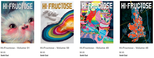


Daily Diary 23/04
Today I worked on making and sending my interview questions out to people
If I knew that I would be including generative art in my magazine I most likely would’ve gone with making it an interactive magazine instead as generative art links directly to coding, html and thus the internet, but I preferred the thought of having a physical copy of my magazine and didn’t know I’d be writing an article on it
Coming up with questions for Nora Zhao was also a bit difficult for me as I wasn’t sure what questions to start and end with, I think I did okay with adding introductory questions but I had no idea what to do for ending questions. I’m also worried I might’ve focused on her background a bit too much with the questions as the article loosely based on her is about generative art, but I think its mostly fine as well as the main point of the magazine is to ask about the artist’s background
Daily Diary 22/04
Today I called Creamers Printers to ask for recommendations for printing
I was told to have a 3mm bleed with single pages. I have to send it as a PDF and it will be digitally printed as I’m only asking to have two copies made
Interview 1 (Lynsey Moore)
audio file was over 50mb
Research Evaluation
Because of this research I now know a lot of things. I originally started with a multimedia magazine and am now just doing an art magazine, I know what I'm going to ask for from the printers and I know everything I need to for that, I know how much my magazine would theoretically cost and I know how other art magazines in the market look like so I can try to base my design off of that. I've also done research for all of the article topics so I know what I'm going to write for that. I feel confident enough to go into production now and will write my draft for my articles soon
-
Because I did research into various art magazines, I now know how many pages my magazine will be (12),
-
Because of the questionnaire I did I know what people want from art magazines and was able to use those answers and the research I did into other magazines to make my own magazine brand and logo. I also know the tone I will go with for the magazine because of all of the above and my focus group
-
Because of how many people I've contacted I've been able to already source 5/6 artists and designers that will be interviewed for my magazine. I did research into interview techniques so I should be able to interview them all efficiently as well. I also know what I can avoid because I did research into the laws & ethics of interviews
-
I chose the colours for the magazine based on the research I did about colour meanings
-
I know what to do when I get to designing my magazine in InDesign now that I did research into it
-
I know what I want from the printers and what to ask from them as I did research into printing, such as the bleeds and GSM I'd want for the magazine
-
I know what my target audience is now because of the pitch feedback and my research into art magazines usual target audiences
-
I know how much my magazine would cost (£9) now that I've looked into how much other art magazines cost
Daily Diary 24/04
Today I did research on how much magazines cost and colourblindness to see what colours I should try to avoid using together
I’ve also still been trying to find an art magazine reader I can interview, but I haven’t found much else. I tried the forums I mentioned previously again but most people on there admit to not reading art magazines and the few that do aren’t in my target audience regardless. None of the writers I’ve reached out to have responded still either, so I might have to go with my questionnaire answers for help on this one
Artist Profiles
I did research into every single artist I contacted, but I'll go over the artists that have been chosen to be in the magazine specifically to cut down on time. I did research to see if they'd be a good fit for my magazine's target audience and to see what I could base their articles on
-
Fantelle (@fantellerhur on Instagram)
-
Interview on the pre-production page, her article is on the history of pet art
Fantelle is an illustrator living in Ghent, Belgium. She takes commissions online and sells art on her Redbubble. Her portfolio and other social media links are all here. She’s currently looking for an internship this year and describes herself as a “2D generalist” on her Twitter
She was chosen very early into the unit and was the first artist I asked as we were already talking for other reasons. Because of this there wasn’t a main reason I asked her, it was more for personal reasons such as me liking her art a lot. The article I’m going to be writing loosely based on her was her idea and it was definitely something I wouldn’t have come up with on my own (history on pet art). Her art is very realistic but also painterly. As stated before her article was based on her own idea and from looking at the portfolio of her art that she gave me to work with, she has done a lot of pet art commissioned and for personal reasons. To put it in simpler terms, I found her art on a browser-based game and one of the prizes in it was art from her. I was able to claim the prize first and we started talking from there
-
How long have you been doing art online?
-
What’s your favourite thing to draw?
-
What’s your least favourite?
-
What are your main inspirations for art?
-
Do you think your background has ever been incorporated into your art? How so?
-
Do you have any pets of your own?
-
What was the first pet you’ve drawn?
-
Abbsterism (@abbsterism on Twitter)
-
Interview on the pre-production page, her article is on being a freelance illustrator
Abbsterism is a Kenyan-Guyanese illustrator, animator and graphic designer who lives in Pennsylvania. She’s a freelancer and is currently an art student. Her socials are on her portfolio and on it also shows her working on concept art and character designs as well
She was chosen as I was already a fan of her art and knew she’d most likely be able to answer my main question (about individual artist’s background). Her art is very cartoony usually but she can also do more realistic looking art styles as well. I first found her on tumblr and I knew she was a freelancer prior to this. Her article is on how to get into freelancing, so I tried to base the questions on that
-
Do you prefer drawing digitally or traditionally?
-
What’s your favourite thing to draw?
-
What’s your least favourite?
-
When did you first get into art?
-
When did you realise you wanted to do this as a career?
-
What would you say your main inspirations are?
-
Have there been times where you’ve put your background into your art? For example when I draw I usually end up drawing black people as that’s who I am
-
Do you have any tips for anyone who’d want to be a freelancer illustrator or animator?
-
Emily Zullo (@emilyzulllo on Twitter)
-
Interview on the pre-production page, her article is on the difference between animation and illustration
Emily Zullo is an independent animator living in New York. She also does comics and character & background design. She’s currently attending the School of Visual Arts to get her BFA in animation and is also looking for internships. Her portfolio is here and she sells comics and stickers on her store. She also has a LinkedIn page, Twitter and an account on The Rookies
I found her on a SpaceHey forum originally and she was posting her art on there. I chose her as I didn’t have an animator and knew I’d be able to write an article on the difference between illustration and animation, I’m also a fan of her work. She mainly does animation work but she also does her own comics, similarly to Abbsterism she also has a cartoonish art style. We agreed to make the interview about animation mostly, but I also wanted to add a few questions about her other projects
-
What’s your favourite thing to draw?
-
What’s your least favourite?
-
Do you prefer doing animation or comics?
-
When did you realise you were interested in animation?
-
Are there any differences in animation and illustration? Especially when doing character designs?
-
What are your main inspirations?
-
Do you think you’ve ever put your background or general life experience into your work?
-
What’s your favourite work you’ve done so far?
-
What would be your dream project to work on?
-
Nora Zhao (@norazhaodesign on Instagram)
-
Interview on the pre-production page, her article is on the generative art
Nora Zhao is a freelance graphic designer living in China. She’s mainly into generative art and has done multiple personal projects such as Machine Translation and The Letter Evolution. She has a bachelor’s degree in Business Administration, a postgraduate diploma in Design for Visual Communications and a master's degree in Graphic Media Design. Her socials are on her portfolio
I found her while looking for graphic designers on Instagram. I chose her as some of her projects (Machine Translation and Chinese Grid) directly linked into her background and where she lived, so I knew I’d be able to write something on that at least. She's a graphic designer and not an illustrator, but she seems to focus on basic designs for her work. I ended up going with generative art instead as she said that was what she was most interested in
-
When did you first get into art / graphic design?
-
What was your favourite project to work on?
-
What are your main inspirations?
-
I’ve noticed some of your projects such as Machine Translation and Chinese Grid are linked to how you’re Chinese, have you done any other works like that?
-
You’ve studied in both London and China, would you say there’s a difference between the two?
-
How did you first get into generative art?
-
What’s your favourite part about generative art?
-
Lynsey Moore (https://www.lynseymoore.co.uk)
-
Interview on the pre-production page, her article is on costume design and illustration
Lynsey Moore is a costume designer who lives in London. She likes both period and contemporary costume design and uses illustrations to envision her designs. She has a First Class BA Honours degree in Costume for Performance and has trained at the Royal Opera House and English National Opera. She currently works for television shows and has done work for shows such as The Curse and I May Destroy You. Her Instagram is also on her portfolio
She was coming to the college for an industry talk and I decided she would be a good fit for the magazine as she's an illustrator and while costume design isn't the first thing people think of when they think of an artist, she does technically count as one and that could be interesting to explore. I also chose her just in case I wasn’t able to secure all six artists in time. She's known for her costume designs rather than her art but her illustrations are featured on her website. I thought I’d be able to do an article on how she uses art for her work as there are some examples of illustration on her portfolio
I’ve already interviewed her, the “Interview Questions” section above was for her.
-
Alexandra Stan
-
Interview on the pre-production page, her article is on doing art as a hobby
The last artist is Alexandra, an artist who currently studies art and design in college. She doesn't post her art on social media but she showed me some of her art work
I went up to the art department in college and found someone who volunteered to be part of my project, but I couldn’t see the work she did until the actual interview and the only thing I knew was that she did it digitally on a tablet. The good news was that because the interview would be face to face, I’d have more time to be able to do another interview asking who she was before I go into the actual one. I originally planned to do an article about studying art in college, but I changed it to doing art as a hobby as it was something she mentioned
-
What art do you do?
-
How did you first get into art?
-
What’s your favourite thing to draw?
-
What’s your least favourite?
-
How do you feel about studying for art in college so far?
-
What career do you plan to get into?
-
What are your main inspirations?
-
Do you have any favourite artists?
-
Do you have any art pieces that are personal to you?
-
Are there any times where you put your background into your art?
-
Do you post your art online?
-
Are there any ways I can contact you afterwards?


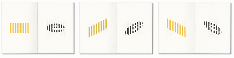


Bibliography
Abbott, M. (1970) Media Law Guidance. Available at: https://www.communityjournalism.co.uk/media-law-guidance/. Available at: 12.04.22
Addy, L. (2018) Animation vs. Illustration. Available at: https://www.fuzzyduck.com/animation-vs-illustration/. Accessed at: 15.04.22
Aesthetica. (2022) Aesthetica Issues. Available at: https://shop.aestheticamagazine.com/collections/aesthetica-issues. Accessed at: 24.04.22
Airey, D. (2009) Logo Design Love. [Ebook] Pearson Education. Accessed at: 28.03.22
Apollo. (2022) April 2022 | Apollo Magazine. Available at: https://www.apollo-magazine.com/issue/april-2022/. Accessed at: 31.03.22
Aston, D. (Year unknown) 10 Article Headline Examples That Got Us 10 Million Readers. Available at: https://www.incomediary.com/10-article-headline-examples-that-got-10000000-readers. Accessed at: 15.04.22
B&B Press. (Year unknown) Difference Between Matte and Glossy: Which Should You Choose for a Planner?. Available at: https://www.bbpress.co.uk/news/difference-between-matte-and-glossy-planners. Accessed at: 21.04.22
Bately, M. (2015) Brand Meaning. [Ebook] Taylor & Francis. Accessed at: 13.04.22
BBC Teach. (2019) Art and Design KS2 | Costume design | BBC Teach. Available at: https://www.youtube.com/watch?v=a7g58fEED_M. Accessed at: 25.04.22
Beneficial Shock. (2022) Magazines. Available at: https://www.beneficialshock.com/collections/magazines. Accessed at: 24.04.22
Bil'ak, P. (2013) Editorial. Available at: https://worksthatwork.com/1/editorial. Accessed at: 31.03.22
Bitesize. (2020) Five top tips for acing online interviews. Available at: https://www.bbc.co.uk/bitesize/articles/zxcy6g8. Accessed at: 07.04.22
Bitesize. (Year unknown) Legal issues – Media law, ethics and regulation. Available at: https://www.bbc.co.uk/bitesize/guides/zyt282p/revision/3. Accessed at: 11.04.22
Brabbu. (2016) Best Art Magazines Online. For Free!. Available at: https://brabbu.com/blog/2016/05/best-art-magazines-online-for-free/. Accessed at: 31.03.22
Calameo. (Year unknown) Graffiti Art 56 - Extrait. Available at: https://en.calameo.com/read/00546737179bde40f5ec8?authid=g4rkEUgWh0V2. Accessed at: 24.03.22
Canvas. (2022) Canvas – Art and Culture from Middle East and Arab World. Available at: https://read.canvasonline.com. Accessed at: 24.03.22
Canvas API. (Year unknown) Canvas API - Web APIs | MDN. Available at: https://developer.mozilla.org/en-US/docs/Web/API/Canvas_API. Available at: 16.04.22
Chan, G. (2018) 10 Golden Rules Of Personal Branding. Available at: https://www.forbes.com/sites/goldiechan/2018/11/08/10-golden-rules-personal-branding/?sh=6cacdefb58a7. Accessed at: 24.03.22
Chartered Institute of Marketing. (1998) Innovation in Marketing. [Ebook] Butterworth-Heinemann. Accessed at: 13.04.22
Ciszewska, Z. (2021) How To Work and Succeed as Freelance Artist in 2022. https://blog.displate.com/how-to-work-as-a-freelance-artist/. Accessed at: 14.04.22
Clemett, L. (Year unknown) Marketing Your Personal Brand With Your Own Magazine. Available at: https://theaudaciousagency.com/marketing-your-personal-brand-with-your-own-magazine/. Accessed at: 24.03.22
Collinge, R. (2017) How to Design for Color Blindness. Available at: https://www.getfeedback.com/resources/ux/how-to-design-for-color-blindness/. Accessed at: 24.04.22
Communication Arts. (2022) Magazine | Communication Arts. Available at: https://www.commarts.com/magazines. Accessed at: 24.03.22
Concept Art Empire. (Year unknown) Intro To Costume Design For Concept Art. Available at: https://conceptartempire.com/intro-to-costume-design/. Accessed at: 25.04.22
Contemporary Lynx. (2018) Issue 1 (9) 2018 - Contemporary Lynx - print and online magazine on art. Available at: https://contemporarylynx.co.uk/issue/1-9-2018. Accessed at: 31.03.22
Copyright. (2022) Copyright and Rights: The law. Available at: https://copyright.uk/legal-copyright-law.html?msclkid=90d243d0b89011ec8d0e3a1d519ecbdd. Accessed at: 10.04.22
Copyrightuser. (Year unknown) The Interview Tape. Available at: https://www.copyrightuser.org/educate/the-game-is-on/episode-3-case-file-27/. Accessed at: 10.04.22
CPC. (Year unknown) Saddle Stitch Versus Perfect Bound. Available at: https://www.cpcprintpromo.com/saddle-stitch-versus-perfect-bound/. Accessed at: 21.04.22
Crabit, R. (2019) How to Use Color Blind Friendly Palettes to Make Your Charts Accessible. Available at: https://venngage.com/blog/color-blind-friendly-palette/. Accessed at: 24.04.22
Creative Boom. (2021) Amanda Rach Lee on doodling, building an online brand and coping with millions of followers. Available at: https://www.creativeboom.com/podcast/amanda-rach-lee/. Accessed at: 24.03.22
Creative Boom. (2022) Art & Design Magazine for the Creative Industries | Creative Boom. Available at: https://www.creativeboom.com. Accessed at: 23.03.22
Creative Review. (2022) Sector: Magazine / Newspaper. Available at: https://www.creativereview.co.uk/sectors/magazine-newspaper. Accessed at: 24.03.22
Dazzle Printing. (2015) Which Magazine Binding Style is Best: Perfect Bound or Saddle Stitch?. Available at: https://www.dazzleprinting.com/which-magazine-binding-style-is-best-perfect-bound-or-saddle-stitch/. Accessed at: 21.04.22
Design Like a Pro. (2017) Let's Create a 3 Page Magazine Spread in InDesign. [Online Video.] Available at: https://www.youtube.com/watch?v=bjD4zhAvF7s. Accessed at: 14.04.22
Douglas, S. (2022) Introducing the April 2022 Global Interiors Issue of Wallpaper*. Available at: https://www.wallpaper.com/design/april-2022-issue-read-more. Accessed at: 24.03.22
Drew, J and Meyer, S. (2010) Choosing Color for Logos and Packaging. [Ebook] Rockport Publishers. Accessed at: 13.04.22
Dubroff, D. (2014) Animals In Art Down Through History. Available at: petslady.com/articles/animals-art-down-through-history-66242. Accessed at: 13.04.22
Ethan Becker. (2019) ILLUSTRATION VS ANIMATION. [Online Video.] Available at: https://www.youtube.com/watch?v=RX6Iaszmf_E. Accessed at: 15.04.22
Eye. (2022) Back Issues. Available at: https://eyemagazine.escosubs.co.uk/back-issues.htm. Accessed at: 24.03.22
Eyeyah. (2022) Issues Archives. Available at: https://eyeyah.com/product-category/issues/. Accessed at: 24.04.22
Fanimal. (Year unknown) The History of Pet Portraits. Available at: https://fanimal.online/the-history-of-pet-portraits/. Accessed at: 13.04.22
FeedSpot. (2022) Top 10 Art Forums, Discussions, and Message Boards. Available at: https://blog.feedspot.com/art_forums/. Accessed at: 21.04.22
Friedman, V. (2016) 50 Incredible Photography Techniques and Photo Tutorials. Available at: https://www.smashingmagazine.com/2009/04/the-ultimate-photography-round-up/. Accessed at: 16.04.22
Gateways. (Year unknown) Benefits of Art as a Subject and Hobby. Available at: https://www.gatewaysschool.co.uk/benefits-art-subject-hobby/. Accessed at: 25.04.22
GitHub. (2020) Exploring generative spaces: a quickstart to generative art - GitHub Universe 2020. Available at: https://www.youtube.com/watch?v=meqHPIOzk-U. Accessed at: 16.04.22
Government. (Year unknown) How copyright protects your work. Available at: https://www.gov.uk/copyright?msclkid=90d14f15b89011ec9d3265d414211645. Accessed at: 10.04.22
GraffitiArt. (2021) Graffiti Art 56. Available at: https://www.shop-graffitiart.com/en/graffiti-art-issue-56-xml-354-918.html. Accessed at: 24.03.22
GRAPHIC. (Year unknown) HOME : GRAPHIC. Available at: graphicmag.kr. Accessed at: 24.03.22
Graphic Design USA. (2022) Our February 2022 Digital Edition. Available at: https://gdusa.com/magazine/issuu. Accessed at: 31.03.22
Hi-Fructose. (2022) Hi-Fructose The New Contemporary Art Magazine. Available at: https://store.hifructose.com/. Accessed at: 24.04.22
Hi-Fructose. (Year unknown) Hi-Fructose - Volume 56. Available at: https://store.hifructose.com/products/hi-fructose-volume-56-pre-order?variant=32624570499169. Accessed at: 31.03.22
Hongkiat, L. (2020) 19 Free Online Magazines for Designers. Available at: https://www.hongkiat.com/blog/42-free-online-magazines-for-designers/. Accessed at: 31.03.22
ICA Commission on Map Production and GeoBusiness. (2012) Service Oriented Mapping 2012. [Ebook] Jobstmedia. Accessed at: 24.04.22
Incredible Art Department. (Year unknown) Art Magazine Links. Available at: https://www.incredibleart.org/links/artmags.html. Accessed at: 31.03.22
issu. (2022) Drawing Attention March 2022. Available at: https://issuu.com/drawingattention/docs/da_march_2022_current. Accessed at: 21.04.22
Jay, R. (Year unknown) 9 Video Interview (Zoom Interview) Tips to Help You Succeed. Available at: https://www.flexjobs.com/blog/post/8-tips-successful-online-interview/. Accessed at: 07.04.22
Jelprint. (2022) Printers in Luton - Jelprint. Available at: https://www.jelprint.com/home.html. Accessed at: 21.04.22
Johnson, C. (2019) Platform. [Ebook] Clarkson Potter/Ten Speed. Accessed at: 24.03.22
Juxtapoz. (2022) Juxtapoz Shop. Available at: https://shop.juxtapoz.com. Accessed at: 24.04.22
King Print. (2022) Printers Luton | Design & Printing Services. Available at: https://www.kingprint.co.uk. Accessed at: 21.04.22
Mann, A. (2022) Understanding audiences. Available at: https://www.artsprofessional.co.uk/magazine/article/understanding-audiences. Accessed at: 21.04.22
MasterClass. (2020) 8 Essential Portrait Photography Techniques and Tips. Available at: https://www.masterclass.com/articles/essential-portrait-photography-techniques-and-tips#8-portrait-photography-tips. Accessed at: 16.04.22
MasterClass. (2021) What Is a Costume Designer? Skills, Responsibilities, and How to Become a Film Costume Designer. Available as: https://www.masterclass.com/articles/what-is-a-costume-designer-skills-responsibilities-and-how-to-become-a-film-costume-designer#what-skills-do-you-need-to-be-a-costume-designer. Accessed at: 16.04.22
Mixam. (2022) Magazine Printing. Available at: https://mixam.co.uk/magazines. Accessed at: 21.04.22
Morrish, J. and Bradshaw, P. (2012) Magazine Editing. [Ebook] Taylor & Francis. Accessed at: 24.03.22
National Careers Service. (Year unknown) Video interviews: how to do well. Available at: https://nationalcareers.service.gov.uk/careers-advice/how-to-do-well-in-video-interviews/. Accessed at: 07.04.22
New Media Rights. (2017) Are interviews copyrighted?. Available at: https://www.newmediarights.org/are_interviews_copyrighted?msclkid=55b55490b89211ec9201285c1f68b028. Accessed at: 10.04.22Â
p5.js. (Year unknown) home | p5.js. Available at: https://p5js.org. Accessed at: 16.04.22
Paint Basket Art Forum. (2016) Best Art Magazines. Available at: https://paintbasket.com/members/index.php?topic=9197.msg186703. Accessed at: 21.04.22
Patterson, A. (2021) How to Work as a Freelance Artist. Available at: https://www.bestcolleges.com/blog/how-to-work-as-a-freelance-artist/. Accessed at: 14.04.22
Piehl, O. (Year unknown) What Can Writers Learn From Effective Magazine Headlines? Available at: https://coschedule.com/blog/magazine-headlines. Accessed at: 15.04.22
Printerland. (Year unknown) The Definitive Guide To Printing Paper. Available at: https://www.printerland.co.uk/blog/printer-buying-guide/in-depth-guide-to-printer-paper/. Accessed at: 21.04.22
Print on Paper. (Year unknown) A4 Magazine Specs. Available at: https://printonpaper.com/advice-guidance/a4-magazine-specs/. Accessed at: 21.04.22
Pulsio Print. (Year unknown) What are the Advantages of a Hardcover Book?. Available at: https://pulsioprint.co.uk/advantages-of-a-hardcover-book. Accessed at: 21.04.22
Rand, P. (2017) Design, Form, and Chaos. [Ebook] Yale University Press. Accessed at: 28.03.22
Satori Graphics. (2017) MAGAZINE LAYOUT IN ADOBE INDESIGN TUTORIAL - PHOTOSHOP & INDESIGN - Adobe InDesign Tutorial. [Online Video.] Available at: https://www.youtube.com/watch?v=xXKAhmT9GxU. Accessed at: 14.04.22
Sharma, P. (2020) Pursuing art as a hobby can be therapeutic and instructional. Available at: https://www.deccanherald.com/supplements/dh-education/pursuing-art-as-a-hobby-can-be-therapeutic-and-instructional-910796.html. Accessed at: 25.04.22
slanted. (2022) Magazines & Books by Slanted Publishers. Available at: https://www.slanted.de/publisher/magazines-books-2/. Accessed at: 31.03.22
Soo Hoo, F. (2018) The Unsung Challenges of Contemporary Costume Design. Available at: https://fashionista.com/2018/07/contemporary-tv-costume-design-challenges. Accessed at: 17.04.22
Spittel, A. (2018) An introduction to Generative Art: what it is, and how you make it. Available at: https://www.freecodecamp.org/news/an-introduction-to-generative-art-what-it-is-and-how-you-make-it-b0b363b50a70/. Accessed at: 16.04.22
StarNgage. (Year unknown) art.magazine's Instagram Audience Analytics and Demographics. Available at: https://starngage.com/app/id/influencers/art.magazine. Accessed at: 21.04.22
Taggart, E. (2020) Top 8 Art Magazine Subscriptions That Celebrate Creativity in Print. Available at: https://mymodernmet.com/art-magazine-subscriptions/. Accessed at: 24.04.22
Tailor Brands. (Year unknown) Is an Orange Logo Right For Your Business? Here's How to Check. Available at: https://www.tailorbrands.com/blog/orange-logos. Accessed at: 13.04.22
Tailor Brands. (Year unknown) Is a Red Logo Right For You? Here's How to Check. Available at: https://www.tailorbrands.com/blog/red-logos. Accessed at: 13.04.22
Tailor Brands. (Year unknown) The Meaning Behind Logo Colors. Available at: https://www.tailorbrands.com/logo-maker/logo-colors. Accessed at: 13.04.22
Traphagen, E. (2008) Costume Design and Illustration. [Ebook] Read Books. Accessed at: 26.04.22
Trull, S. (Year unknown) Strategies of Effective Interviewing. Available at: https://hbr.org/1964/01/strategies-of-effective-interviewing. Accessed at: 06.04.22
TYPEONE. (2022) TYPEONE Magazine — Issue 01. Available at: https://type-01.com/product/typeone-magazine-issue-01. Accessed at: 24.03.22
Verzosa, C. (Year unknown) 12 Tips for Making It as a Magazine Photographer. Available at: https://expertphotography.com/magazine-photographer-tips/. Accessed at: 16.04.22
Village. (2022) Design Magazines | Village. Leed, UK. Available at: https://villagebooks.co/collections/magazines/Design. Accessed at: 24.03.22
Walker, S. (2021) Top 10(+1) of the Very Best Contemporary Art Magazines. Available at: https://www.contemporaryartissue.com/top-101-of-the-very-best-contemporary-art-magazines/. Accessed at: 31.03.22
Wallpaper*. (2022) Wallpaper*: design, interiors, architecture, fashion, art. Available at: https://www.wallpaper.com. Accessed at: 24.03.22
Webmart. (Year unknown) Papers for Printing: Most Popular Paper Weights for 6 Printed Products. Available at: https://www.webmartuk.com/guides/papers-for-printing-most-popular-paper-weights-for-6-printed-products/. Accessed at: 21.04.22
WetCanvas. (2022) Search Results for 'magazine'. Available at: https://www.wetcanvas.com/forums/search/magazine/. Accessed at: 21.04.22