
Production Log (rough draft & video)
Daily Diary 10/05
Today I focused on editing the video for the art magazine
I was able to speak with Alexandra about sending me her art, she said she'll be able to send it to my email by today. I wasn't planning on editing the video today as it wouldn't leave me with much to do in the next two weeks, but I wouldn't be able to do an actual QR code that links to the video without it. I still have to do research on how to do that and I wasn't able to complete the full video in the four hours I had to work on it, so I still need to revisit it this week while also finishing my magazine at the same time
Magazine Page Inspiration Board

I was able to do a moodboard of different magazine pages (I looked at a wide range of them from art magazines, graffiti magazines and even a few gaming magazines like the one for the Dreamcast) so that I’d get different layouts and designs. I also feel like looking at art magazines, an overwhelming majority of the market being fine art magazines, may have tampered with my perception of what layouts I could do for my magazine. I knew what aesthetic I wanted for the magazine already so I didn’t really include it in the moodboard, especially since I was focusing on single page layouts
I noticed that with some of these (the ones for ImagineFX especially) you could tell which pages belonged to a singular magazine brand. ImagineFX has these borders and coloured lines for almost all of its pages and Illustoria uses bright colours for many of its pages. This allows the magazines to sometimes experiment with their pages and change layouts while still feeling cohesive
Leonkeer. (Year unknown) Graffiti Art Magazine Guide 2021. Available at: https://www.leonkeer.com/graffiti-art-magazine-guide-2021-leonkeer/. Accessed at: 11.05.22
Paperspecs. (Year unknown) The Power of Magazine Illustration. Available at: https://www.paperspecs.com/caught-our-eye/magazine-illustration/. Accessed at: 11.05.22
Pocketmags. (2022) ImagineFX - July 2022 Subscriptions. Available at: https://pocketmags.com/imaginefx. Accessed at: 11.05.22
Shenmue Dojo. (Year unknown) Shenmue Dojo. Available at: https://shenmuedojo.com/media/dreamcast-magazine/dreamcast-magazine-uk-december-2001/. Accessed at: 11.05.22
Stylefile. (Year unknown) Urban Media Graffiti Art #55 - France. Available at: https://www.stylefile.es/en/urban-media-graffiti-art-%2355---france-magazine/P.MA22255.html. Accessed at: 11.05.22
Daily Diary 11/05
Today I continued designing the rough draft for my magazine
I'm not really happy with my design so far. I felt like none of the pages really went together and wasn't sure how to fix it. I looked at a few art magazine pages and felt slightly inspired by the pages in Illustoria, a children's art magazine. I also looked at a few of the previews available of ImagineFX. I feel like the problem is that I based my magazine designs off of fine art magazines (to be fair they are the most prevalent art magazines) and therefore all the pages felt boring and basic because of it. I mainly felt that the magazine design so far was very inconsistent and didn't have its own identity. I was following the sketches I made for the pages and it still didn't end up working out, this might be because of the fonts I've chosen. I feel like I've wasted a day
Tuesday 24th 4:45pm - deadline for printing
Daily Diary 12/05
Today I continued designing, I'll come in tomorrow at 9am to finish the rough draft. I have to prepare questions to ask the focus group on Saturday but I have to finish the rough draft before doing that
After making the moodboard and looking at a few physical magazines from the art department in college, I feel much better about designing the magazine. I was able to look back at references easily because of this as well and I had a few ideas for the pages that I was able to do correctly (for example I was able to incorporate a few "house styles" into my magazine that helps unify the magazine together), the table of contents came out differently than what I was aiming for but I still like it. I was also given a physical guide of InDesign that I'll be able to look through over the weekend
I started on my generative art article today as well, I knew it would take the longest which is why I wanted to leave it closer to the end. Its been fun so far but I find doing the production log to be a little bit annoying as I know most of what I'm doing (especially for Photoshop) so I have to check if I put it in the production log already. I have to write my editorial notes as well but I still want to leave it to the very end
Daily Diary 13/05
Today I finished designing my rough draft
I spent the first two hours editing the generative art article and I liked how it turned out but I'm worried about the text font being a bit too unreadable because of how skinny it appears. I also have a similar worry with the concept art page as well, on Photoshop it looks just fine but on InDesign it looks really jagged and off putting. I don't know if this is simply a view issue (if I make the view 100% on Indesign the generative article looks pixelated and low quality but on 75% it looks just fine) or if its a genuine problem with how I cut the image on Photoshop
Rough Draft Questions
1. Do the pages feel consistent enough? Or are they all too distinct?
2. If so, is there a way you’d suggest to unify the pages together more? (like with the magazine name being at the bottom of each page for example)
3. Are the pages too simple?
4. Does the text go too low on some pages?
5. Do any of the fonts clash too much?
6. Is the text wrap around images too close together in some pages?
7. I am least happy about the last two pages (hobby article & Alexandra Stan pages), do you have any suggestions on how I could improve these two?
8. Are the adverts (WHSmith & slanted) in the magazine too simple?
Daily Diary 14/05
Today I made my questions and sent an email asking the magazine designer about my rough draft
I was in a bit of a rush to screenshot all of the pages I worked on yesterday and I ended up screenshotting a double page spread while a strange glitch happened, it wasn't too bad though as I was able to crop it out and the pages looked normal afterwards. While looking at the pages I noticed that the mascot will appear in every single page, which I'm happy about. I wanted to feature them in at least most of the pages. I also found writing the questions easy as I had much more to ask about this time
I sent the questions over to Goodness Okoro today. I'm a bit concerned about her as she hasn't responded to the previous email I sent to her showing my rough draft, but that might've been because I had to send the entire project file to her instead of pictures like this time. I also didn't send a reminder as by the time I could I was already back to designing the magazine more. I may have to find another magazine designer to critique my final product just in case. I also sent an email to Alexandra asking for more of her art to put in the table of contents (each artist had different art for their page and the table of contents but her) and she said she'd send it to me later today
Rough Draft
Before 16/05
Updated
InDesign in easy steps
The book mainly goes over the basics and tools that InDesign has, but doesn't show everything as this is meant to be for beginners after all. I read the InDesign book by Robert Shufflebotham and found out about a few key details
I didn't know that while using the zoom tool the smaller the selection, the more it'll zoom into something. This happened to me a few times while I was designing my magazine to the point where I didn't bother using the zoom in tool and instead manually used the zoom on the bottom right corner, so it's good to learn why that was happening
I also learned about live corners, this allows you to change the corners on a shape to make it more rounded. I'm not sure if I'll use that but I'll try it tomorrow and see if it works
I found out about space before/space after for paragraphs in the same text box as well, I originally made the spaces in between paragraphs have a bigger tracking to do this but tomorrow I can go back and use the proper tool for that
I read about drop caps, which is something I tried out previously for my magazine using character styles instead, but I didn't like how it looked so I won't be using it anyway
There are actually clipping paths in InDesign as well. I've currently been editing the sketchbook in the costume designer page to be transparent in Photoshop, so hearing I could've done it in InDesign instead is new to me. Looking at the process though, on InDesign it's much more automated and I don't think I would've got good results using the built in clipping paths because of that. The picture of the sketchbook was originally taken with a white background (something the book says is preferable) but the pages of the sketchbook are also white so I think in the end its better if I continue with Photoshop for this
There's a spell check system, this is accessed with Edit > Spelling > Check Spelling (its recommended to check Edit > Preferences > Dictionary to make sure its the correct language before doing this). There are many options on what InDesign can spell check, but I'll most likely be using Search: All Documents. I'm fairly confident that everything is spelt correctly but I can never be too sure
I can insert tables by going on Table > Insert Table, I briefly considered doing the layout of the Nora Zhao page this way (besides the hobby & Alexandra pages, Nora's page would be the one I'm least happy about) but decided against it pretty quickly. There's a lot of text in that page and I don't know if I'd be able to fit them all in one page if I used tables
When printing I should talk to Creamers Printers about which transparency flattener (in advanced category) to use since I've used effects such as glow and gradient feathering in my magazine. I'm going to be sending this as a PDF to them so I hopefully won't need to send the printer fonts to download. There are two main qualities, print and press. Printing quality is for PDF's that will be printed while press quality is higher quality and generally looks more like the original file, its obvious what I'll pick just from the names. To view the PDF after exporting it I can select View PDF After Exporting on the Options section
Daily Diary 16/05
Today I tried to add more to my rough draft and then showed it to my focus group, I'm waiting until tomorrow so I'll hopefully have more than one response. I'm going to have to call Creamers Printers again on advice for what to do about the transparency flattener
For the editorial notes page I was originally planning to design the page like a forum post, however while I was designing it I wasn't satisfied with it and scrapped the idea. I took inspiration from one of the pages in my moodboard and I think I prefer it. I'm not sure if I'm going to put the photo of me in the magazine anymore as I feel it might not fit the magazine? I think art of me might work better than a real life photo of me as it'd fit the mascot, but I'm also not completely sure on it yet
I mainly came to college to work on the last two pages for my magazine though. I made the Hobby article page better as there wasn't any overset text on it anymore, but I feel like it looks kind of bland now that the handmade style of the page is gone. When I got to the Alexandra Stan page I realised I wasn't sure what I wanted to change from this page at all, only that I didn't like it as much as the other ones
I started sending placeholder images to the artist that'll be doing the art for the mascot in the pages, these placeholder images are the exact width and height I wanted the images to be and had small sketches/text of what I wanted her to draw. The images themselves are a bit basic and difficult to discern but this was because while making them I had to go quicker because of how late it was and we were right next to each other so I was able to explain to her in person what I wanted. The only ones I haven't sent to her are the editorial notes image and the front cover as I'm not completely sure what I want from them yet and will hopefully send her what I want from them by tomorrow
The physical guide I was given helped much more than I thought it would, especially since a lot of the book covers the basics of InDesign that I'm already familiar with. It also gave me an idea I wasn't expecting which is to use live corners to round out some of the elements in my magazine more and introduced me to parts of InDesign I didn't realise were there such as clipping paths and drop caps. I didn't expect the guide to have info on printing and PDFs as well so it helped me a lot in that regard as well
I also realised throughout the entirety of production I haven't went back to my questionnaire responses. This is mainly because the questionnaire was about the branding of the magazine and thats it, but I didn't design with the questionnaire responses in mind which was my mistake. I'm not sure if I can change it now that it's so late in production either (especially since the main problem with the responses was the lack of pages in my magazine to accommodate having so much art featured instead of text)
I delayed the focus group for this long because I wasn't able to actually finish all of the pages (the last two & the editors note page), I didn't want to show them something I'm not already okay with. I probably should've shown them before today so I'd have suggestions on what to change, but I'm coming in tomorrow anyway (and on Wednesday & Thursday as well of course) so I don't think its an issue. I'll analyse the focus group tomorrow as they have different timezones than me and take awhile to respond because of that
The main thing I'm worried about now is audience feedback as I planned to get much more than what I currently have, it might be the one thing holding me back from the highest grade if I had to guess. I showed my "mock up" to Emily Zullo and the magazine designer awhile ago and neither of them have responded still. I'm less concerned about Emily as I imagine she was simply curious about it but if it takes the magazine designer that long to respond to me, then I might have to find someone else. It's a bit late for it now but I plan to get as many magazine designers to look at my final design as I can to try and get more feedback. Throughout this entire project I've struggled with finding people who are quick at responding to me, so much so that it's a little frustrating
Progress Review Feedback
My teachers looked at my magazine and had a few suggestions on things I could do to make the magazine more consistent and also general suggestions I can do
- The WHSmith ad can have sketches of the character to the right side of it to fill in the dead space
- The slanted ad might not be suitable for the target audience
- The right page could be a solid block colour as a house style
- The A-master at the bottom of each page can have "[subject] interview" to differentiate from each page
- A small circular picture next to the artists names of their picture
- Adding captions to the images about the art
- Adding more HTML elements in the generative article
- Possibly changing the concept art page to have Lynsey Moore's concept art instead of the mascot
I can change the slanted ad into something else, I'm not sure what I could change it to though. I was thinking the magazine Illustoria but that art magazine's target audience is too young and I haven't come across any other art magazine that wasn't aiming for a target audience that's too old or isn't compatible with mine. I don't want to do another art supply as well as there's already one in the magazine. For the WHSmith ad I think I'll be able to do that, but my only issue is I'd have no idea how I'd achieve a sketchy looking style digitally as the image for the WHSmith ad was a photo taken from a drawing I did in my sketchbook
I tried having a solid block colour for all the interview pages but there were some like Abbsterism's page that I didn't like it in that much, there are so many colours in the art I used for her page that its a little hard to get one colour that feels consistent. I can do the A-master suggestion just fine but I worry that it might clutter the page a bit as there are some text that go quite low in the page
I'm not sure with having a circle picture next to the interviewee's names since I'd have to find an image of each artist, which is something I can't do for some of them (Alexandra is the first that comes to mind). That's also the same with adding captions, I thought about doing it while designing my rough edit but I realised that'd mean I'd have to know where each image comes from and for some of them (especially the art) I don't. I can add more HTML elements easily, like with adding paragraph brackets, and for the final suggestion I'm not sure if I want to do that. It'd make the pages flow better together though so I might, I liked how it currently shows the concept art for the mascot but I understand that it doesn't read that way as well
Focus Group (rough draft & cover art)
I showed the focus group the rough draft I had from yesterday and got multiple responses. I asked them the same questions I sent to the magazine designer
1. Do the pages feel consistent enough? Or are they all too distinct?
2. If so, is there a way you’d suggest to unify the pages together more? (like with the magazine name being at the bottom of each page for example)
3. Are the pages too simple?
4. Does the text go too low on some pages?
5. Do any of the fonts clash too much?
6. Is the text wrap around images too close together in some pages?
7. I am least happy about the last two pages (hobby article & Alexandra Stan pages), do you have any suggestions on how I could improve these two?
8. Are the adverts (WHSmith & slanted) in the magazine too simple?
For the first question everyone agreed that the pages look consistent, 1 and 5 said that making the heading fonts match would better unify it though. I'll try it to see if it works in the magazine, part of the aesthetic was having mismatched fonts and I think it works for the interview & table of contents pages but for consistency the headings might be better being the same one or two fonts instead
1 made suggestions with the 3rd question which I've implimented into the magazine now, the reason the editorial notes page had such a big box was because I was thinking of adding art to the editorial notes instead of my picture but after thinking about it I've now gone back on that. 5 said the pages feel crowded due to the font size and spacing, I unfortunately can't do much about the font size now as it'd be much too long to change and some pages would have too much text to be able to design around. They both also mention the text and margins at the end of pages being too close together like with the 17th page (Alexandra) for example, I also agree with this and have now edited it to not be so close
5 says that the pages dont match eachother, which is a sentiment I've heard echoed alot throughout the entirety of production. At this point I'm worried that its a bit too late to heavily modify anything but I was recommended to have the interview pages have a different background than white to make a house style with that, this is something I'm currently trying out. Everyone agreed that the text wrapping and ads were fine
2 suggested it might be better to use different artwork entirely for the Alexandra page. 2 also mentions doing might match the creme tones of the magazine, but considering I'm making the interview pages have a solid colour background now that most likely won't be the case anymore. I've thought about using different art instead already and have sent her an email asking for her artwork again, but she hasn't responded yet and it might be a bit too late to use something else now. I think the suggestions given already help though
I then showed them concept art of what the front cover could look like. I was biased towards 5 as I felt it was the most interesting and fun, but similarly to my mascot design I wanted to show the other concepts to the focus group to see if my target audience would like something else. In the concept art I showed them, 3 is crossed out as I ended up not liking it and felt it was too out of place for the magazine. I also added reasons as to what inspired me while making these
I agree with what 5 said about it, however the general consenus was that 1 was more preferred. I also asked 3 on which one they liked the most and they agreed on 1 which cemented the vote. I feel like 5 might be a missed opportunity and I could always just go with 5 anyway, but I wanted to stick with the vote instead since its more popular


Sourcing Art in the Magazine
I received the art back from the artist who's doing the mascot art for the magazine, I asked my friend who's doing art in my college to do it (she asked to be called Phos in the magazine). She used a brush that I'm a bit worried will come out pixelated in the final print of the magazine, but I think it should hopefully come out fine especially since she sent me the PSDs she was working with (meaning that this is the highest quality I can really get). I chose her instead of anyone else as she has a cartoonish art style that I think will fit with the mascot's design. I had her do all of the mascot art in the magazine aside from the WHSmith ad and the sketchbook in the costume design magazine, as I had already did that art
Speaking of art in the pet article, I tried to add a caption below the art featured in that page but I felt that I didn't know enough about where the pictures came from to properly add them. I quickly looked at art magazines that do this (Canvas mostly) and they show who made the subject featured, where they might've done so, what time period they did and even what camera was used to take the photo. I just didn't have all of that information. I do agree that adding captions would make the magazine overall much more better and professional though so I'm upset that I'm not able to include any. The cave canem artwork came from Poetry Foundation and the renaissance picture featured is from Kathleen Walker-Meikle's book, Medieval Pets

Daily Diary 17/05
Today I worked on the magazine with the feedback given by my focus group and my teachers
I'm worried I might not have much time left as next week has the deadline for publishing and I find myself only working on the magazine still, which is concerning as I haven't worked on the video since the 10th. Tomorrow I plan on solely working on the video and spending much less time on the magazine as its mostly done now and I've worked on it for so long that I'm genuinely getting a bit frustrated with it. The deadline for production is at Thursday 6pm and I'm honestly not sure if I'll be able to meet that deadline while making all the changes suggested from the feedback
I showed the focus group my rough draft yesterday night but analysed the responses now as most of the respondents live in a different time zone and I quickly showed them the cover art today as well. I've been able to make some of the changes suggested to me from both the teachers and the focus group such as with spacing and making some pictures smaller. Speaking of feedback from them, since I'm quite stressed for time I'm not sure if I'll be able to try out all of the suggestions given by my teachers. I agree with some of their points such as with the WHSmith article but I'd rather get the video done than worry about that
I also emailed many magazine designers today. I found them by using upwork, this is how I found the magazine designer I was talking to previously. All of these designers have done magazine layouts before and according to the upwork website take below 24 hours to respond to requests. I first emailed Russel C as he is a self described magazine expert and specialise in print & layout design (these are tags on his page, this is seen by scrolling down to the bottom). I then moved onto Dawn L, she's been a graphic designer for over 35 years and has worked in various designs including print and magazines. Stephanie R is more specialised in general printing works but has done magazines so she might be able to help m more when it comes to any problems I might have with printing. I found other designers on the website who I wanted to contact but they didn't link to external portfolios or websites I could contact or see their work on

Daily Diary 18/05
Today I worked on the video for the art magazine and made some tweaks to my magazine such as changing all the heading fonts for each article to match for each other (except the generative art article)
I also tried to make the paragraph style more unified as I've noticed for awhile that they're all varied. I tried out sections to have a "[section] interview" like my progress feedback suggested but it didn't work out as I can't add multiple sections between a double page spread, for example both my pet article and fantelle interview would either have "pet article & pet interview" or "fantelle article & fantelle interview" and while the first option could work, I'm not sure if I like it or not
I woke up to three emails back to me with all of the designers saying they'll do feedback so that's a good sign. I'll send them all the final magazine edit when its done which should hopefully be by tomorrow or Friday at the latest. I might also try to email a few video editors as well for the video I'll be doing. Alexandra also sent me more of her work I might be able to use for her magazine page instead
So far I'm not proud of how my video looks at all, despite my target audience catering to teenagers I still think the video looks too unprofessional. While working I realised I should've done more to prepare for this. I only planned to do a video after researching was already over so I unfortunately couldn't do much at the time, but I should've at least looked at some videos from art magazines or some how-to guides as while I was editing the video I realised I didn't know what I was doing. I can still work on the video tomorrow though, which gives me time to look at some videos after college to get a better idea on how I should be editing this. I also think I should add a section at the beginning telling the viewer what the technique is and possibly where its used as well, but I'm not sure if I'll have enough time for that seeing as I only have tomorrow and Friday
While making the video I followed the fonts already used in the magazine and chose the more important ones (heading & subheading and master/footer font) throughout the video. Unfortunately the font used for the master isn't available so I had to use something similar
I called Creamers Printers to ask about the transparency flattener, how much it'll cost and where I'd be able to pay afterwards. They said that since I'm using InDesign the photos should flatten automatically. I relayed the information I've gotten by my previous calls from them (20 page magazine, two copies and digitally printed) and they said the magazine should cost about £30 and I can pay for this online
Drypoint Video
Thumbnail

Daily Diary 19/05
Today I finished my video and I've almost finished my magazine. I guarantee you if I had the regular hour left I would've been done today, which is a shame as it means I have to come in tomorrow for around 30 minutes just to finish this
While working on the video I liked it much more and I now think it looks better, the only thing I'd say about it if I had to say anything is that the animation for the "what do we need" part of the video is a bit stiff and that the video might look like its a bit too childish even if they are my tertiary audience. I do like the video a lot more though, I searched drypoint videos online and tried to make the thumbnail look similar to theirs (some even have clearly randomly generated thumbnails, they're all very basic). The art of the mascot at the beginning was actually supposed to be used in the pet art article but there wasn't enough space to include it and the QR code together in the page, I also thought it looked better with it being in the video instead
When I tried to use the QR code converters I found in the pre-production page for the video they either didn't support videos, said my file size was too large or said I had to have a premium membership to continue. This is the only thing that slowed me down at the end and if I was able to do this, I wouldn't need to come back tomorrow. As you can tell I'm not thrilled about it but it does give me a lot more time to finish things I guess
I also found out while exporting that the InDesign automatically upscales images to 300dpi when exporting to PDF, so that technique I've done where I upscaled all the images manually in Photoshop actually means nothing. Before this I double checked to make sure all the images in the InDesign file were 300dpi and some of the images automatically went back down to 71dpi anyway. When updating files in InDesign it can sometimes cause the text wrap around it to automatically reset to default (for example images go back to text going over the image instead of being wrapped around it), so that means that me upscaling the images manually has actually hurt me and wasted more of my time than benefited me. I'm not too mad over this though as it's easily fixable and don't really matter in the grand scheme of things
The good news is the magazine is done and I don't need to work on it anymore aside from putting the QR code into it, so I'll be able to quickly finish this tomorrow. I'm also waiting until tomorrow to finish my editorial notes as it doesn't feel right to do it when the entire project/magazine isn't "technically done" yet
Production Log (final)
Final Magazine
From 20/05
Updated
Daily Diary 20/05
Today I made a QR code for my video (I had to make an account on Scanova to do this though), put it in my magazine and wrote the editorial notes. This means I've completely finished my magazine now. I sent emails to everyone who's been interviewed in said magazine (except Lynsey Moore as she doesn't have any social media links that accept messages from me), the four magazine designers who agreed to critique the magazine and Creamers Printers
The first time I exported the magazine I noticed that the text wrapping on the costume design article wasn't there anymore, causing the text to go over the sketchbook. It was a good thing I caught it at the time as that definitely wouldn't be acceptable but I missed one thing after that. While at home writing the emails I realised a crucial mistake in the PDF, the Lynsey Moore page has a white line in the background. I don't think this will be too detremental to the physical copies as the binding will most likely cover that, but it's still an awful mistake on my part. The next time I'd be able to edit this is Monday and I obviously can't wait that long, so I have to send the current version of this PDF. I understand how I was able to miss this though as this is how it looks on InDesign
I'm aware this isn't a good start to the last diary entry of production. Anyway though I'm glad this is all finally over, I want to say I had a lot of fun doing this but that'd be a lie. I did mostly have fun designing the pages and doing this has taught me that I actually really want to work with publishing and printed media, but for the past few weeks I have spent ages working on and stressing over this project. I desperately want to get the highest grade and I think that very much shows with how much effort I've put into this, but yesterday I came to the realisation that its okay if I don't. It's fine if I only get a merit for this, I have made mistakes throughout this project and sometimes I reflect on myself and I'm not sure my technical skills are good enough for a distinction yet anyway. The world won't come to an end if I don't get the results I wanted and there's always next year. It will if I only get a pass for this, though I'm aware I'm way past that (hopefully)
I still feel like I should've tried to contact video editors and article writers (although from experience, none of them like to answer back much) but I don't think there's much time for that anymore.. And magazine designers are the most important ones for audience feedback to me as that's the main reason I chose to make a magazine. I emailed the magazine designers a PDF of the magazine and also an imgur link that contains all of the magazine as a picture, I also gave them a brief introduction as to the magazines general goals, target audience and how much I contributed to it (basically all of it). This is generally what all the emails I sent to them look like
I'm still anxious that printing will go terribly as I only really have one shot to do this. I was told that local printers were the best choice as they'll be the quickest but I'm not sure how fast they'll be or how well my magazine will turn out.. In my original pitch I gave myself two weeks for this so I'd avoid this issue but that didn't go as planned and now that I think about it, that probably wasn't possible anyway


Daily Diary 23/05
Well. Today I got an email back from Creamers Printers that said I had to add a 3mm bleed to the magazine before they exported, so I quickly came into college to do just that
I originally had a diary entry for today written out already as I work on my diary throughout the day, but I deleted it because I think to truly understand what happened today I have to write it out more narratively so it's more understandable what happened
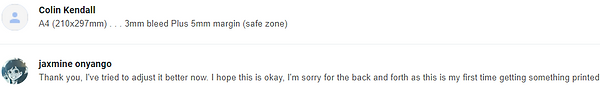
I sent an email to Creamers Printers through their Contact Us page on Friday like I said in the previous entry but decided to send another email to them on Sunday as I realised I couldn't send them the PDF on their page. Skipping to Monday, it was 12am and I was in my bedroom doing nothing. I suddenly got an email from Creamers Printers saying this
One of my younger brothers gets picked up at 12am so I quickly got dressed and went to college to try and fix this. I realised I forgot to add Marks and Bleeds while exporting the PDF (as I had added that when I originally made the InDesign file but not the PDF) so I exported it with a 3mm bleed and still got an email back saying that I didn't do the bleed right. For context, my magazine on my InDesign file looked like this (the pink square around the page is the 3mm bleed)
I knew what bleed was already and I made sure to design with that in mind, so I didn't understand what he meant. I was starting to panic from this point forward so I showed one of my teachers the email and my InDesign file and she agreed that she didn't understand what they meant either. I was recommended to ask what the dimensions were for the printer as it might help me better understand
I adjusted everything (text, the lightbulb in Emily Zullo's page, some of the doodles on the hobby article page, ect.) and the A-Master / Footer on all of the pages to be in the safe zone that was described. I decided to remove the black line that was on the A-Master as suggested as I was already confused enough as is and it wasn't working with the printers, I made the back page line thicker as suggested as well since I didn't want to get rid of that
I was starting to give up at this point as it was starting to get too late for me to stay in the college. I tried to call them as the PDFs I sent them still weren't working and I got through to them a few times but was hang up on multiple times so they could accept a different call, which was also very demoralising. In the meantime I tried to focus on finishing other various tasks on my FMP page and quickly do more research about bleed to see if I missed something the first time, but these were all things I knew already. It wasn't until 5pm (one hour before college closes) that I quickly looked through my entire InDesign file did I realise what was wrong. The white pages (freelance article, animation vs illustration article, editorial notes & table of contents) didn't have any bleed
As you can see by the time, I didn't have anymore time left to try and make changes or updates to the magazine so if this didn't work I couldn't get it printed on time. I was very anxious at this point because of that and because of the terrible impact that possibility would have on my grade. I hope this has been obvious throughout the course of this unit, but I have tried extremely hard with this magazine, including coming in almost daily to work on it. At the end of the day I get the grade I get, but at this point I was worried I wouldn't even get a pass for this. After sending those emails I had to leave, I couldn't stay in the college for any longer as 6pm would be when it shuts. While I was preparing to leave the college I got an email on my phone
I was so relieved afterwards. I emailed them back saying thank you and sorry for my mistakes, later on I got an email back saying that the magazine is now ready to be collected for tomorrow
This entire experience was very very stressful for me, I almost walked out of the college scared that I'd have to suddenly put the magazine online instead. The wording from Creamers Printers also didn't really help me much, there was bleed on most of the pages but he kept saying there wasn't on any of them which was really confusing. He also said the bleed was too thin, at the time it really confused me but now I understand what he meant. He meant this page specifically as I used a gradient feather on the image being used for the background. I don't blame him much as I don't think he fully knew what was going on either
In the end it turns out I made a very simple mistake, if I noticed this earlier I probably would've been able to get the magazine today and left 30 minutes after I arrived like I planned. This is my first time getting something printed so I'm not too angry at myself over making a mistake. I'm still glad I did the prior research to this as I was able to give them the GSM, book binding and finish I wanted with no complaint (180GSM for covers & 130GSM for inserts/pages inside, saddle stitched, glossy finish)
The good news about this as well is that I already have my audience feedback and was thus able to make some of the small changes that were included in it, I was also able to fix the white line in the Lynsey Moore page. Because of the "safe zone" the printers told me about, I was able to adjust accordingly to that and this experience forced me to work with the printers on designing the magazine. To be fair I was already doing that, but I didn't know about the safe zone while designing (although now that I checked the InDesign file the columns are automatically operating on a 5mm safe zone anyway)


Bibliography
Amazon. (Year unknown) Medieval Pets: Walker-Meikle, Kathleen. Available at: https://www.amazon.ca/Medieval-Pets-Kathleen-Walker-Meikle/dp/1843837587. Accessed at: 17.05.22
Jess, T. (2016) Cave Canem at Twenty: Reflections From '96. Available at: https://www.poetryfoundation.org/harriet-books/2016/11/cave-canem-at-twenty-reflections-from-96. Accessed at: 17.05.22
Leonkeer. (Year unknown) Graffiti Art Magazine Guide 2021. Available at: https://www.leonkeer.com/graffiti-art-magazine-guide-2021-leonkeer/. Accessed at: 11.05.22
Paperspecs. (Year unknown) The Power of Magazine Illustration. Available at: https://www.paperspecs.com/caught-our-eye/magazine-illustration/. Accessed at: 11.05.22
Pocketmags. (2022) ImagineFX - July 2022 Subscriptions. Available at: https://pocketmags.com/imaginefx. Accessed at: 11.05.22
Shenmue Dojo. (Year unknown) Shenmue Dojo. Available at: https://shenmuedojo.com/media/dreamcast-magazine/dreamcast-magazine-uk-december-2001/. Accessed at: 11.05.22
Stylefile. (Year unknown) Urban Media Graffiti Art #55 - France. Available at: https://www.stylefile.es/en/urban-media-graffiti-art-%2355---france-magazine/P.MA22255.html. Accessed at: 11.05.22