
Production Log (bracelets)

magic wand tool
I first downloaded the template I found from researching how I'll be designing my bracelets. Since the image isn't transparent, I had to cut the shapes so I could start designing on them. I used the magic wand tool to select the boxes and pressed the delete key on my keyboard to erase them. I had to heavily lower the tolerance to 5 for the boxes to be selected properly
Daily Diary 07/02
Today I've started on production, I still have a few things to correct for my pre-production though (descriptions for brochure, colour swatches)
While my pre-production was checked, I was given some feedback on my double page spread mock ups and colour swatches. My colour swatches were originally going to be different colours for each medium but I was told that having a consistent colour palette would be better as it'd be easier to tell that they were all marketing one event
Originally I wasn't planning on having much text for my brochure due to not having much on my brochure mock ups, but I got feedback that the whole point of the brochure is to have more information and my mock ups looked more like a poster without it. Before designing my brochure I'll have to write some small descriptions about Parklife for it
When I was writing my magazine article I struggled on what to write for it since I only had the line up, but I was recommended a few things to talk about: no camping rule, nearby facilities/bars, VIP experience and accommodation recommendations
I was also told that my best double page spread mock up was the one I was planning to go with (bottom right). I said that I was planning on changing the picture because I felt like I needed to use an image with more colour, but was told that they really liked the image used for it. Since I've changed my colour palette to be more consistent (black, red & slightly off white) it would be fine if I used it instead of the ones in my image justification
Daily Diary 08/02
Today I continued designing my bracelets
I'm worried as I still haven't finished them yet and I was meant to start on my brochure today, but I'd rather get the bracelet designs finished first since I have to get them made elsewhere that likely won't be in the UK. I think it should only take an hour or two tomorrow though as I only have to design two more of them and they're both half done already
I wanted to get feedback on the bracelet designs but since I have to finish them by tomorrow and then immediately send the designs out to someone who can make them, I likely won't be able to implement any of the feedback in them
Bracelet Designs


Production Log (brochure)
Daily Diary 09/02
Today I finished my bracelets and started designing my brochure. I have to come in tomorrow so I can finish my brochure design, after tomorrow I have to send my current designs to the designers for feedback
I feel like my bracelet designs are alright, I think some are definitely better than others though. Halfway through designing I felt burnt out and ran out of ideas, which is definitely apparent. I know that this is an issue designers can face often, but from what I remember the best ways to get out of it (take a break or look at others for inspiration) I've already done one and I don't have the time to do the other option. The designs I finished aren't sorted in chronical order, I started the first design but halfway through got an idea for the second one so technically the design on the top was the last one I finished. I also didn't know what to do for the bottom design either
Since I'm adding text to my brochure now, when it came to designing it I didn't really know how I was going to lay it out. I should have an idea of how I'm doing it by tomorrow but when it came to designing it today I mostly focused on editing the images used for it, since I knew I wanted to do that anyway
Brochure
Daily Diary 10/02
Today I finished with my brochure, I stayed as long as I could for it
I feel pretty confident in my brochure design, my only worry is that it might look a bit bland. One of the criticisms I got for my FMP magazine was that it looked "too much like a word document" and I don't feel like I've avoided that here. It's pretty simple but I don't feel like I have enough space on the brochure to make it look more visually appealing. I like the front cover and how you can see the full picture if you lay it out like a poster though, I think it makes the brochure more memorable and worth keeping
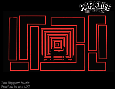
I actually spent a lot of time on redesigning the map. It took an excruciating amount of time like I thought it would and I think it only looks half decent. It does fit the design of the brochure more though which is why I'm using it in the final design. I sent the bracelet & brochure designs to the designers I'm getting feedback from before I went home, hopefully I should get feedback before next week so I can work on any improvements they might give me

Production Log (posters)


new guide layout
I used New Guide Layout to create a "bleed" for my posters. I did this by going on View > New Guide Layout and selecting the options above. I wanted to make sure the bleed was fine since I thought it was a little short, but I found that 0.25 inches is what printers usually ask for when printing posters. I also used a temporary guide layout to create a rectangle with an equal size, instead of having a margin I only used Columns and Rows for this. I changed the Margin from pixel to inches by right clicking on the boxes (below Top, Left, Bottom, Right)
Daily Diary 14/02
Today I came in to start doing my posters, but I wasn't able to make much progress
I had an idea for my first poster but I wasn't sure I liked how it turned out, so I tried making my second one. I ended up not liking it much either. I tried looking at the posters in my moodboard but wasn't able to think of much else. I decided to stop and leave earlier since I wasn't making any progress
Daily Diary 15/02
Today I didn't come in, I instead tried to focus on thinking of ideas for my poster and doing mock ups instead
I should've done this earlier. When making my mock ups I only focused on my brochure instead of my poster or magazine, which ended up costing me as I wasn't able to do much yesterday. I think so far my work has been poor, but I should hopefully still have time to change this
These mock ups are for my poster and magazine since I'm unsure what I'll be doing for either yet. I like the idea on the top left the most but am unsure what to go for my second poster still. I think the one in the middle could work but I don't think I'd be able to fit everything else in it (date, time, place, etc.)

Production Log (magazine)
Daily Diary 16/02
Today I came in to work on my magazine
I originally thought my article for my magazine was done, but after looking back on the document I said was finished it was clear it was the one I made before I got feedback from my tutor. I had to spend an hour adding onto it which ate up a lot of my time. I'm disappointed with the way I've acted this week as I feel like I've barely got anything done
Feedback from Designers
I only got my feedback for my brochure and bracelet designs by the 16th and 20th and that was after sending a few reminders to them. Two out of the three I asked to look at my work responded, while one still hasn't. I'm worried that they respond too slowly for me to send them anything and get valuable feedback on time, so I might have to look for more audience feedback instead
The first response I got back was from Maria Shuvanova, who sent me some detailed feedback

They said the dates of the festival and the tagline on the front might be unreadable in print. I ended up changing them to stand out more due to this feedback. The old version is pictured below


They said the dates of the festival and the tagline on the front might be unreadable in print. I ended up changing them to stand out more due to this feedback. The old version is pictured below
I didn't want to change the white text on a black background though as I had a very limited colour palette to work with, I feel like red acted better as an accent colour and thought that having the background be white would be less appealing since its the default paper colour. When it comes to how small the text was, I said it was 10px on A4 in the email afterwards and they said that'd be fine. I didn't want to get rid of any of the text either so I highlighted the important parts like they suggested instead
I ended up making the map bigger like I was suggested to do, I couldn't find a bigger version of the Parklife map so I couldn't do much else with the map except from scaling it to be bigger (it also took a considerable amount of time to edit the map so that it'd fit the colour scheme I'm working with). This meant I changed the layout of the brochure a bit from the draft I originally sent them before, instead of three separate pages I made the map bigger so that it'd fit two pages. The newer version is below


I also sent them the bracelet designs I made. They said they liked the first design being hand-drawn and that it might be better to go on with more illustration rather than the vector graphics I was using. I was originally going to draw everything on the bracelets (this is only evident in the production log for my bracelets when I was talking about the brush tool) but wasn't confident in my illustration skills, I also knew that it'd take a lot of time if I did continue doing it
They liked the second one but didn't get the UFO imagery. Later on in the email they say the brochure and bracelets don't have a similar identity other than colour palettes, so I decided I'd make the entire portfolio have a space theme. Deciding on a theme really helped out in the long run of the project, especially when I had to make my posters
They said for the third bracelets that I could list of the artists names for the inside of the bracelets rather than have Parklife 2022 repeat, so I changed it and ended up liking it a lot more


For the fourth bracelet they said they liked the idea but that I should work on the composition. I tried fitting the map onto the bracelet but didn't think it looked at all so I scrapped it. I had no ideas when it came to designing the last bracelet so it was a bit of a throwaway, I plan on designing something better later on when I have an idea for it
I also got feedback from Firuza Azizova, they only mentioned to also work on the composition on the fourth bracelet
