
Daily Diary 18/01
Today I tried doing my first draft of my project proposal. I have to come tomorrow at 9:50 for my headshot picture
Trying to do my project proposal today felt very frustrating because I didn't know what the topic for my project would be yet, so I couldn't write much. And because I don't know my topic, I have no clue what my target audience would be either. I planned to do research into topics that could fit for my project first, finding out what I want to do afterwards and then finish my project proposal draft and research list last. Because of this I have to get my proposal checked next Tuesday instead of today
Most of the day was spent on the project proposal but I was also able to upload and finish my ident. It looks very basic but it mostly fits with what I wanted it to be and I didn't want to make it too long either. My main issue with it still though is that it has no audio, I'm not too annoyed about it since I don't know what I would've used and I didn't want to put something I wasn't happy with. I spent most of the hour trying to follow the tutorial I linked earlier but wasn't able to follow it in the end anyway
Daily Diary 19/01
Today I focused on making my show reel, I wasn't able to finish it though
It's difficult making my show reel as, unlike everyone else, I'm mainly working with the magazine I made for FMP and the front cover & double page spread from the interactive magazine unit. I don't have much to work with and I'm currently finding it difficult to even reach one minute with it, I might have to add more magazine pages to it and show them for a longer duration
Project Proposal (first draft)


Research for Project Proposal
As mentioned previously there are many different types of print media, each with their individual strengths and weaknesses. Since I'm planning to do a collage I obviously can't do a full fledge magazine or book, so I looked at a list of print media to see what I could work with
There are:
- brochures
- posters
- postcards
- stickers
There are also other types such as booklets, business cards, catalogues and billboard banners but I knew I didn't want to do any of those. I already plan to do a double page spread of a magazine as I mainly chose this project to improve on my magazine design and at least one poster as its versatile and sounds interesting to me
Brochures (alternatively known as pamphlets) are usually trifold, although it can be folded in other ways. Its often used at fairs, trade shows, open houses or as restuarant menus to help the reader absorb any important information. Its mainly used for advertisements and for people who are already interested in the topic its about

After doing a bit of research into brochures I realised that this wasn't going to help me much. I'm already aware that most print is used for advertising, but that doesn't give me any ideas for what it should actually be advertising
However what this research did help me decide is what my collage is going to consist of. I plan to do a two page magazine spread, two posters and a brochure. This might be a bit ambitious though as I've never made a poster or brochure so I'm not sure how long it'll take me to make one of each. I would do stickers (and possibly could later as an extra bonus) but I don't know how I'd go about doing that yet and would rather focus on getting a topic down first
Drew, C. (2022) 18 Print Media Examples. Available at: https://helpfulprofessor.com/print-media-examples/. Accessed at: 22.01.23
flottman. (2016) 6 Benefits of Using Brochures. Available at: https://www.flottmanco.com/6-benefits-of-using-brochures/. Accessed at: 22.01.23
Gauthier, A. (2020) What's The Difference Between Flyers, Leaflets, Brochures and Booklets? Available at: https://www.printingcenterusa.com/blog/whats-the-difference-between-flyers-leaflets-brochures-and-booklets/. Accessed at: 22.01.23
Promo Media. (2023) Print Media Options | Printing Leaflets and Posters. Available at: https://www.promo-media.co.uk/type-of-ads/print/. Accessed at: 22.01.23
Spacey, J. (2020) 14 Examples of Print Media. Available at: https://simplicable.com/en/print-media. Accessed at: 22.01.23
Deciding the Topic
As I've said before I'm doing this differently from everyone else as I haven't decided on a topic yet. When I first thought of ideas of what it could be I was mainly thinking corporately as I know a lot of print media is used for advertising, however after having a discussion with my teacher we were able to brainstorm a few ideas. The two ideas that I was interested in the most was charity work and music
I thought collaborating with a charity and basing my topic off of a select one would be a great topic, if it went well enough my designs might even be used by said organisation. However aside from that, the topic didn't excite me as much. Depending on the charity it could also take a bit of a toll to work on emotionally wise
I briefly thought about music on my own but didn't know what I'd be doing with the idea as I felt frustrated. After having more time to think about it, I think I'd be able to make a variety of print media based off a concert or a music festival or even a rave. I know that posters are still being made for raves because I remember reading about it in my own spare time, I've always loved how experimentally designed they were as well. I also follow a few designers who've done posters and flyers for music in the past and am personally more interested in music in general, so I've finally decided my topic will be on music
Project Proposal (second draft)


Research List
Research
I wanted to start with looking at recent music events or festivals. I was originally thinking of basing it off of a local event however most of them haven't been announced yet since its so early into the year, so I decided to look into big music festivals instead. I wasn't sure what music festivals were counted, so I looked at a few top lists
The first festival listed was Glastonbury, which is the only one I've heard about before due to it being the largest music festival in the world. It showcases a lot of different music genre (rock, pop, jazz, minimal house, d&b and more) and consistently gets big musicians, last year people like Billie Eilish, Lorde, Megan Thee Stallion, Paul McCartney, Kendrick Lamar and more. Its 2023 festival will be 21st to 25th June. It's been confirmed that this year will have Elton John on the Pyramid Stage on Sunday, this is planned to be his final UK show of his last ever tour. Glastonbury also has an event concert called the Glastonbury Abbey Extravaganza concert which will be happening on August 5th this year in Texas
The next festival was All Points East which first debuted in 2018. Last year it had musicians such as Tame Impala, Charli XCX, Fleet Foxes and Gorillaz. It'll happen on August of this year in London (Victoria Park, Tower Hamlets). Its been confirmed that this years festival will have an exclusive show from Stormzy, other artists are currently listed as to be added. All Points East also presents Field Day on the 16th August as part of All Points East. Field Day focuses on underground electronic musicians and promoting London's music scene. Last years lineup had Squarepusher, Kraftwerk, Daniel Avery, Floating Points and more. This years lineup has Aphex Twins, Bonobo, Desire, MAFRO, Sudan Archives and a lot more underground artists
BST Hyde Park (also known as British Summer Time) is a festival hosted by American Express, it had its first event in 2013. The festival has had guests like Adele, Stevie Wonder, Elton John, The Rolling Stones and more in the past. The event takes place in London Park and happens each summer. On its website it says its 2023 lineup consists of Guns N' Roses, BLACKPINK, P!NK, Billy Joel, Take That and a few others
Parklife Festival is one of the most popular weekend music festivals in the UK, last years featuring artists were Tyler, the Creator, 50 Cent, Megan Thee Stallion, Lewis Capaldi and more. The line up for this year is currently unavailable as it'll be revealed in six days of writing this (it'll be released on about the 30th). It starts on 10-11 June in Manchester's Heaton Park, last year was 11-12 Jun 2022
The last festival I decided to look at was TRNSMT Festival, it originally started out as a festival to replace T in the Park. The festival stands out by giving festival-goers the experience of exploring the city's restaurants, nightclubs, bars and cultural attractions. Last year had a lineup of beabadoobee, Nile Rodgers, Lewis Capaldi and Sam Fender to list a few. The line up for this years festival is already out, featuring artists such as Ashnikko, Jamie Webster, Inhaler, Brooke Combe and more. This years festival would be at Glasgow Green, Scotland at the 7th of July and end on the 9th
After doing research on five big festivals, I thought I had enough to look back on and consider which festival I wanted to base my portfolio on. I mainly looked at each festival's Instagram and website to help me decide as I planned to emulate the design of their website and Instagram posts for my portfolio. I want to do this as most of the festival's Instagram pages have posters for the festival that I can go off of design-wise
TRNSMT Festival has a very consistent design throughout their website and Instagram posts with green and pink, there's also a mascot for this event as well (or at least for this year). The sites design is cartoony and has many animated elements (the icons on either side of the line up & banner image, an animated pop up of a picture of each artist in the line up)


Parklife's design is difficult to tell for its website as it currently doesn't show much other than a countdown and an option to sign up. It does have a fast moving GIF on the left of it though, as shown in an Instagram post. By going on the festival's other socials (Instagram, Twitter & Facebook) I was able to tell more about its design. Its poster design are very bold due to the neon colour palette contrasted with black. The social media posts about the 2023 event all have a uniformed design with its colours and gradient background


BST Hyde Park's design is difficult to tell as its social medias don't have a consistent style. Their website has a white and pink theme and also a pink and purple theme, but there isn't too much to go off of since they don't show posters or designs on their pages


All Points East has a poster for this years festival already. This poster has bold colours and introduces more artists in the line up such as The Strokes, Angel Olsen and Yeah Yeah Yeahs. The poster in general is very simple while also still standing out due to the background

Glastonbury has a consistent brand theme and colour palette that I could work with. Due to the font, colour choice and use of cartoonish hands it almost feels like a circus. It also has a list of its older posters in its shop to give me inspiration


I felt like I had done enough research about these festivals until I've chosen a specific one. I wanted to focus on contacting designers but instead looked at tips for designing for my portfolio instead as freelancer sites have a long sign up process and I wanted to utilise my research time in college wisely. I decided to skip on doing layout research for magazines as I already did research for that previously for my FMP
I first found an article on Visme about the 7-step process for making posters. The first step is about the dimensions of a poster. There isn't a defined size of posters and they can range from many sizes, but down below is a graph of the most common ones
A4 paper size (8.5” x 11” or 21 x 29.7 cm) is good for personal use or for being stuck outside a shop window. This is also a common size for people who have printers at home. Small poster sizes (11” x 17” or 28 x 43 cm) are for flyers, if the poster is planned to be on street lights or bulletin boards and it's small enough to still be used for decorating a room. Medium sized posters (18” x 24” or 46 x 61 cm) can be used for places such as a clinic or office, because of the size it can also hold more information than smaller posters. Large posters (24” x 36” or 61 x 91 cm) are used for bigger events by organisations or for advertising, fundraisers and promotions. These posters are often found outside malls, events and clubs. There isn't a best poster size as it depends on what the poster will be used for

The first step after that is to know what the purpose of my poster is. The three big questions that should be answered are: what's the goal of your poster, who's the audience and where do you plan to share your poster? One of the examples the site gives is a poster for an event, it's crucial to know what you'd want your audience to do after seeing the poster. Asking this question matters as there are many answers to this, some companies want their audience to scan a QR code or register online while others might want them to go to somewhere physically to buy tickets. Considering the audience with this is also extremely important
The rest of the article is just an advert for the site its on so I moved onto another article about the same topic. This was an article on 99designs, another site that focuses on designers
The first section the article provides is also before someone starts designing too, its to know the brand identity of the poster. Its crucial to know this as without it, all of my designs would be conflicting to the audience and the lack of identity would be obvious. The next step is to also know the ideal audience, without knowing this it'll be difficult to target them directly. Some questions the article asks are:
-
Who is my target audience?
-
How does my event speak to them?
-
What kind of designs are the audience likely to respond to?
-
What brand voice would speak to them best? (tongue-in-cheek or more serious)
-
What design elements will captivate them the most?
Afterwards its good to know the message you want the poster to have, it needs to be strong and clear as well. No matter how well the poster is designed, if it's for an event and it doesn't say when its happening then its useless. When and where it's happening and how to join are crucial details that need to be on it. Its also important to not have the visuals clash with the message either as it can be confusing to the audience (the example given in the article is a fundraiser looking volunteers having dark imagery on the poster), while a poster that has design elements that compliment the message can stand out greatly
Knowing the metric of success means you can know if a poster has succeeded or not. A lot of businesses skip doing this but knowing it means you can tell if a poster was successful or needs a redesign. Success could mean getting ticket sales or people going to a specific location, for ticket sales a good idea is to use a custom URL or QR code to be able to track the redirects and sales that came from the poster. Another thing that should be known is the budget, how many posters will be printed out and how much will it cost? I chose to skip this section as I don't plan to print more than two copies for my portfolio
Now the article goes into designing for posters. Not forgetting the brand and remembering to design for the audience in mind were the first two points mentioned. There are standards in place for branding already and its important to mostly stick with them, like with a finance company not going for neon colours and instead choosing a more corporate look. Design elements (like colours and font choices) should go with the brand instead of distracting from it. What you want the poster to look like doesn't matter as much as what the audience would be interested in, so it's important to design with them in mind. What colours and fonts would they like? Would they prefer flashy graphics or a more simple design? Where will the audience see the poster? If its by a bus stop then its better for it to be big and bold or for bulletin boards bright colours can help it stand out
Planning out where everything in the poster will go works well, an example being grabbing all the graphics planned to be used for the poster and rearranging them in different ways. If a lot of text will be on the poster you wouldn't use a large font size because it'd make the poster overcrowded, while if there isn't much text more graphics should be added to make it look more visually interesting
When it comes to the text, the most important part is having a headline that stands out. The headline will be the first thing majority of people will read and if its uninteresting it'll definitely drive most audiences away from reading the rest of it. As mentioned already it should include relevant information like: event/business name, contact information and how to join the call-to-action (where to purchase tickets for an event or a specific website URL)
The next point is about style. Keeping it simple is more important than trying to stick every design element on one poster and leaving it feeling cluttered as a result. Clean and simple posters are also easier to read. Originality can help a poster stand out as well as many poster designs have already seen before, to really capture someones attention sometimes its a good idea to be different from other posters. Colour is also important to consider as it sets the mood for the poster and can even subtly influence audiences (for example a product infront of a red background makes people more likely to purchase it). Brand colours are obvious but its also important to decide colour on other factors as well. Typography and font layouts should be considered carefully, for example the visual hierarchy with text can help audiences focus on the most important parts of the poster. The call-to-action is the last point about style and is arguably the most important as its what you want your audience to do, as such it needs to be the main focus of the poster
The article then goes over evaluation and printing. Before printing the poster should be evaluated as its the last time to make any adjustments to it. A few questions to ask are:
-
Is this design attention-grabbing?
-
Is the message in this poster loud and clear?
-
Is my call-to-action clear and does the design inspire me to follow it?
-
Is the overall look and feel of the poster on-brand?
Getting feedback from other people during evaluation can also help greatly. If they respond yes to all those questions and you feel confident in the design, then you're ready to print it. If not then you should try and fix the issues before then. The last point is about finding a printer and asking them questions to make sure your print will be of highest quality. I'll likely be using the same printing company I used for my FMP as I was happy with the quality my magazine print was
I wanted to look at how to design brochures next, but for the most part articles on the topic give the same advice as the ones for designing posters. There were a few brochure specific tips though, like with how writing should be structured around the brochure's fold design. Venngage gives an example of this with a three fold structured brochure


The front page should have a single clear message that grabs the attention of the audience, a way this could be done is by: clearly telling the audience how they can benefit from reading the brochure ("Helping Families lead better lives"), asking a question ("What makes us special?"), keeping the headline brief but bold ("Authentic Kitchen & Bathroom Surfaces") or by simply letting the product speak for itself by showing a picture of it. Its important to keep it short with one clear message to not overwhelm the reader
The main brochure is also important and is used to give the main information, this part usually consist of a header and brief description that fits with the structure. For headers they should be clear and easy to understand even at a glance. Words like 'introduction' or 'about' shouldn't be used, instead more expressive phrases like "The Advantages of [blank]" or "[blank] Resistant" should be used instead. Another good idea is to make the headers focus on how the business or event will give the audience something they want rather than only what the business or event does. The descriptions shouldn't be neglected either, like the headers they shouldn't be too long but they should also be more detailed. These descriptions should be just enough information to get them interested and then link the reader to a store or a website so they can get more information. There should only be about two or three sentences for each section
The back should incldue extra details like contact information through email, social medias or a website link. Contact info should mainly be at the back (or when designing it, the middle of the brochure) as the "convincing" has already been done in the front and main pages. The last section can be filled with anything really, a QR code or shorter description text
A way to make text look more uniform on a brochure is to center it. Cropping images so they're circles is a popular trend brochures commonly do. Using more than two or three colours can be distracting and make the design feel more confusing, some brochures do well having design elements with only one bold colour
As mentioned before, designing posters and brochures generally have the same tips so I decided to move on to researching how to design a bracelet. Searching this was a little difficult as it mainly came up with DIY. I realised I wasn't sure if I wanted a paper or slap band yet either or how I'd go about making one either
I found a site called Global Promotional Solutions that offered reflective or silicone custom bands, it also had its own designing tool for one. I'd rather have reflective ones as I feel like it'd go with the neon aesthetic Parklife has. The minimum I can buy are 100 and I definitely don't need that many, so I decided to look at other alternatives instead. At the very least I learnt from this site that the average size of slap bands are 23cm x 3cm or 30cm x 3cm
There's a blog with a guide on how to design a slap band that mainly uses Photoshop. It also requires a woven wallpaper swatch, scissors and recommends a clean metal slap bracelet. They plan on exposing the metal ruler part by removing the slap bracelet's cover so there's a smooth finish after applying the wallpaper
The first step is to download the template provided and open it up in Photoshop (canvas should be 24" x 12" with 150 dpi). Rotating the canvas 90° clockwise is recommended to better adjust text, remembering to rotate it back to its original dimensions after finishing the design. You can remove the white background with the magic wand tool, afterwards its time to design. The file should be saved as a PNG or JPG
The next step is printing them, the site recommends using their own printing service. When going on Spoonflower it should be selected as a wallpaper, woven and swatch for paper and size

After getting the sample swatches we can design the bracelets. As mentioned before the cover of the slap bracelets are removed so the wallpaper is smoother. You have to cut on the line of each design and peel the back off the woven paper afterwards. The 'stick me first' portion should be stuck halfway on the side of the bracelet that curves out. Afterwards the paper should be wrapped tightly around the curved side, pushing out any air bubbles. The paper should be wrapped around the entire bracelet until its covered completely, it should also be firmly pressed to make sure the paper sticks to the bracelet. The corners can be cut afterwards to make the paper rounded. The design placed on the inside of the curve will be the design shown when the bracelet is worn


My main issue with this method is that I'm not sure if I can print this from somewhere that's more local, since I don't know how long the delivery will take. I tried searching for anything that does 'wallpaper' prints like this but I don't get much results. To me the wallpaper looks more like a sticker but I'm not sure if it'll stick the same as these wallpapers do
I also tried following the steps on the site but the layout for it has changed and doesn't even have woven bracelets as an option anymore, I assume its been replaced by peel and stick wallpapers since that's linked on the article as well
There are a few local sticker places like Jelprint, King Print or Print Mule but I'm unsure if it'll work with this method so it's a bit of a risk

Since I was already looking at printing, I decided to look at recommended print sizes for brochures and posters. I already knew what size I needed to print for my bracelets so I skipped it and I have previous experience with printing for magazines so I know what margin size to do for those as well
To know the best DPI and finish for posters I'd first have to settle on a size I want. I decided to go with 24" x 36" since that's seemingly the same poster size used for Parklife's posters (shown already). There isn't a set DPI preferred, some go with 150 DPI since it works well without being too demanding while others do 175 DPI
The minimum for a poster is at least 100dpi if its being viewed at 6ft (2m). However DPI is based on how close someone will see the poster, the closer someone is the more DPI is required. For brochures and magazines its recommended for it to be 300dpi because of this. This is a chart on Design Resources which showcases the minimum DPI for someone with good eyesight

However the material can also affect if there's a need for 300dpi or not. 200-250dpi is fine if the papers uncoated while it wouldn't look as good if I were to use glossy coated paper
I then needed to look at paper finishes (matte or glossy). Looking at the Parklife posters they seem to have a matte finish, but I wasn't sure if I preferred matte or glossy for my poster as there are pros and cons to both (glossy would make the colours more vibrant but I also felt like it felt a little more distracting, especially since the posters would be intended to be outside)
Glossy posters are the most common as most people find them more interesting to look at. Its usually used for bedrooms, workout rooms and generally any place that needs more 'personality' so to speak. It looks best on places with consistent lighting and with colourful posters that are either more cartoony or related to sports
Matte posters are good if you prefer detail over colour and don't want your poster to have too much glare. If a poster is dark, framed under glass or being put somewhere with high or natural light then matte posters are usually the better option. This is because the reflection of light or glass can make a glossy poster much harder to see
Other options are metallic, similar to glossy but with a more metallic effect. This finish is more durable and works well with posters that have sharp images, bold colours and designs. Laminated does the same while also providing a glossy finish. Thermographic & embossing would make the poster feel more 3D, themographic would 'lift' the letters off the page and embossing would would add a texture that'd create a 3D effect
For brochures, there are a few different finishes recommended for it. One is embossing (or debossing or letterpress that does the opposite effect), often used for high-quality and premium products. Metallic foil stamping adds gold or silver to your brochure and is a great and easy way to catch a readers attention, there are also other colours like neon and other metallic ones to use. Spot UV varnish can be used to highlight a specific part by using varnish to make it shinier, often used to highlight a logo or key message. Die cutting creates an interesting tactile experience by die-cutting shapes out of the paper. There's also the option to laminate the brochure with either a matte or glossy finish which can be used with spot UV varnish
The recommended GSM for my poster and tri-fold brochure are 160-200gsm as they'll be rigid but light. Brochures can also have 130-170gsm pages and a 170-200gsm or 200-250gsm cover, 200-250gsm will have a much more heavier card feel
After that I moved onto getting some tips for Adobe Illustrator as I may use this to design my brochure. While finding guides I found out that I could actually use InDesign for this instead like I suspected, but I thought it'd be a good idea for me to see some guides on Adobe Illustrator regardless. I did find a more generalised guide but decided it'd be better to go for a guide that specifically focuses on what I want to make instead
The standard size for a tri-fold brochure is 8.5 x 11 inches on landscape. They recommend using two artboards to use as a front and back and a standard bleed of 0.125 all around. The colour mode should be on CMYK

After creating the canvas, you can create the three folds by calculating the width (11 inches) divided by 3 which is 3.66 reoccuring. I should click on the rectangle tool and drag it across the page until I see a menu pop up asking for the width x height, the width should be 3.66 inches and the height should be 8.5 inches. This'll be used as a guide, I should drag it to the leftmost side and zoom in to make sure its perfectly aligned. Then I should go to Object > Transform > Move and change the horizontal to be 3.66 and leave the vertical movement as 0 and then click on Copy instead of Ok to make a duplicate panel, after doing this I should do it again with the second rectangle. I can get rid of the stroke on the rectangles as I don't need them. After doing this I need to check to make sure the right rectangle is actually aligned with the end of the canvas. Copy and paste the boxes onto the other artboard as well and then highlight all three boxes and CTRL5 to turn the boxes into guides
A comment on the video also says I can bypass zooming in by selecting the boxes, going on Options > Align to artboard to enable one-click alignment

They show how the brochure will be folded down below. The inside page could be one big graphic and doesn't necessarily have to go by the boxes while the other artboard normally would be

The tutorial was very short but I felt like it went over the main thing I wanted to know (setting up the canvas for a tri-fold layout). I decided to do a bit more research into Parklife 2022 before finishing my research
I found an article on Parklife 2022 on Manchester Evening News. As mentioned before the line up for Parklife 2022 featured 50 Cent, Tyler, The Creator, Megan Thee Stallion and Lewis Capaldi as the main headliners. Chase & Status, Jamie xx, Four Tet, Peggy Gou, Arlo Parks and Loyle Carner on Saturday and Sunday. Bicep (described as "Dance Floor royalty") headlined The Valley stage for the first time as well
Other artists include Arlo Parks, Folamour (Live), Headie One, Central Cee, Fred Again, ArrDEE, Caroline Polacheck, Tom Misch and PinkPantheress. There are also DJ sets from Carol Cox, Marco Carola, Camelphat, The Blessed Madonna, Andy C, DJ EZ, Sonnet Fodera, Jayda G and many more. DJ Annie Mac, formely on Radio 1, will be on stage as well.
The festival was on June 11th and 12th at Heaton Park and was attended by 80k festival-goers each day, being the biggest metropolitan festival in the UK. This years festival was the first one since 2019 due to the pandemic. The doors opened at 11am on Saturday and close at 11pm, same for Sunday except from it starting an hour later (12am). The last entry into Heaton Park was at 5pm. The image of line ups are shown here

50 Cent will be on the main Parklife Stage on Saturday 11th June, Loyle Carner, Headie One, Mahalia, Joy Crookes and ArrDee will also be on the stage afterwards. Chase & Status will be on The Valley Stage that day. Headliners Jamie xx, Sonny Fodera and Four Tet will star on the day as well
On Sunday 12th Tyler, The Creator, Megan Thee Stallion and Lewis Capaldi headlined the Parklife Stage, Caroline Polachek and Arlo Parks were also on that stage later on. Bicep, The Blessed Madonna and Annie Mac were on The Valley stage while Eric Prydz was on The Hangar
At the time this article was written, Saturday general and mostly VIP sale tickets were already completely sold out. VIP upgrade tickets could still be purchased for £49.50 for Saturday if you already owned general sale tickets. Weekend tickets are also sold out but the VIP options start from £186.45 and go to £247.50 for the entire weekend, tickets could still be booked for the full weekend if you paid for the VIP option. Sunday tickets are available from £92.95. In previous years Parklife had gave out VIP passes in competitions presumingly hosted on their Twitter @Parklifefest. Ticket availability can be checked on Parklife's official site or Ticketmaster
VIP had perks like a fast track for queues and an exclusive area. This area had a food village, luxury loos and The Smugglers Inn bar. They also had their own DJS which had special guests on a dancefloor separate from the rest of the festival. Another area they had access to was a new light tunnel where they could see Heaton Park's "northern lights". If it was sunny then there's also the cloud 9 VIP spa, lockers and a Secret Club which wasn't announced at the time the article was written
Aside from driving to where the festival is, there's also an option to take coaches. There's a Metrolink stop right outside the gates and four public entry and exit points: North Gate by the Lake in Heaton Park, East Gate on Sheepfoot Lane, West Gate on Bury Old Road and VIP (off Sheepfoot Lane) which is adjacent to East Gate. The Big Green Coach is the festival's Official Travel Partner with an option for a carbon neutral Day Return coach, there's 18 pick-up locations and seats start from £32 return. There's also the Travel Pass which can be used for either Metrolink or shuttle buses
I also found a site hosting a gallery of images from Parklife 2022 here, there are tons of photos I'll be able to choose from. Its a bit difficult to tell what the target audience is, but from the various sources I've seen and the Terms and Conditions preview I can see from Google the audience seems to be teenagers to young adults. A maximum of 4 under 18's can be brought to the festival under a legal guardian, however the age limit is strictly for over 17's
While doing research I realised I wanted to base my portfolio around Parklife. I did research into their event that happened last year as the information around this year isn't out yet, so I may have to base my portfolio around last years festival. I mainly did this research so I'd know what to write about for my brochure and magazine spread. I quickly looked at their social medias just so I could get an idea of how my designs should look like
Now that I know a few tips about Adobe Illustrator and about designing for my portfolio, I should have an easier time designing for them. I plan to experiment in Adobe Illustrator about what I've learnt once I get the chance. Looking at a guide for designing brochures in Illustrator helps especially as I've never made a brochure before and had no idea which pages fold into eachother
When it comes to how I'll be printing my posters, I was originally planning to do matte as I didn't want the poster to look too shiny and reflective. However after finding out that matte wouldn't work well with the bright and colourful designs I was planning to do, I tried to look for other options. I'm not completely sure on which one I'll go with yet as glossy and laminated would be better, but I was holding off on using those finishes. My poster will be 24" x 36" with 160-200gsm and will have 300dpi to be on the safe side
For my brochure I'll likely be using 160-250gsm with a matte finish as I'm planning on having a more darker colour palette for it. I'm planning on it being tri-folded as well. I didn't do research for my magazine spread as I knew I wanted it to be A4 with a 70-130gsm
I'm mainly worried about designing my bracelets currently. I know how to but am unsure if I'll be able to do it in the way provided, or if it'll even deliver to me in time. I have multiple weeks and I plan to design my bracelets first so I should hopefully get them by the deadline if I decide to do that method
Adobe Support Community. (2010) Ideal resolution (dpi) for standard 24"x36" posters? Available at: https://community.adobe.com/t5/photoshop-ecosystem-discussions/ideal-resolution-dpi-for-standard-24-quot-x36-quot-posters/td-p/2641776. Accessed at: 29.01.23
All Points East. (2023) All Points East. Available at: https://www.allpointseastfestival.com. Accessed at: 24.01.23
Aura Print. (Year unknown) Best Paper Weight For Flyers. Available at: https://aura-print.com/uk/blog/post/best-paper-weight-for-flyers. Accessed at: 29.01.23
AVA. (2023) AVA Festival 2023 | 2 + 3 June, Belfast. Available at: https://avafestival.com. Accessed at: 24.01.23
Boundary Brighton. (2023) Boundary Brighton. Available at: https://boundarybrighton.com. Accessed at: 24.01.23
BST Hyde Park. (2023) BST Hyde Park | Home. Available at: https://www.bst-hydepark.com. Accessed at: 24.01.23
Campbell, J. (2022) Parklife 2022 lineup, entry times, venue, stages and everything else you need to know. Available at: https://www.manchestereveningnews.co.uk/whats-on/music-nightlife-news/parklife-festival-2022-tickets-line-23923020. Accessed at: 30.01.23
Design Resources. (Year unknown) DPI For Printing. Available at: resources.printhandbook.com/pages/dpi-for-printing.php. Accessed at: 29.01.23
Digital Printing. (2013) A Guide to Paper Weights for Print Brochures. Available at: https://www.digitalprinting.co.uk/blog/a-guide-to-paper-weights-for-your-printed-brochure/. Accessed at: 29.01.23
Discount Sticker Printing. (2023) Label & Sticker Printing UK. Available at: https://www.discountstickerprinting.co.uk. Accessed at: 28.01.23
Erin Gipford. (2017) How To Create A Trifold Brochure in Adobe Illustrator. Available at: https://www.youtube.com/watch?v=PKjdqTVCB4k. Accessed at: 30.01.23
Facebook. (2023) All Points East. Available at: https://www.facebook.com/allpointseastuk. Accessed at: 25.01.23
Facebook. (2023) Glastonbury Festivals. Available at: https://www.facebook.com/glastonburyofficial. Accessed at: 25.01.23
Facebook. (2023) PARKLIFE FESTIVAL. Available at: https://www.facebook.com/parklifefestival/. Accessed at: 25.01.23
Field Day. (2023) Field Day 2023 - Victoria Park. Available at: https://fielddayfestivals.com. Accessed at: 24.01.23
Gareth David Studio. (2014) The Complete Beginners Guide To Adobe Illustrator | FREE COURSE. Available at: https://www.youtube.com/watch?v=IBouhf4seWQ. Accessed at: 30.01.23
Glastonbury Festival. (2023) Glasonbury Festival | The Official Glastonbury Festival Website. Available at: https://www.glastonburyfestivals.co.uk. Accessed at: 24.01.23
Glastonbury Festival. (2023) Posters. Available at: https://shop.glastonburyfestivals.co.uk/collections/posters. Accessed at: 25.01.23
Global Promotional Solutions. (Year unknown) Design Your Own Slap Bands & Order Online. Available at: https://www.globalpromotionalsolutions.co.uk/product-category/slap-bands/. Accessed at: 28.01.23
Instagram. (2023) All Points East (@allpointseastuk). Available at: https://www.instagram.com/allpointseastuk/. Accessed at: 25.01.23
Instagram. (2023) BST Hyde Park (@bsthydepark). Available at: https://www.instagram.com/bsthydepark/. Accessed at: 25.01.23
Instagram. (2023) Parklife (@parklife_festival). Available at: https://www.instagram.com/parklife_festival/. Accessed at: 24.01.23
Instagram. (2023) TRNSMT Festival (@trnsmtfest). Available at: https://www.instagram.com/TRNSMTfest/. Accessed at: 24.01.23
Jelprint. (2023) Printers in Luton. Available at: https://www.jelprint.com/home.html. Accessed at: 28.01.23
Just Digital. (Year unknown) Paper weights explained. Available at: https://www.justdigitalprint.co.uk/paper-weights-explained/. Accessed at: 29.01.23
KALLIDA. (2023) KALLIDA Festival. Available at: https://kallida.co.uk. Accessed at: 24.01.23
King Print. (2023) Printers Luton | Design & Printing Services. Available at: https://www.kingprint.co.uk. Accessed at: 28.01.23
Nediger, M. (2021) Marketing Brochure Design: The Definitive Guide. Available at: https://venngage.com/blog/brochure-design/. Accessed at: 28.01.23
Parklife. (2022) Parklife | Gallery | 2022. Available at: photos.parklife.uk.com/2022/gallery/?image_keywords=year%3A2022. Accessed at: 30.01.23
Parklife Festival. (2023) Parklife Festival. Available at: https://parklife.uk.com. Accessed at: 24.01.23
PosterBurner. (2020) Gloss vs. Matte Finish: Which One is Best for My Poster? Available at: https://www.posterburner.com/Blog/BlogPost/Gloss_Or_Matte_Poster_Printing/. Accessed at: 29.01.23
Print Mule. (2023) Low Cost Online Printing & Design Luton. Available at: https://printmule.co.uk. Accessed at: 28.01.23
Pumpkin Sign & Display. (2020) 5 Great Options for Poster Finishes. Available at: https://www.pumpkinsd.co.uk/blogs/5-great-poster-finishes. Accessed at: 29.01.23
Singh, A. (2022) Biggest Music Festivals on the Planet. Available at: https://www.farandwide.com/s/biggest-music-festivals-ca71f3346443426e. Accessed at: 24.01.23
StickerShop. (2023) Stickers: The Best Label & Sticker Printing in the UK. Available at: https://www.stickershop.co.uk. Accessed at: 28.01.23
Terminal V. (2023) Terminal V Festival. Available at: https://terminalv.co.uk. Accessed at: 24.01.23
T, J. (2022) Learn how to easily make a brochure. Available at: https://helpx.adobe.com/uk/indesign/how-to/make-brochure.html. Accessed at: 30.01.23
TRNSMT. (2023) TRNSMT | 7th - 9th July | Glasgow Green. Available at: https://trnsmtfest.com. Accessed at: 24.01.23
Twitter. (2023) BST Hyde Park. Available at: https://twitter.com/BSTHydePark. Accessed at: 25.01.23
Twitter. (2023) Glastonbury Festival. Available at: https://twitter.com/glastonbury. Accessed at: 25.01.23
Twitter. (2023) Parklife 2023. Available at: https://twitter.com/parklifefest. Accessed at: 25.01.23
Sheikh, M. (2021) How to Make a Poster: Beginner’s Design Guide (& Templates). Available at: https://visme.co/blog/how-to-make-a-poster/. Accessed at: 25.01.23
Soundclub. (2023) All About Parklife Festival. Available at: https://mag.soundclub.com/festivals-features/all-about-parklife-festival. Accessed at: 05.02.23
Spoonflower. (2022) Customize Your Next Big Event with DIY Slap Bracelets! Available at: https://blog.spoonflower.com/2016/02/13/customize-your-wedding-with-diy-slap-bracelets/. Accessed at: 28.01.23
Staff Writers. (2022) Top 20 Music Festivals in the UK for 2023. Available at: https://www.festicket.com/magazine/discover/top-20-music-festivals-in-the-uk/. Accessed at: 24.01.23
Stribley, M. (Year unknown) 50 amazingly talented graphic designers to follow on Instagram. Available at: https://www.canva.com/learn/graphic-designers-instagram/. Accessed at: 25.01.23
Swallowtail Print. (Year unknown) Brochure printing - front cover finishes. Available at: https://www.swallowtailprint.co.uk/news/articles/post/38-brochure-printing--front-cover-finishes. Accessed at: 29.01.23
Williams, M. (2022) What is the best finish for your brochure? Available at: https://www.toastdesign.co.uk/brochure-design-blog/brochure-design-finishes/. Accessed at: 29.01.23
Daily Diary 24/01
Today I researched different music festivals I could base my portfolio on. I also got feedback on my project proposal
The feedback I got helped a lot, especially with the action plan & timetable. I wanted to give myself an extra week incase I still needed it, but I think two weeks should be enough to finish designing everything as long as I come in everyday I can. I changed it so that I should be done by week 7, I may have to come in on Monday that week to finish everything but by Wednesday that week I'd hope to be finished with designing everything
From the research I did today I've narrowed it down to five festivals. I'm most interested in Parklife and Field Day currently but Parklife's website doesn't show me much information on the festival and Field Day is part of All Points East. I like the designs both festivals have, they're very bold and colourful. I haven't fully decided yet today since I haven't finished doing research but I should be done with festival research by tomorrow
Daily Diary 25/01
Today I continued doing research and chose to base my portfolio on Parklife
I was going to do research into finding designers for feedback during production after finishing research on music festivals, but the sites I wanted to use (Upwork and Behance) required me to sign up and that would've taken a bit of time so I opted to doing research on how to design for my portfolio instead. I still think trying to find designers as early as I possibly can is a very good idea and I plan to at least contact a few by the end of this week
I knew I was interested in Parklife when I saw its website because I liked its designs the most, but I wanted to hold off on it because as mentioned previously its website is currently barebones with mainly just a countdown and sign up option. I needed more information on Parklife before being able to write about it, but I was told that my portfolio doesn't necessarily have to be from this years festival and can be from last years instead. The countdown says six days which means It'll get announced next week Tuesday, but I have to finish all my research by Monday so I can't wait that long
Daily Diary 26/01
Today I went to a talk from the British Film Institution
I enjoyed watching the various people talk about their jobs, while I was there there was a person for drama, entertainment and journalism. I wasn't able to watch the documentary talk unfortunately. I'm not extremely interested in pursuing any of the jobs the people had (I'm not interested in writing for journalism as much) but I found it insightful regardless. I was most interested in the journalism talk
Gaining Feedback from Designers
I wanted to have at least three other designers give me feedback through pre-production and after I'm finished with my project. The [BLANK] is because I plan on asking designers that specialise in different areas (one for magazines, another for posters and someone else for brochures)

I first went to Fiverr as it featured a top 16 for magazine designers on the site. I had to make an account to contact people on the site, however due to Fiverr's policies I have to contact them through the site. I hope to move any further contacts to email if anyone on the site is willing to give me feedback though. Here are the people I contacted using Fiverr:


They both specialise in magazine design, Stefanelli also does brochure and poster designs as well
However, I didn't have much faith in Fiverr due to it being a platform purely about people paying for services, so I wanted to branch out to other sites as well. I looked into Behance as that was a site I was using for inspiration and tried to find designers willing to help me there. On Behance I'm trying to be more picky with who I chose as Jayden and Stefanelli do more professional looking designs and that's the exact opposite of what I'm looking for (I want more experimental and bold designs and I know Behance has a lot more of those). The first person I contacted on Behance was Firuza Azizova, I was able to email them as they provided their email through their Instagram


I liked their poster and magazine a lot even if its not exactly what I'm looking for, so I made sure to express that in my email to them
I liked their poster and magazine a lot even if its not exactly what I'm looking for, so I made sure to express that in my email to them. The last magazine designer I contacted was Mun Pham, its a collaborative work but I liked their MUZINE Magazine a lot and it felt almost similar to the design I wanted to have for my own double page spread


I felt like I contacted enough people for my double page spread so I contacted people to help with my poster and brochure designs. The next designer I emailed was Paloma Buzzi, I liked how bold their designs were and wanted to emulate a similar style for my portfolio as well


I then emailed Maria Shuvanova, I liked their Sweet Day poster and felt like they could help me with my posters, especially since they're interested in music


The last person I contacted was Olga Šč. They did a portfolio of work based on Prepared Surroundings, a music festival. I liked how much thought was put into the designs and how experimental they looked. They also made a flyer for the project as well, so I wanted to ask them for feedback for my brochure too


Behance. (2023) Firuza Azizova on Behance. Available at: https://www.behance.net/firuzaazizova. Accessed at: 02.02.23
Behance. (2023) maria shuvanova on Behance. Available at: https://www.behance.net/mariashuvanova. Accessed at: 02.02.23
Behance. (2023) Mun Pham on Behance. Available at: https://www.behance.net/mun1210. Accessed at: 02.02.23
Behance. (2023) Olga Šč on Behance. Available at: https://www.behance.net/sc_dsgn. Accessed at: 02.02.23
Behance. (2023) Paloma Buzzi on Behance. Available at: https://www.behance.net/palomabuzzi. Accessed at: 02.02.23
Fiverr. (2023) Be your magazine designer by Jayden_designs. Available at: https://www.fiverr.com/jayden_designs/be-your-magazine-designer. Accessed at: 02.02.23
Fiverr. (2023) I will design a professional brochure, catalog or magazine by Fannystefanelli. Available at: https://www.fiverr.com/fannystefanelli/design-a-brochure-catalog-or-magazine-professional. Accessed at: 02.02.23
Fiverr. (2023) Top 16 Freelance Magazine design experts for Hire. Available at: https://www.fiverr.com/hire/magazine-design. Accessed at: 02.02.23
Target Audience
I already did a bit of research into the target audience, but its difficult to get a clear representitive. From the Terms & Conditions, I can see that the age limit for Parklife is at least strictly 17 and over. Soundclub says the festival's target audience are mainly teenagers and young adults and that Gen Z dominates the its audience, with a Parklife attendee telling The Guardian that “even 27-year-olds could feel like fossils here.”
The primary target audience of my portfolio will be young adults (20-25 year olds) as they seem to be the most popular attendees at Parklife. The gender and ethnicity are nonspecific because Parklife can be enjoyed by everyone due to how many musicians are attending. Their martial status will be unmarried and family size will be none as that means they'll be more likely to spend their time enjoying the festival rather than taking care of children. Since Parklife tickets are quite expensive, they'd have worked for years and have middle class jobs (social grade B). They'd live in a city-based area in Manchester as that's where Parklife is hosted. On the psychographic table they'd be explorers due to the energy and thrill Parklife provides. They'd also be in the M56 (Self Supporters) mosaic group due to being single and having a modest wage
Secondary target audience will be teenagers (17-19 year olds). They'll be part of O62 (Central Pulse) as they'll be young and rent an apartment nearby to stay in for the two days of the festival. To be able to afford this they'll be in social grade C1, which is what most of the population is. They'll be mainstreamers who'd like how Parklife 2022 features famous and well known musicians such as Tyler, The Creator and Megan Thee Stallion. Their family size and martal status would be nonspecific as they may bring friends or siblings around their age range
Tertiary audience will be young adults aged a bit older than the primary (26-30 year olds). Their martial status would be married and their family size may include one or two children (who would be teenagers or young adults at this point, so they could all go to the festival together and still comply with the 17 and over age limit). They'd be part of N58 (Cultural Comfort) as they'd be a family in a multi-cultural community. They'd live in the suburbs and be part of social grade C2. They'd be part of the aspirers in the psychographic table as Parklife is a popular and prestigious music festival
Project Proposal
Pre-Production List
Page Layout Designs
To make my mock ups I decided to use Photoshop as I'll be able to easily rearrange elements and I'm already comfortable with the software. I first started on my magazine mock ups as I planned to make another magazine for next unit
I'm following the advice I was given for magazine layouts during the pre-production of my FMP, for it I interviewed a magazine designer on some advice for layout design. I was also told to look at some magazines on Behance to try and get inspiration so I searched for magazine layouts on the site. I also looked for music specific magazines as well using the Creative Fields tab


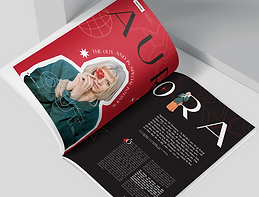
This was the first magazine layout I made using the layout guide the magazine designer provided in their original email, but I don't like it much. I'm using the images from the Parklife's gallery website since I plan to use those for my portfolio regardless

After getting some more inspiration, I designed a few other mock ups. I wanted to take advantage of the fact that I have to design two pages, so I stretched the images to be large enough to fit two. This was a limitation I faced in my FMP because of the limited amount of pages I had to work with (only 20 pages and 4 of those were adverts)


I ended up liking the fifth one I made the most (bottom right) enough to know I wanted to do something like that for my mock up. I like how the left page looks a lot but still think the right page could be improved more, I feel it looks a little too bland. I feel like I want to keep using the picture on the left, its on this page in the gallery website
For now though I wanted to start focusing on my brochure as I had no clue for how I wanted that to be planned out yet. I did the same as I did for magazines and first looked for inspiration on Behance


There weren't as many on Behance that didn't look extremely generic, so I wasn't able to find as many designs that I liked. I still found a few though and tried to apply some of the elements I liked about the magazines I found into the brochure mock ups. This was the first one I made, I wanted to make the front and the back match somewhat


front
back
I generally like the idea of these designs (the drawings on the front cover are a very crude version of what I want them to actually look like) but I still think there are some issues. I'm not sure if the front cover itself is striking enough to make someone want to continue reading it, I might make it the design on the middle section instead; especially since I think the image currently in the middle looks much better on the back. I'm not sure what I would replace it with though
Another issue with the front is that its difficult to tell what its for. If someone didn't know what Parklife was they'd be confused at first glance. I might swap the back right section to be the front right section, but I think it makes more sense where it is currently
When designing the inside of my brochure I wanted to make sure that I knew what I would include in my brochure before this. The descriptions in my brochure should at least include:
-
the Parklife 2022 lineup
-
how to get tickets (how much it costs is optional as I'll be linking to the site)
-
where & when Parklife 2022 starts (how to get there? may be optional)
I'm fine with how the back looks. I have an idea of how I want the musicians to be listed but didn't fully do it as I knew it'd take a lot of time. As shown as a demonstration, I want the font sizes to change depending on regular musicians and the headliners of the event. I was also planning the fonts to change for each musician like with the lineup poster I showed earlier when I was doing extra research about Parkline 2022 but that'd take me much longer to do. I also want to edit the image of Tyler, The Creator (back left & middle sections) so the red is bolder and stands out more. Other than that I think the back of the brochure looks nice, I especially love the more detailed(?) spiral box image
Behance. (2023) Magazine Layout Projects. Available at: https://www.behance.net/search/projects?search=magazines+layout&tracking_source=typeahead_search_suggestion. Accessed at: 31.01.23
Behance. (2023) Trifold Brochure Layout Projects. Available at: https://www.behance.net/search/projects?tracking_source=typeahead_search_direct&search=trifold+brochure+layout. Accessed at: 31.01.23
Production Log

brush tool
I used the brush tool to draw on my front cover. I did this by clicking on the Brush Tool on the left toolbar
Daily Diary 31/01
Today I designed a few mock ups for my magazine. I have to work to complete some things on my checklist as well, like doing more research into my target audience
I spent longer than I thought making mock ups, I wasn't expecting to dedicate the entire day to it. I'd be worried about that since I also need to focus on the other things on my list, however I'm mainly doing my mock ups during college because I know I can do everything else on my list at home
Regardless I'm glad I made a few page layouts just to see what I like, since I now have an idea of what my magazine layout will look like. I'm unsure about my brochure designs yet since I wasn't able to finish the first one I did today but I'll be dedicating my time tomorrow to designing them so I should be able to at least get one done
Instead of making my bracelets using the guide I found, I was recommended to order a custom one on Etsy. I've used Etsy before so I'm familiar with the site and the delivery should most likely be on time, I'm mainly worrying about the shipping fees if anything..
Daily Diary 01/02
Today I was able to make a mock of a brochure that I'm mostly happy with, I've also started to contact different designers
I feel good about the mock up of the brochure I was able to make, especially since I had no idea what I wanted it to look like at all yesterday. I still want to make a few changes to it and I plan to try and rework the front side since I think its much more weaker than the other side
I was originally supposed to get people for audience feedback during production last week, but now that it's halfway into the week I haven't started yet. I should've done it at the beginning of this week as I now have less days to get people for it. While it isn't the biggest deal in this case (I still have a few days in this week to do it and I can try and get people next week if no one answers me) it's something I definitely should be better at for next unit
Daily Diary 02/02
Today I went to the University of Bedfordshire to take part in their TV Takeover session
I'm not very interested in working for TV (I could do it just fine as a job but it's not something I'm extremely passionate about) but today was very insightful. The university's gallery and vision mixer is mostly similar to ours but a lot more bigger, their set is a lot more modern and in line with a chat show though
I was supposed to be helping with the vision mixer but because someone else didn't show up, I had to fill in to be with the cameras. I was annoyed by this at first because if there was any role I would want it'd be with the vision mixer, but I ended up doing okay with the cameras still
Moodboards
I wanted to have some moodboards for everything on my portfolio, I've already done layout design so I wanted to have inspirations that would be similar to the design I wanted. In general I want my portfolio to look experimental and bold with bright colours. I mainly want to stick with two or three colours (different for each of the things in my portfolio) as I think it'll help it stand out best
I noticed Parklife mostly uses graphics rather than photos for their promotional material so I wanted to do the same. I also want to play with typography since I feel like it'll elevate the designs (the top right 'RUN' and 'Intechration' / Roumex Milan poster show this the best)


Image Justification
Font Justification
Colour Swatches
I liked the design of my brochure so much that I wanted the colour palette for it to be throughout my entire portfolio (black and red). When making my mock ups I had used the eyedrop tool with the red square image so that everything else in the brochure (text, background colour, etc.) would be the same colour (#DF1F27), which is the colour seen down below. The white colour will mostly be used for text

Coolors. (2023) Coolors - The super fast color palettes generator! Available at: https://coolors.co. Accessed at: 06.02.23
Article for Magazine (first draft)
Article for Magazine (second draft)
Article for Magazine (second draft)
Article for Brochure (draft)
After a year of staying safe, Parklife is back on for 2022! It's the first year we've been back since the pandemic and we've got quite the line up. On the 11th and 12th of June get ready to see your favourite artists on the Parklife stage such as Megan Thee Stallion, 50 Cent, Lewis Capaldi and Tyler, The Creator.
Getting to our venue can be easier too with The Big Green Coach! The Metrolink is also available and if all else fails, there's always the option to drive yourself here. We'll be where we always are: at Heaton Park, Manchester. And once you get there there's tons of stuff to do, like visiting the nearby bars or even going into some escape rooms! Once you're here you might even feel overwhelmed to do everything.
Get the best experience by becoming a VIP! Skip the long queues with your own private entrance, get access to charging ports & lockers and experience VIP only areas like The 90’s Cocktail Lounge and our own Street Food Quarter. And for the neatnik's out there, you even get luxury loo's included in our VIP package.
Camping isn't allowed so we'd suggest finding a place nearby to stay. For hotels, Hilton should always be your first choice. With Hilton you can earn Points that can be used to earn free nights and enjoy unforgettable experiences. Hilton Honors members can even enjoy free WiFi and have the lowest price guaranteed. But you gotta book in fast, there's no telling how many spots will still be open!
Oh and this festivals cashless, there's no need for it when everything's already at the venue! This event is strictly for 17 year olds and up and under 18's must be accompanied by a person of age! Tickets and more info are available on our site, https://parklife.uk.com
Article for Brochure (final)
Article for Magazine (final)
Bibliography
AVA. (2023) AVA Festival 2023 | 2 + 3 June, Belfast. Available at: https://avafestival.com. Accessed at: 24.01.23
Adobe Support Community. (2010) Ideal resolution (dpi) for standard 24"x36" posters? Available at: https://community.adobe.com/t5/photoshop-ecosystem-discussions/ideal-resolution-dpi-for-standard-24-quot-x36-quot-posters/td-p/2641776. Accessed at: 29.01.23
All Points East. (2023) All Points East. Available at: https://www.allpointseastfestival.com. Accessed at: 24.01.23
Aura Print. (Year unknown) Best Paper Weight For Flyers. Available at: https://aura-print.com/uk/blog/post/best-paper-weight-for-flyers. Accessed at: 29.01.23
BST Hyde Park. (2023) BST Hyde Park | Home. Available at: https://www.bst-hydepark.com. Accessed at: 24.01.23
Behance. (2023) Firuza Azizova on Behance. Available at: https://www.behance.net/firuzaazizova. Accessed at: 02.02.23
Behance. (2023) Magazine Layout Projects. Available at: https://www.behance.net/search/projects?search=magazines+layout&tracking_source=typeahead_search_suggestion. Accessed at: 31.01.23
Behance. (2023) Mun Pham on Behance. Available at: https://www.behance.net/mun1210. Accessed at: 02.02.23
Behance. (2023) Olga Šč on Behance. Available at: https://www.behance.net/sc_dsgn. Accessed at: 02.02.23
Behance. (2023) Paloma Buzzi on Behance. Available at: https://www.behance.net/palomabuzzi. Accessed at: 02.02.23
Behance. (2023) Trifold Brochure Layout Projects. Available at: https://www.behance.net/search/projects?tracking_source=typeahead_search_direct&search=trifold+brochure+layout. Accessed at: 31.01.23
Behance. (2023) maria shuvanova on Behance. Available at: https://www.behance.net/mariashuvanova. Accessed at: 02.02.23
Boundary Brighton. (2023) Boundary Brighton. Available at: https://boundarybrighton.com. Accessed at: 24.01.23
Campbell, J. (2022) Parklife 2022 lineup, entry times, venue, stages and everything else you need to know. Available at: https://www.manchestereveningnews.co.uk/whats-on/music-nightlife-news/parklife-festival-2022-tickets-line-23923020. Accessed at: 30.01.23
Coolors. (2023) Coolors - The super fast color palettes generator! Available at: https://coolors.co. Accessed at: 06.02.23
Design Resources. (Year unknown) DPI For Printing. Available at: resources.printhandbook.com/pages/dpi-for-printing.php. Accessed at: 29.01.23
Digital Printing. (2013) A Guide to Paper Weights for Print Brochures. Available at: https://www.digitalprinting.co.uk/blog/a-guide-to-paper-weights-for-your-printed-brochure/. Accessed at: 29.01.23
Discount Sticker Printing. (2023) Label & Sticker Printing UK. Available at: https://www.discountstickerprinting.co.uk. Accessed at: 28.01.23
Drew, C. (2022) 18 Print Media Examples. Available at: https://helpfulprofessor.com/print-media-examples/. Accessed at: 22.01.23
Erin Gipford. (2017) How To Create A Trifold Brochure in Adobe Illustrator. Available at: https://www.youtube.com/watch?v=PKjdqTVCB4k. Accessed at: 30.01.23
Facebook. (2023) All Points East. Available at: https://www.facebook.com/allpointseastuk. Accessed at: 25.01.23
Facebook. (2023) Glastonbury Festivals. Available at: https://www.facebook.com/glastonburyofficial. Accessed at: 25.01.23
Facebook. (2023) PARKLIFE FESTIVAL. Available at: https://www.facebook.com/parklifefestival/. Accessed at: 25.01.23
Field Day. (2023) Field Day 2023 - Victoria Park. Available at: https://fielddayfestivals.com. Accessed at: 24.01.23
Fiverr. (2023) Be your magazine designer by Jayden_designs. Available at: https://www.fiverr.com/jayden_designs/be-your-magazine-designer. Accessed at: 02.02.23
Fiverr. (2023) I will design a professional brochure, catalog or magazine by Fannystefanelli. Available at: https://www.fiverr.com/fannystefanelli/design-a-brochure-catalog-or-magazine-professional. Accessed at: 02.02.23
Fiverr. (2023) Top 16 Freelance Magazine design experts for Hire. Available at: https://www.fiverr.com/hire/magazine-design. Accessed at: 02.02.23
Gareth David Studio. (2014) The Complete Beginners Guide To Adobe Illustrator | FREE COURSE. Available at: https://www.youtube.com/watch?v=IBouhf4seWQ. Accessed at: 30.01.23
Gauthier, A. (2020) What's The Difference Between Flyers, Leaflets, Brochures and Booklets? Available at: https://www.printingcenterusa.com/blog/whats-the-difference-between-flyers-leaflets-brochures-and-booklets/. Accessed at: 22.01.23
Glastonbury Festival. (2023) Glasonbury Festival | The Official Glastonbury Festival Website. Available at: https://www.glastonburyfestivals.co.uk. Accessed at: 24.01.23
Glastonbury Festival. (2023) Posters. Available at: https://shop.glastonburyfestivals.co.uk/collections/posters. Accessed at: 25.01.23
Global Promotional Solutions. (Year unknown) Design Your Own Slap Bands & Order Online. Available at: https://www.globalpromotionalsolutions.co.uk/product-category/slap-bands/. Accessed at: 28.01.23
Instagram. (2023) All Points East (@allpointseastuk). Available at: https://www.instagram.com/allpointseastuk/. Accessed at: 25.01.23
Instagram. (2023) BST Hyde Park (@bsthydepark). Available at: https://www.instagram.com/bsthydepark/. Accessed at: 25.01.23
Instagram. (2023) Parklife (@parklife_festival). Available at: https://www.instagram.com/parklife_festival/. Accessed at: 24.01.23
Instagram. (2023) TRNSMT Festival (@trnsmtfest). Available at: https://www.instagram.com/TRNSMTfest/. Accessed at: 24.01.23
Jelprint. (2023) Printers in Luton. Available at: https://www.jelprint.com/home.html. Accessed at: 28.01.23
Just Digital. (Year unknown) Paper weights explained. Available at: https://www.justdigitalprint.co.uk/paper-weights-explained/. Accessed at: 29.01.23
KALLIDA. (2023) KALLIDA Festival. Available at: https://kallida.co.uk. Accessed at: 24.01.23
King Print. (2023) Printers Luton | Design & Printing Services. Available at: https://www.kingprint.co.uk. Accessed at: 28.01.23
Nediger, M. (2021) Marketing Brochure Design: The Definitive Guide. Available at: https://venngage.com/blog/brochure-design/. Accessed at: 28.01.23
Parklife Festival. (2023) Parklife Festival. Available at: https://parklife.uk.com. Accessed at: 24.01.23
Parklife. (2022) Parklife | Gallery | 2022. Available at: photos.parklife.uk.com/2022/gallery/?image_keywords=year%3A2022. Accessed at: 30.01.23
PosterBurner. (2020) Gloss vs. Matte Finish: Which One is Best for My Poster? Available at: https://www.posterburner.com/Blog/BlogPost/Gloss_Or_Matte_Poster_Printing/. Accessed at: 29.01.23
Print Mule. (2023) Low Cost Online Printing & Design Luton. Available at: https://printmule.co.uk. Accessed at: 28.01.23
Promo Media. (2023) Print Media Options | Printing Leaflets and Posters. Available at: https://www.promo-media.co.uk/type-of-ads/print/. Accessed at: 22.01.23
Pumpkin Sign & Display. (2020) 5 Great Options for Poster Finishes. Available at: https://www.pumpkinsd.co.uk/blogs/5-great-poster-finishes. Accessed at: 29.01.23
Sheikh, M. (2021) How to Make a Poster: Beginner’s Design Guide (& Templates). Available at: https://visme.co/blog/how-to-make-a-poster/. Accessed at: 25.01.23
Singh, A. (2022) Biggest Music Festivals on the Planet. Available at: https://www.farandwide.com/s/biggest-music-festivals-ca71f3346443426e. Accessed at: 24.01.23
Soundclub. (2023) All About Parklife Festival. Available at: https://mag.soundclub.com/festivals-features/all-about-parklife-festival. Accessed at: 05.02.23
Spacey, J. (2020) 14 Examples of Print Media. Available at: https://simplicable.com/en/print-media. Accessed at: 22.01.23
Spoonflower. (2022) Customize Your Next Big Event with DIY Slap Bracelets! Available at: https://blog.spoonflower.com/2016/02/13/customize-your-wedding-with-diy-slap-bracelets/. Accessed at: 28.01.23
Staff Writers. (2022) Top 20 Music Festivals in the UK for 2023. Available at: https://www.festicket.com/magazine/discover/top-20-music-festivals-in-the-uk/. Accessed at: 24.01.23
StickerShop. (2023) Stickers: The Best Label & Sticker Printing in the UK. Available at: https://www.stickershop.co.uk. Accessed at: 28.01.23
Stribley, M. (Year unknown) 50 amazingly talented graphic designers to follow on Instagram. Available at: https://www.canva.com/learn/graphic-designers-instagram/. Accessed at: 25.01.23
Swallowtail Print. (Year unknown) Brochure printing - front cover finishes. Available at: https://www.swallowtailprint.co.uk/news/articles/post/38-brochure-printing--front-cover-finishes. Accessed at: 29.01.23
T, J. (2022) Learn how to easily make a brochure. Available at: https://helpx.adobe.com/uk/indesign/how-to/make-brochure.html. Accessed at: 30.01.23
TRNSMT. (2023) TRNSMT | 7th - 9th July | Glasgow Green. Available at: https://trnsmtfest.com. Accessed at: 24.01.23
Terminal V. (2023) Terminal V Festival. Available at: https://terminalv.co.uk. Accessed at: 24.01.23
Twitter. (2023) BST Hyde Park. Available at: https://twitter.com/BSTHydePark. Accessed at: 25.01.23
Twitter. (2023) Glastonbury Festival. Available at: https://twitter.com/glastonbury. Accessed at: 25.01.23
Twitter. (2023) Parklife 2023. Available at: https://twitter.com/parklifefest. Accessed at: 25.01.23
Williams, M. (2022) What is the best finish for your brochure? Available at: https://www.toastdesign.co.uk/brochure-design-blog/brochure-design-finishes/. Accessed at: 29.01.23
flottman. (2016) 6 Benefits of Using Brochures. Available at: https://www.flottmanco.com/6-benefits-of-using-brochures/. Accessed at: 22.01.23